<transform-function>
<transform-function> CSS 資料型別表示影響元素外觀的變換。變換函式可以在 2D 或 3D 空間中旋轉、調整大小、扭曲或移動元素。它用於 transform 屬性。
語法
<transform-function> 資料型別使用以下列出的轉換函式之一指定。每個函式都在 2D 或 3D 中應用幾何操作。
矩陣變換
matrix()-
描述齊次 2D 變換矩陣。
matrix3d()-
將 3D 變換描述為 4×4 齊次矩陣。
透視
perspective()-
設定使用者與 z=0 平面之間的距離。
旋轉
rotate()-
圍繞 2D 平面上的固定點旋轉元素。
rotate3d()-
圍繞 3D 空間中的固定軸旋轉元素。
rotateX()-
圍繞水平軸旋轉元素。
rotateY()-
圍繞垂直軸旋轉元素。
rotateZ()-
圍繞 z 軸旋轉元素。
縮放(調整大小)
傾斜(扭曲)
平移(移動)
translate()-
在 2D 平面上平移元素。
translate3d()-
在 3D 空間中平移元素。
translateX()-
水平平移元素。
translateY()-
垂直平移元素。
translateZ()-
沿 z 軸平移元素。
描述
可以使用各種座標模型來描述 HTML 元素的大小和形狀,以及應用於它的任何變換。最常見的是笛卡爾座標系,儘管有時也使用齊次座標。
笛卡爾座標
在笛卡爾座標系中,二維點用兩個值描述:x 座標(橫座標)和 y 座標(縱座標)。這由向量表示法 (x, y) 表示。
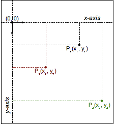
在 CSS(和大多數計算機圖形學)中,原點 (0, 0) 表示任何元素的左上角。正座標在原點的下方和右側,而負座標在上方和左側。因此,一個點向右 2 個單位,向下 5 個單位將是 (2, 5),而一個點向左 3 個單位,向上 12 個單位將是 (-3, -12)。
變換函式
變換函式透過操縱其座標值來改變元素的 görünüş。線性變換函式使用 2×2 矩陣描述,如下所示
該函式透過矩陣乘法應用於元素。因此,每個座標根據矩陣中的值而變化
甚至可以連續應用多個變換
透過這種表示法,可以描述並因此組合大多數常見的變換:旋轉、縮放或傾斜。(事實上,所有線性變換都可以被描述。)複合變換實際上是從右到左應用的。
然而,一個主要的變換不是線性的,因此在使用這種表示法時必須進行特殊處理:平移。平移向量 (tx, ty) 必須單獨表達,作為兩個額外的引數。
示例
變換函式比較
以下示例提供了一個由 DOM 元素和變換建立的 3D 立方體,以及一個選擇選單,允許您選擇不同的變換函式來變換立方體,以便您可以比較不同型別的影響。
選擇一個,變換將應用於立方體;2 秒後,立方體將恢復到其起始狀態。立方體的起始狀態使用 transform3d() 稍微旋轉,以便您可以看到所有變換的效果。
HTML
<main>
  <section id="example-element">
    <div class="face front">1</div>
    <div class="face back">2</div>
    <div class="face right">3</div>
    <div class="face left">4</div>
    <div class="face top">5</div>
    <div class="face bottom">6</div>
  </section>

  <div class="select-form">
    <label for="transfunction">Select a transform function</label>
    <select id="transfunction">
      <option selected>Choose a function</option>
      <option>rotate(360deg)</option>
      <option>rotateX(360deg)</option>
      <option>rotateY(360deg)</option>
      <option>rotateZ(360deg)</option>
      <option>rotate3d(1, 1, 1, 90deg)</option>
      <option>scale(1.5)</option>
      <option>scaleX(1.5)</option>
      <option>scaleY(1.5)</option>
      <option>scaleZ(1.5)</option>
      <option>scale3d(1, 1.5, 1.5)</option>
      <option>skew(17deg, 13deg)</option>
      <option>skewX(17deg)</option>
      <option>skewY(17deg)</option>
      <option>translate(100px, 100px)</option>
      <option>translateX(100px)</option>
      <option>translateY(100px)</option>
      <option>translateZ(100px)</option>
      <option>translate3d(50px, 50px, 50px)</option>
      <option>perspective(200px)</option>
      <option>matrix(1, 2, -1, 1, 80, 80)</option>
      <option>matrix3d(1,0,0,0,0,1,3,0,0,0,1,0,50,100,0,1.1)</option>
    </select>
  </div>
</main>
CSS
main {
  width: 400px;
  height: 200px;
  padding: 50px;
  background-image: linear-gradient(135deg, white, cyan, white);
}

#example-element {
  width: 100px;
  height: 100px;
  transform-style: preserve-3d;
  transition: transform 1.5s;
  transform: rotate3d(1, 1, 1, 30deg);
}

.face {
  display: flex;
  align-items: center;
  justify-content: center;
  width: 100%;
  height: 100%;
  position: absolute;
  backface-visibility: inherit;
  font-size: 60px;
  color: white;
}

.front {
  background: rgb(90 90 90 / 70%);
  transform: translateZ(50px);
}

.back {
  background: rgb(0 210 0 / 70%);
  transform: rotateY(180deg) translateZ(50px);
}

.right {
  background: rgb(210 0 0 / 70%);
  transform: rotateY(90deg) translateZ(50px);
}

.left {
  background: rgb(0 0 210 / 70%);
  transform: rotateY(-90deg) translateZ(50px);
}

.top {
  background: rgb(210 210 0 / 70%);
  transform: rotateX(90deg) translateZ(50px);
}

.bottom {
  background: rgb(210 0 210 / 70%);
  transform: rotateX(-90deg) translateZ(50px);
}

.select-form {
  margin-top: 50px;
}
JavaScript
const selectElem = document.querySelector("select");
const example = document.querySelector("#example-element");

selectElem.addEventListener("change", () => {
  if (selectElem.value === "Choose a function") {
    return;
  }
  example.style.transform = `rotate3d(1, 1, 1, 30deg) ${selectElem.value}`;
  setTimeout(() => {
    example.style.transform = "rotate3d(1, 1, 1, 30deg)";
  }, 2000);
});
結果
規範
| 規範 |
|---|
| CSS 變換模組級別 1 # 變換函式 |
| CSS 變換模組級別 2 # 變換函式 |
瀏覽器相容性
載入中…