在 CSS 網格佈局中對齊專案
CSS 網格佈局實現了 CSS 盒模型對齊,這與 Flexbox 在其彈性容器中對齊專案所使用的標準相同。對齊模組詳細說明了對齊在所有佈局方法中應該如何工作。
在本指南中,我們將瞭解如何使用盒模型對齊屬性來對齊網格佈局中的專案。
你可能會注意到這些屬性和值在 Flexbox 中的工作方式有相似之處。由於網格是二維的,而 Flexbox 是一維的,因此存在一些需要注意的細微差別。因此,我們將首先了解在網格中對齊專案時需要處理的兩個軸。
網格佈局的兩個軸
使用網格佈局時,有兩個軸可供對齊——塊軸和行內軸。塊軸是在塊級佈局中塊的排列軸。如果頁面上有兩個段落,它們會一個接一個地顯示,因此我們將這個方向描述為塊軸。
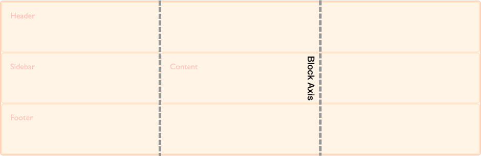
行內軸與塊軸交叉,它是常規行內流中文字的走向。
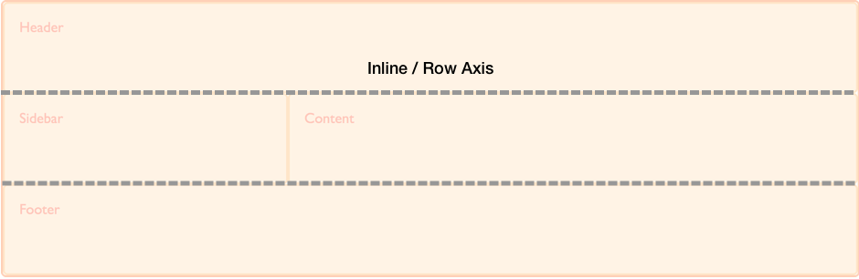
我們能夠在這兩個軸上對齊網格區域內的內容以及網格軌道本身。
在塊軸上對齊專案
align-self 和 align-items 屬性控制塊軸上的對齊。當我們使用這些屬性時,我們正在改變專案在你放置它的網格區域內的對齊方式。
使用 align-items
在下面的示例中,我們的網格中有四個網格區域。我們可以在網格容器上使用 align-items 屬性,使用 normal、stretch 或 <self-position> 或 <baseline-position> 值來對齊專案。
normalstretchstartendcenterbaselinefirst baselinelast baselineauto(僅用於align-self)
預設值是 normal,對於網格容器,它解析為 stretch。
.wrapper {
display: grid;
grid-template-columns: repeat(8, 1fr);
gap: 10px;
grid-auto-rows: 100px;
grid-template-areas:
"a a a a b b b b"
"a a a a b b b b"
"c c c c d d d d"
"c c c c d d d d";
align-items: start;
}
.item1 {
grid-area: a;
}
.item2 {
grid-area: b;
}
.item3 {
grid-area: c;
}
.item4 {
grid-area: d;
}
<div class="wrapper">
<div class="item1">Item 1</div>
<div class="item2">Item 2</div>
<div class="item3">Item 3</div>
<div class="item4">Item 4</div>
</div>
請記住,一旦你設定了 align-items: start,每個子 <div> 的高度將由 <div> 的內容決定。這與完全省略 align-items 的情況相反,在後者中,每個 <div> 的高度會拉伸以填充其網格區域。
align-items 屬性為所有子網格專案設定了 align-self 屬性。這意味著你可以透過直接在網格專案上使用 align-self 來單獨設定該屬性。
使用 align-self
在下一個示例中,我們使用 align-self 屬性來演示不同的對齊值。第一個區域顯示 align-self 的預設行為,在本例中解析為 stretch。第二個專案,align-self 值為 start,第三個為 end,第四個為 center。
.wrapper {
display: grid;
grid-template-columns: repeat(8, 1fr);
gap: 10px;
grid-auto-rows: 100px;
grid-template-areas:
"a a a a b b b b"
"a a a a b b b b"
"c c c c d d d d"
"c c c c d d d d";
}
.item1 {
grid-area: a;
}
.item2 {
grid-area: b;
align-self: start;
}
.item3 {
grid-area: c;
align-self: end;
}
.item4 {
grid-area: d;
align-self: center;
}
<div class="wrapper">
<div class="item1">Item 1</div>
<div class="item2">Item 2</div>
<div class="item3">Item 3</div>
<div class="item4">Item 4</div>
</div>
具有固有寬高比的專案
align-self 的預設行為是從網格容器的 align-items 屬性繼承,其 normal 預設值為 stretch,但具有固有寬高比的專案除外,在這種情況下,它們的行為類似於 start。原因是,如果具有寬高比的專案被拉伸,它們會變形。
在行內軸上調整專案
align-items 和 align-self 在塊軸上對齊專案,而 justify-items 和 justify-self 則在行內軸上對齊專案。你可以選擇的值與 align-self 屬性的 normal、stretch、<self-position> 和 <baseline-position> 值相似,此外還有 left 和 right。值包括:
normalstartendleftrightcenterstretchbaselinefirst baselinelast baselineauto(僅用於justify-self)
你可以在下面看到與 align-items 相同的示例。這一次,我們應用的是 justify-self 屬性。
同樣,預設值是 stretch,除非專案具有固有寬高比。這意味著網格專案預設會覆蓋其網格區域,除非你更改對齊方式。在此示例中,第一個專案演示了預設的 stretch 對齊值。
.wrapper {
display: grid;
grid-template-columns: repeat(8, 1fr);
gap: 10px;
grid-auto-rows: 100px;
grid-template-areas:
"a a a a b b b b"
"a a a a b b b b"
"c c c c d d d d"
"c c c c d d d d";
}
.item1 {
grid-area: a;
}
.item2 {
grid-area: b;
justify-self: start;
}
.item3 {
grid-area: c;
justify-self: end;
}
.item4 {
grid-area: d;
justify-self: center;
}
<div class="wrapper">
<div class="item1">Item 1</div>
<div class="item2">Item 2</div>
<div class="item3">Item 3</div>
<div class="item4">Item 4</div>
</div>
與 align-self 和 align-items 一樣,你可以將 justify-items 應用於網格容器,為容器內的所有網格專案設定 justify-self 值。
注意: justify-self 和 justify-items 屬性並未在 Flexbox 中實現。這是由於 Flexbox 的一維特性,並且軸上可能有多個專案,使得無法調整單個專案。要在 Flexbox 中沿主軸(行內軸)對齊專案,請使用 justify-content 屬性。
簡寫屬性
place-items 屬性是 align-items 和 justify-items 的簡寫。
place-self 屬性是 align-self 和 justify-self 的簡寫。
在區域內居中一個專案
透過結合 align 和 justify 屬性,我們可以輕鬆地將一個專案在網格區域內居中。
.wrapper {
display: grid;
grid-template-columns: repeat(4, 1fr);
gap: 10px;
grid-auto-rows: 200px;
grid-template-areas:
". a a ."
". a a .";
}
.item1 {
grid-area: a;
align-self: center;
justify-self: center;
}
<div class="wrapper">
<div class="item1">Item 1</div>
</div>
在塊軸上對齊網格軌道
如果你遇到網格軌道使用的區域小於網格容器的情況,你可以在該容器內對齊網格軌道本身。align-content 在塊軸上對齊軌道,justify-content 在行內軸上對齊。與 *-items 和 *-item 屬性一樣,place-content 屬性是 align-content 和 justify-content 的簡寫。
align-content、justify-content 和 place-content 的值都包括 <content-distribution> 和 <content-position> 值。align-content 屬性還接受 <baseline-position> 值,並且像其他 justify-* 屬性一樣,justify-content 也接受 left 和 right。
place-content 的有效關鍵字包括:
normalstartendcenterstretchspace-aroundspace-betweenspace-evenlybaselinefirst baselinelast baselineleftright
align-content 屬性應用於網格容器,因為它作用於整個網格。
預設對齊
在這個例子中,一個 500px 乘 500px 的網格容器有三個 100px 的行軌道和三個 100px 的列軌道,以及 10px 的間隙。這意味著在網格容器內,塊方向和行內方向都有空間。
預設情況下,我們的網格軌道位於網格的左上角,與起始網格線對齊,因為網格佈局中的預設行為是 start。
* {
  box-sizing: border-box;
}

.wrapper {
  border: 2px solid #f76707;
  border-radius: 5px;
  background-color: #fff4e6;
}

.wrapper > div {
  border: 2px solid #ffa94d;
  border-radius: 5px;
  background-color: #ffd8a8;
  padding: 1em;
  color: #d9480f;
}
.wrapper {
display: grid;
grid-template-columns: repeat(3, 100px);
grid-template-rows: repeat(3, 100px);
height: 500px;
width: 500px;
gap: 10px;
grid-template-areas:
"a a b"
"a a b"
"c d d";
}
.item1 {
grid-area: a;
}
.item2 {
grid-area: b;
}
.item3 {
grid-area: c;
}
.item4 {
grid-area: d;
}
<div class="wrapper">
  <div class="item1">Item 1</div>
  <div class="item2">Item 2</div>
  <div class="item3">Item 3</div>
  <div class="item4">Item 4</div>
</div>
設定 align-content: end
使用相同的 CSS 和 HTML,在這個例子中,我們向容器添加了值為 end 的 align-content,因此所有軌道都移動到網格容器在塊維度上的結束線。
.wrapper {
align-content: end;
}
設定 align-content: space-between
我們還可以應用 <content-distribution> 的空間分佈值,如 space-between、space-around、space-evenly 和 stretch。在這個例子中,我們將 align-content 設定為 space-between,它在塊軸上對齊軌道,從而將軌道分散開。
.wrapper {
align-content: space-between;
}
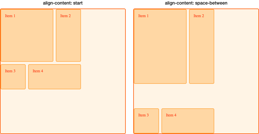
如果一個專案跨越了多個網格軌道,使用空間分佈值可能會導致網格上的專案變大,因為軌道之間增加的空間會加到跨越專案上。因此,如果你使用這些值,請確保軌道的內容可以應對額外的空間,或者你已在專案上使用了對齊屬性,使它們移動到開始或結束位置而不是拉伸。
在下圖中,我們用兩種不同的 align-content 值放置了網格,以比較 start 和 space-between。你可以看到,在 space-between 的例子中,前兩個跨越兩個行軌道的專案如何獲得了額外的高度,因為它們獲得了由於三行之間自由空間分佈而產生的空間。
在行內軸上調整網格軌道
我們可以使用 justify-content 在行內軸上執行與我們在塊軸上使用 align-content 相同的對齊方式。
使用相同的例子,我們將 justify-content 設定為 space-around。這再次導致跨越多個列軌道的軌道獲得額外的空間。
.wrapper {
align-content: space-between;
justify-content: space-around;
}
對齊和自動外邊距
另一種在區域內對齊專案的方法是使用自動外邊距。如果你曾經在視口中居中過佈局,或在任何父元素內居中塊級元素,你可能是透過將要居中的元素的左右外邊距設定為 auto 來實現的。自動外邊距會吸收所有可用空間。在兩側都設定 auto 外邊距會將塊級元素推到中間,因為兩邊的外邊距都試圖佔據所有空間。
在下一個例子中,專案 1 的 margin-left 屬性被設定為 auto。這會將內容推到區域的右側,因為自動外邊距佔用了內容所需空間分配後剩餘的可用空間。
.wrapper {
display: grid;
grid-template-columns: repeat(3, 100px);
grid-template-rows: repeat(3, 100px);
height: 500px;
width: 500px;
gap: 10px;
grid-template-areas:
"a a b"
"a a b"
"c d d";
}
.item1 {
grid-area: a;
margin-left: auto;
}
.item2 {
grid-area: b;
}
.item3 {
grid-area: c;
}
.item4 {
grid-area: d;
}
<div class="wrapper">
  <div class="item1">Item 1</div>
  <div class="item2">Item 2</div>
  <div class="item3">Item 3</div>
  <div class="item4">Item 4</div>
</div>
使用瀏覽器開發者工具中的網格檢查器來檢視專案是如何對齊的。

對齊和書寫模式
所有這些示例都是在英語環境下,一種從左到右的語言。這意味著從物理方向上考慮,我們的起始線位於網格的頂部和左側。
CSS 網格佈局和 CSS 盒模型對齊與 CSS 中的書寫模式協同工作。當顯示從右到左的語言(如阿拉伯語)時,網格的起始點是右上角,因此 justify-content: start 的預設行為是網格軌道從網格的右側開始。
設定物理屬性,例如使用 margin-right 或 margin-left 設定自動外邊距,或者使用 top、right、bottom 和 left 偏移量進行絕對定位,這些都不會遵循書寫模式。在網格、邏輯值和書寫模式指南中,我們將進一步探討 CSS 網格佈局、盒模型對齊和書寫模式之間的這種互動。如果你開發需要在多種語言中顯示的網站,或者想在設計中混合語言或書寫模式,理解這一點將非常重要。