試一試
border-image-slice: 30;
border-image-slice: 30 fill;
border-image-slice: 44;
border-image: url("/shared-assets/images/examples/border-florid.svg") round;
border-image-slice: calc(50 / 184 * 100%) calc(80 / 284 * 100%) fill;
border-image-width: 30px 48px;
<section id="default-example">
  <div id="example-element">This is a box with a border around it.</div>
</section>
#example-element {
  width: 80%;
  height: 80%;
  display: flex;
  align-items: center;
  justify-content: center;
  padding: 50px;
  background: #fff3d4;
  color: black;
  border: 30px solid;
  border-image: url("/shared-assets/images/examples/border-diamonds.png") 30
    round;
  font-size: 1.2em;
}
切片過程總共建立九個區域:四個角、四個邊和一箇中間區域。四條切片線(與各自的邊保持給定距離)控制著區域的大小。
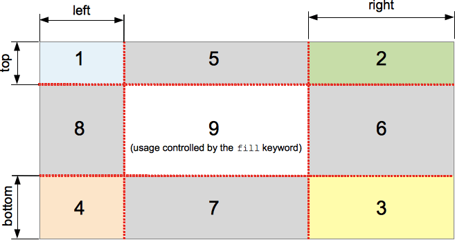
上圖說明了每個區域的位置。
- 區域 1-4 是角區域。每個區域都只使用一次,以形成最終邊框影像的角。
- 區域 5-8 是邊緣區域。這些區域在最終的邊框影像中被重複、縮放或以其他方式修改,以匹配元素的尺寸。
- 區域 9 是中間區域。預設情況下它被丟棄,但如果設定了關鍵字
fill,則像背景影像一樣使用。
border-image-repeat、border-image-width 和 border-image-outset 屬性決定了這些區域如何用於形成最終的邊框影像。
語法
/* All sides */
border-image-slice: 30%;

/* top and bottom | left and right */
border-image-slice: 10% 30%;

/* top | left and right | bottom */
border-image-slice: 30 30% 45;

/* top | right | bottom | left */
border-image-slice: 7 12 14 5;

/* Using the `fill` keyword */
border-image-slice: 10% fill;
border-image-slice: fill 10%;

/* Global values */
border-image-slice: inherit;
border-image-slice: initial;
border-image-slice: revert;
border-image-slice: revert-layer;
border-image-slice: unset;
border-image-slice 屬性可以使用一到四個 <number-percentage> 值來指定,表示每個影像切片的位置。負值無效;大於其對應維度的值將被限制為 100%。
- 當指定一個位置時,它會以相同距離從各自的邊建立所有四個切片。
- 當指定兩個位置時,第一個值建立從頂部和底部測量的切片,第二個值建立從左側和右側測量的切片。
- 當指定三個位置時,第一個值建立從頂部測量的切片,第二個值建立從左側和右側測量的切片,第三個值建立從底部測量的切片。
- 當指定四個位置時,它們按順序(順時針)建立從頂部、右側、底部和左側測量的切片。
可選的 fill 值(如果使用)可以放置在宣告中的任何位置。
值
<number>-
表示光柵影像的畫素邊緣偏移量,以及向量影像的座標。對於向量影像,該數字是相對於元素大小而不是源影像大小的,因此在這些情況下通常百分比更可取。
<percentage>-
表示邊緣偏移量,以源影像大小的百分比表示:水平偏移量為影像寬度,垂直偏移量為影像高度。
fill-
保留中間影像區域並將其像背景影像一樣顯示,但堆疊在實際的
background之上。它的寬度和高度分別與頂部和左側影像區域匹配。
正式定義
| 初始值 | 100% |
|---|---|
| 應用於 | 所有元素,但在 border-collapse 為 collapse 時,內部表格元素除外。該屬性也適用於 ::first-letter。 |
| 繼承性 | 否 |
| 百分比 | 指邊框影像的大小 |
| 計算值 | 一到四個百分比(按指定)或絕對長度,如果指定了關鍵字 fill |
| 動畫型別 | 按計算值型別 |
正式語法
border-image-slice =
  [ <number [0,∞]> | <percentage [0,∞]> ]{1,4}  &&
  fill?
示例
可調整的邊框寬度和切片
以下示例顯示了一個設定了邊框影像的 <div>。邊框的源影像如下:

菱形寬 30px,因此將 30 畫素設定為 border-width 和 border-image-slice 的值將使您在邊框中獲得完整且相當清晰的菱形。
border-width: 30px;
border-image-slice: 30;
這些是我們在此示例中使用的預設值。但是,我們還提供了兩個滑塊,允許您動態更改上述兩個屬性的值,讓您體會它們所產生的影響。
border-image-slice 更改用於每個邊框和邊框角(如果使用了 fill 關鍵字,則還用於內容區域)的影像切片的大小——將其從 30 調整會導致邊框看起來有些不規則,但可能會產生一些有趣的效果。
border-width: 更改邊框的寬度。取樣影像大小會縮放以適應邊框內部,這意味著如果寬度大於切片,影像可能會開始顯得有些畫素化(當然,除非您使用 SVG 影像)。
HTML
<div class="wrapper">
  <div></div>
</div>

<ul>
  <li>
    <label for="width">slide to adjust <code>border-width</code></label>
    <input type="range" min="10" max="45" id="width" />
    <output id="width-output">30px</output>
  </li>
  <li>
    <label for="slice">slide to adjust <code>border-image-slice</code></label>
    <input type="range" min="10" max="45" id="slice" />
    <output id="slice-output">30</output>
  </li>
</ul>
CSS
.wrapper {
  width: 400px;
  height: 300px;
}

div > div {
  width: 300px;
  height: 200px;
  border-width: 30px;
  border-style: solid;
  border-image: url("/shared-assets/images/examples/border-diamonds.png");
  border-image-slice: 30;
  border-image-repeat: round;
}

li {
  display: flex;
  place-content: center;
}
JavaScript
const widthSlider = document.getElementById("width");
const sliceSlider = document.getElementById("slice");
const widthOutput = document.getElementById("width-output");
const sliceOutput = document.getElementById("slice-output");
const divElem = document.querySelector("div > div");

widthSlider.addEventListener("input", () => {
  const newValue = `${widthSlider.value}px`;
  divElem.style.borderWidth = newValue;
  widthOutput.textContent = newValue;
});

sliceSlider.addEventListener("input", () => {
  const newValue = sliceSlider.value;
  divElem.style.borderImageSlice = newValue;
  sliceOutput.textContent = newValue;
});
結果
規範
| 規範 |
|---|
| CSS Backgrounds and Borders Module Level 3 # border-image-slice |
瀏覽器相容性
載入中…
另見
- 1-到-4 值語法的圖示說明
- MDN 部落格上的《CSS 中的邊框影像:Interop 2023 的一個重點關注領域》(2023 年)