卡片
這種模式是“卡片”元件的列表,帶有可選的頁尾。一張卡片包含標題、圖片、描述或其他內容,以及署名或頁尾。卡片通常以組或集合的形式顯示。
依賴項
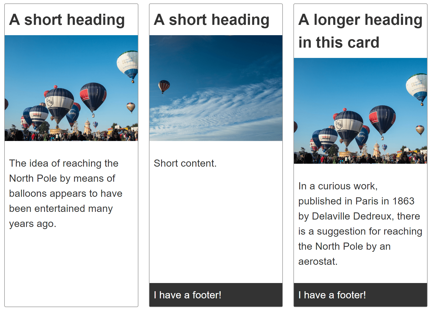
建立一個卡片組,每個卡片元件都包含標題、圖片、內容,以及可選的頁尾。
卡片組中的每張卡片應該具有相同的高度。可選的卡片頁尾應該緊貼卡片底部。
卡片組中的卡片應該在兩個維度上對齊——垂直和水平。
示例
點選下面程式碼塊中的“Play”按鈕,在 MDN Playground 中編輯示例。
<div class="cards">
  <article class="card">
    <header>
      <h2>A short heading</h2>
    </header>

    <img
      src="https://mdn.github.io/shared-assets/images/examples/balloons.jpg"
      alt="Hot air balloons" />
    <div class="content">
      <p>
        The idea of reaching the North Pole by means of balloons appears to have
        been entertained many years ago.
      </p>
    </div>
  </article>

  <article class="card">
    <header>
      <h2>A short heading</h2>
    </header>

    <img
      src="https://mdn.github.io/shared-assets/images/examples/balloons2.jpg"
      alt="Hot air balloons" />
    <div class="content">
      <p>Short content.</p>
    </div>
    <footer>I have a footer!</footer>
  </article>

  <article class="card">
    <header>
      <h2>A longer heading in this card</h2>
    </header>

    <img
      src="https://mdn.github.io/shared-assets/images/examples/balloons.jpg"
      alt="Hot air balloons" />
    <div class="content">
      <p>
        In a curious work, published in Paris in 1863 by Delaville Dedreux,
        there is a suggestion for reaching the North Pole by an aerostat.
      </p>
    </div>
    <footer>I have a footer!</footer>
  </article>
  <article class="card">
    <header>
      <h2>A short heading</h2>
    </header>

    <img
      src="https://mdn.github.io/shared-assets/images/examples/balloons2.jpg"
      alt="Hot air balloons" />
    <div class="content">
      <p>
        The idea of reaching the North Pole by means of balloons appears to have
        been entertained many years ago.
      </p>
    </div>
  </article>
</div>
body {
  font: 1.2em sans-serif;
}

img {
  max-width: 100%;
}

.cards {
  max-width: 700px;
  margin: 1em auto;

  display: grid;
  grid-template-columns: repeat(auto-fill, minmax(230px, 1fr));
  grid-gap: 20px;
}

.card {
  border: 1px solid #999999;
  border-radius: 3px;

  display: grid;
  grid-template-rows: max-content 200px 1fr;
}

.card img {
  object-fit: cover;
  width: 100%;
  height: 100%;
}

.card h2 {
  margin: 0;
  padding: 0.5rem;
}

.card .content {
  padding: 0.5rem;
}

.card footer {
  background-color: #333333;
  color: white;
  padding: 0.5rem;
}
已做出的選擇
儘管佈局是一維的,但每張卡片都使用CSS 網格佈局進行佈局。這使得網格軌道能夠使用內容尺寸。要設定單列網格,我們可以使用以下內容:
.card {
  display: grid;
  grid-template-rows: max-content 200px 1fr;
}
display: grid 將元素轉換為網格容器。grid-template-rows 屬性的三個值將網格分為至少三行,按順序定義卡片前三個子元素的高度。
每個card按順序包含<header>、<img>和<div>,其中一些還包含<footer>。
標題行或軌道設定為max-content,這可以防止它拉伸。圖片軌道設定為200畫素高。第三個軌道,即內容所在的位置,設定為1fr。這意味著它將填充任何額外空間。
除了三個具有明確定義尺寸的子元素之外,任何子元素都會在隱式網格中建立行,這些行適合新增的內容。預設情況下,這些行是自動調整大小的。如果卡片包含頁尾,則頁尾是自動調整大小的。當存在頁尾時,它會粘在網格的底部。頁尾會自動調整大小以適應其內容;然後內容<div>會拉伸以佔據任何額外空間。
以下規則集建立了卡片網格:
.cards {
  display: grid;
  grid-template-columns: repeat(auto-fill, minmax(230px, 1fr));
  gap: 20px;
}
grid-template-columns 屬性定義了網格列的寬度。在這種情況下,我們將網格設定為自動填充,重複的列最小為230px,但允許其增長以填充可用空間。gap 屬性設定了相鄰行和相鄰列之間20px的間隙。
注意:不同卡片中的各個元素彼此不對齊,因為每張卡片都是一個獨立的網格。可以使用子網格來使每張卡片中的元件與相鄰卡片中的相同元件對齊。
替代方法
Flexbox 也可以用於佈局每張卡片。使用 Flexbox,每張卡片行的尺寸由每行的flex 屬性設定,而不是在卡片容器上設定。
使用 flexbox,彈性專案的尺寸是在子元素上定義的,而不是在父元素上定義的。選擇使用 grid 還是 flexbox 取決於您的偏好,是喜歡從容器控制軌道還是喜歡為專案新增規則。
我們為卡片選擇了網格,因為通常情況下,您希望卡片在垂直和水平方向上都對齊。此外,可以使用子網格將每張卡片中的元件與相鄰卡片的元件對齊。Flex 沒有與子網格等效的無技巧方法。
可訪問性考慮
根據卡片的內容,您可能需要或應該採取一些措施來增強可訪問性。請參閱 Heydon Pickering 的包容性元件:卡片,獲取這些問題的非常詳細的解釋。