試一試
border-top-right-radius: 80px 80px;
border-top-right-radius: 250px 100px;
border-top-right-radius: 50%;
border-top-right-radius: 50%;
border: black 10px double;
background-clip: content-box;
<section class="default-example" id="default-example">
  <div class="transition-all" id="example-element">
    This is a box with a top right rounded corner.
  </div>
</section>
#example-element {
  width: 80%;
  height: 80%;
  display: flex;
  justify-content: center;
  flex-direction: column;
  background-color: #5b6dcd;
  color: white;
  padding: 10px;
}
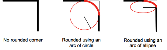
圓角可以是圓形或橢圓形,如果其中一個值為 0,則不進行圓角處理,角為直角。
背景(無論是影像還是顏色)都會在邊框處被裁剪,即使是圓角邊框也是如此;裁剪的確切位置由 background-clip 屬性的值定義。
注意: 如果此屬性的值在應用於元素且在 border-top-right-radius CSS 屬性之後使用的 border-radius 簡寫屬性中未設定,則此屬性的值將被 簡寫屬性 重置為其初始值。
語法
css
/* the corner is a circle */
/* border-top-right-radius: radius */
border-top-right-radius: 3px;

/* the corner is an ellipse */
/* border-top-right-radius: horizontal vertical */
border-top-right-radius: 0.5em 1em;

border-top-right-radius: inherit;

/* Global values */
border-top-right-radius: inherit;
border-top-right-radius: initial;
border-top-right-radius: revert;
border-top-right-radius: revert-layer;
border-top-right-radius: unset;
一個值時
- 該值是
<length>或<percentage>,表示該角邊框使用的圓的半徑。
兩個值時
- 第一個值是
<length>或<percentage>,表示該角邊框使用的橢圓的水平半長軸。 - 第二個值是
<length>或<percentage>,表示該角邊框使用的橢圓的垂直半長軸。
值
<length-percentage>-
表示圓的半徑或橢圓的半長軸和半短軸的大小。作為絕對長度,它可以表示為 CSS
<length>資料型別允許的任何單位。百分比值中,水平軸的百分比值參照框的寬度,垂直軸的百分比值參照框的高度。負值無效。
正式定義
| 初始值 | 0 |
|---|---|
| 應用於 | 所有元素;但當border-collapse為collapse時,使用者代理不要求應用於table和inline-table元素。目前,內部表格元素的行為未定義。它也適用於::first-letter。 |
| 繼承性 | 否 |
| 百分比 | 參考邊框框的相應維度 |
| 計算值 | 兩個絕對 <length> 或 <percentage> 值 |
| 動畫型別 | 一個長度、百分比或 calc(); |
正式語法
border-top-right-radius =
  <length-percentage [0,∞]>{1,2}

<length-percentage> =
  <length>      |
  <percentage>
示例
圓弧
單個 <length> 值會產生圓弧。
css
div {
  border-top-right-radius: 40px;
  background-color: lightgreen;
  border: solid 1px black;
  width: 100px;
  height: 100px;
}
橢圓弧
兩個不同的 <length> 值會產生橢圓弧。
css
div {
  border-top-right-radius: 40px 20px;
  background-color: lightgreen;
  border: solid 1px black;
  width: 100px;
  height: 100px;
}
帶有百分比半徑的正方形元素
帶有單個 <percentage> 值的正方形元素會產生圓弧。
css
div {
  border-top-right-radius: 40%;
  background-color: lightgreen;
  border: solid 1px black;
  width: 100px;
  height: 100px;
}
帶有百分比半徑的非正方形元素
帶有單個 <percentage> 值的非正方形元素會產生橢圓弧。
css
div {
  border-top-right-radius: 40%;
  background-color: lightgreen;
  border: solid 1px black;
  width: 200px;
  height: 100px;
}
規範
| 規範 |
|---|
| CSS Backgrounds and Borders Module Level 3 # border-radius |
瀏覽器相容性
載入中…