linear-gradient()
Baseline 廣泛可用 *
linear-gradient() CSS 函式用於建立一個由兩種或多種顏色沿一條直線漸變構成的影像。其結果屬於 <gradient> 資料型別,這是一種特殊的 <image>。
試一試
background: linear-gradient(#e66465, #9198e5);
background: linear-gradient(0.25turn, #3f87a6, #ebf8e1, #f69d3c);
background: linear-gradient(
  to left,
  #333333,
  #333333 50%,
  #eeeeee 75%,
  #333333 75%
);
background:
  linear-gradient(217deg, rgb(255 0 0 / 0.8), transparent 70.71%),
  linear-gradient(127deg, rgb(0 255 0 / 0.8), transparent 70.71%),
  linear-gradient(336deg, rgb(0 0 255 / 0.8), transparent 70.71%);
<section class="display-block" id="default-example">
  <div id="example-element"></div>
</section>
#example-element {
  min-height: 100%;
}
語法
/* A gradient with a single color of red */
linear-gradient(red)

/* A gradient tilted 45 degrees,
   starting blue and finishing red */
linear-gradient(45deg, blue, red)

/* A gradient going from the bottom right to the top left corner,
   starting blue and finishing red */
linear-gradient(to left top, blue, red)

/* Interpolation in rectangular color space */
linear-gradient(in oklab, blue, red)

/* Interpolation in polar color space */
linear-gradient(in hsl, blue, red)

/* Interpolation in polar color space
  with longer hue interpolation method */
linear-gradient(in hsl longer hue, blue, red)

/* Color stop: A gradient going from the bottom to top,
   starting blue, turning green at 40% of its length,
   and finishing red */
linear-gradient(0deg, blue, green 40%, red)

/* Color hint: A gradient going from the left to right,
   starting red, getting to the midpoint color
   10% of the way across the length of the gradient,
   taking the rest of the 90% of the length to change to blue */
linear-gradient(.25turn, red, 10%, blue)

/* Multi-position color stop: A gradient tilted 45 degrees,
   with a red bottom-left half and a blue top-right half,
   with a hard line where the gradient changes from red to blue */
linear-gradient(45deg, red 0 50%, blue 50% 100%)
值
<side-or-corner>-
漸變線的起始點位置。如果指定,它由
to加上最多兩個關鍵字組成:一個表示水平方向(left或right),另一個表示垂直方向(top或bottom)。方向關鍵字的順序無關緊要。如果未指定,則預設為to bottom。to top、to bottom、to left和to right的值分別等同於0deg、180deg、270deg和90deg。其他值會被轉換成一個角度。 <angle>-
漸變線的方向角度。
0deg等同於to top;增加值會從此開始順時針旋轉。 <linear-color-stop>-
色標的
<color>值,後面可以跟一個或兩個可選的位置(每個位置可以是沿漸變軸的<percentage>或<length>)。 <color-hint>-
一個插值提示,用於定義漸變在相鄰色標之間的過渡方式。該長度定義了在兩個色標之間的哪個點,漸變色應達到顏色過渡的中點。如果省略,顏色過渡的中點將是兩個色標之間的中點。
描述
與任何漸變一樣,線性漸變沒有內在尺寸;也就是說,它沒有自然或首選的大小,也沒有首選的比例。它的具體大小將與應用它的元素的大小相匹配。
要建立重複填充其容器的線性漸變,請改用 repeating-linear-gradient() 函式。
由於 <gradient> 屬於 <image> 資料型別,因此它們只能在可以使用 <image> 的地方使用。因此,linear-gradient() 不適用於 background-color 以及其他使用 <color> 資料型別的屬性。
線性漸變的構成
線性漸變由一個軸(漸變線)和兩個或多個色標點定義。軸上的每個點都是一種不同的顏色;為了建立平滑的漸變,linear-gradient() 函式會繪製一系列垂直於漸變線的彩色線條,每條線的顏色都與它和漸變線相交點的顏色相匹配。
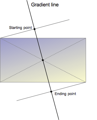
漸變線由包含漸變影像的盒子的中心和一個角度定義。漸變的顏色由兩個或多個點決定:起始點、結束點以及介於兩者之間的可選色標點。
起始點是漸變線上第一種顏色開始的位置。結束點是最後一種顏色結束的位置。這兩個點都是由漸變線與一條穿過同象限盒子角落的垂直線的交點定義的。結束點可以理解為起始點的對稱點。這些有些複雜的定義導致了一個有趣的效果,有時被稱為魔術角:最接近起始點和結束點的角落與它們各自的起始點或結束點具有相同的顏色。
自定義漸變
透過在漸變線上新增更多的色標點,你可以在多種顏色之間建立高度定製的過渡。色標的位置可以透過使用 <length> 或 <percentage> 來明確定義。如果你沒有指定一個顏色的位置,它會被放置在它前面和後面的顏色之間的中間位置。以下兩個漸變是等效的。
linear-gradient(red, orange, yellow, green, blue);
linear-gradient(red 0%, orange 25%, yellow 50%, green 75%, blue 100%);
預設情況下,顏色從一個色標的顏色平滑地過渡到下一個色標的顏色,顏色之間的中點是顏色過渡的中間點。你可以透過在兩種顏色之間新增一個未標記的 % 顏色提示,將這個中點移動到兩個色標之間的任何位置,以指示顏色過渡的中間應該在哪裡。以下示例從開始到 10% 標記處為純紅色,從 90% 到結束為純藍色。在 10% 和 90% 之間,顏色從紅色過渡到藍色,但是過渡的中點在 30% 標記處,而不是在沒有 30% 顏色提示的情況下會發生的 50%。
linear-gradient(red 10%, 30%, blue 90%);
如果兩個或多個色標位於相同位置,過渡將是在該位置宣告的第一個和最後一個顏色之間的硬線。
色標應按升序排列。後面值較小的色標將覆蓋前一個色標的值,從而產生硬過渡。以下示例在 40% 標記處從紅色變為黃色,然後在漸變的 25% 範圍內從黃色過渡到藍色。
linear-gradient(red 40%, yellow 30%, blue 65%);
允許多位置色標。一種顏色可以宣告為兩個相鄰的色標,方法是在 CSS 宣告中包含兩個位置。以下三個漸變是等效的。
linear-gradient(red 0%, orange 10%, orange 30%, yellow 50%, yellow 70%, green 90%, green 100%);
linear-gradient(red, orange 10% 30%, yellow 50% 70%, green 90%);
linear-gradient(red 0%, orange 10% 30%, yellow 50% 70%, green 90% 100%);
預設情況下,如果沒有顏色在 0% 停止,宣告的第一個顏色將位於該點。同樣,最後一個顏色將持續到 100% 標記,或者如果最後一個停止點沒有宣告長度,則位於 100% 標記處。
正式語法
<linear-gradient()> =
  linear-gradient( [ <linear-gradient-syntax> ] )

<linear-gradient-syntax> =
  [ [ <angle> | <zero> | to <side-or-corner> ] || <color-interpolation-method> ]? , <color-stop-list>

<side-or-corner> =
  [ left | right ]  ||
  [ top | bottom ]

<color-interpolation-method> =
  in [ <rectangular-color-space> | <polar-color-space> <hue-interpolation-method>? | <custom-color-space> ]

<color-stop-list> =
  <linear-color-stop> , [ <linear-color-hint>? , <linear-color-stop> ]#?

<rectangular-color-space> =
  srgb               |
  srgb-linear        |
  display-p3         |
  display-p3-linear  |
  a98-rgb            |
  prophoto-rgb       |
  rec2020            |
  lab                |
  oklab              |
  <xyz-space>

<polar-color-space> =
  hsl    |
  hwb    |
  lch    |
  oklch

<hue-interpolation-method> =
  [ shorter | longer | increasing | decreasing ] hue

<custom-color-space> =
  <dashed-ident>

<linear-color-stop> =
  <color> <color-stop-length>?

<linear-color-hint> =
  <length-percentage>

<xyz-space> =
  xyz      |
  xyz-d50  |
  xyz-d65

<color-stop-length> =
  <length-percentage>{1,2}

<length-percentage> =
  <length>      |
  <percentage>
示例
45 度角的漸變
body {
  background: linear-gradient(45deg, red, blue);
}
從漸變線 60% 處開始的漸變
body {
  background: linear-gradient(135deg, orange 60%, cyan);
}
矩形顏色空間中的插值
body {
  background: linear-gradient(90deg in oklab, blue, red);
}
色相插值
在這個插值示例中,使用了 hsl 顏色系統,並對色相進行了插值。
.shorter {
  background: linear-gradient(90deg in hsl shorter hue, red, blue);
}

.longer {
  background: linear-gradient(90deg in hsl longer hue, red, blue);
}
頂部的盒子使用較短插值,意味著顏色使用色輪上的較短弧線直接從紅色變為藍色。底部的盒子使用較長插值,意味著顏色使用較長弧線從紅色變為藍色,經過綠色、黃色和橙色。
帶有多位置色標的漸變
此示例使用多位置色標,相鄰顏色具有相同的色標值,從而建立條紋效果。
body {
  background: linear-gradient(
    to right,
    red 20%,
    orange 20% 40%,
    yellow 40% 60%,
    green 60% 80%,
    blue 80%
  );
}
更多 linear-gradient 示例
請參閱使用 CSS 漸變以獲取更多示例。
規範
| 規範 |
|---|
| CSS 影像模組第 4 級 # 線性漸變 |
瀏覽器相容性
載入中…