animation-timing-function: linear;
animation-timing-function: ease-in-out;
animation-timing-function: steps(5, end);
animation-timing-function: cubic-bezier(0.1, -0.6, 0.2, 0);
<section class="flex-column" id="default-example">
  <div class="animating" id="example-element"></div>
  <button id="play-pause">Play</button>
</section>
#example-element {
  animation-duration: 3s;
  animation-iteration-count: infinite;
  animation-name: slide;
  animation-play-state: paused;
  background-color: #1766aa;
  border-radius: 50%;
  border: 5px solid #333333;
  color: white;
  height: 150px;
  margin: auto;
  margin-left: 0;
  width: 150px;
}

#example-element.running {
  animation-play-state: running;
}

#play-pause {
  font-size: 2rem;
}

@keyframes slide {
  from {
    background-color: orange;
    color: black;
    margin-left: 0;
  }
  to {
    background-color: orange;
    color: black;
    margin-left: 80%;
  }
}
const el = document.getElementById("example-element");
const button = document.getElementById("play-pause");

button.addEventListener("click", () => {
  if (el.classList.contains("running")) {
    el.classList.remove("running");
    button.textContent = "Play";
  } else {
    el.classList.add("running");
    button.textContent = "Pause";
  }
});
通常,為了圖方便,可以使用簡寫屬性 animation 一次性設定所有動畫屬性。
/* Keyword values */
animation-timing-function: ease;
animation-timing-function: ease-in;
animation-timing-function: ease-out;
animation-timing-function: ease-in-out;
animation-timing-function: linear;
animation-timing-function: step-start;
animation-timing-function: step-end;

/* cubic-bezier() function values */
animation-timing-function: cubic-bezier(0.42, 0, 1, 1); /* ease-in */
animation-timing-function: cubic-bezier(0, 0, 0.58, 1); /* ease-out */
animation-timing-function: cubic-bezier(0.42, 0, 0.58, 1); /* ease-in-out */

/* linear() function values */
animation-timing-function: linear(0, 0.25, 1);
animation-timing-function: linear(0 0%, 0.25 50%, 1 100%);
animation-timing-function: linear(0, 0.25 50% 75%, 1);
animation-timing-function: linear(0, 0.25 50%, 0.25 75%, 1);

/* steps() function values */
animation-timing-function: steps(4, jump-start);
animation-timing-function: steps(10, jump-end);
animation-timing-function: steps(20, jump-none);
animation-timing-function: steps(5, jump-both);
animation-timing-function: steps(6, start);
animation-timing-function: steps(8, end);

/* Multiple animations */
animation-timing-function: ease, step-start, cubic-bezier(0.1, 0.7, 1, 0.1);

/* Global values */
animation-timing-function: inherit;
animation-timing-function: initial;
animation-timing-function: revert;
animation-timing-function: revert-layer;
animation-timing-function: unset;
<easing-function>-
由 animation-name 決定的,與給定動畫相對應的緩動函式。
非階梯的關鍵字值(ease、linear、ease-in-out 等)各自代表一個固定的四點三次貝塞爾曲線,而 cubic-bezier() 函式值允許指定一個非預定義的值。steps() 緩動函式將輸入時間劃分為指定數量的等長時間間隔。其引數包括步數和步進位置。
linear-
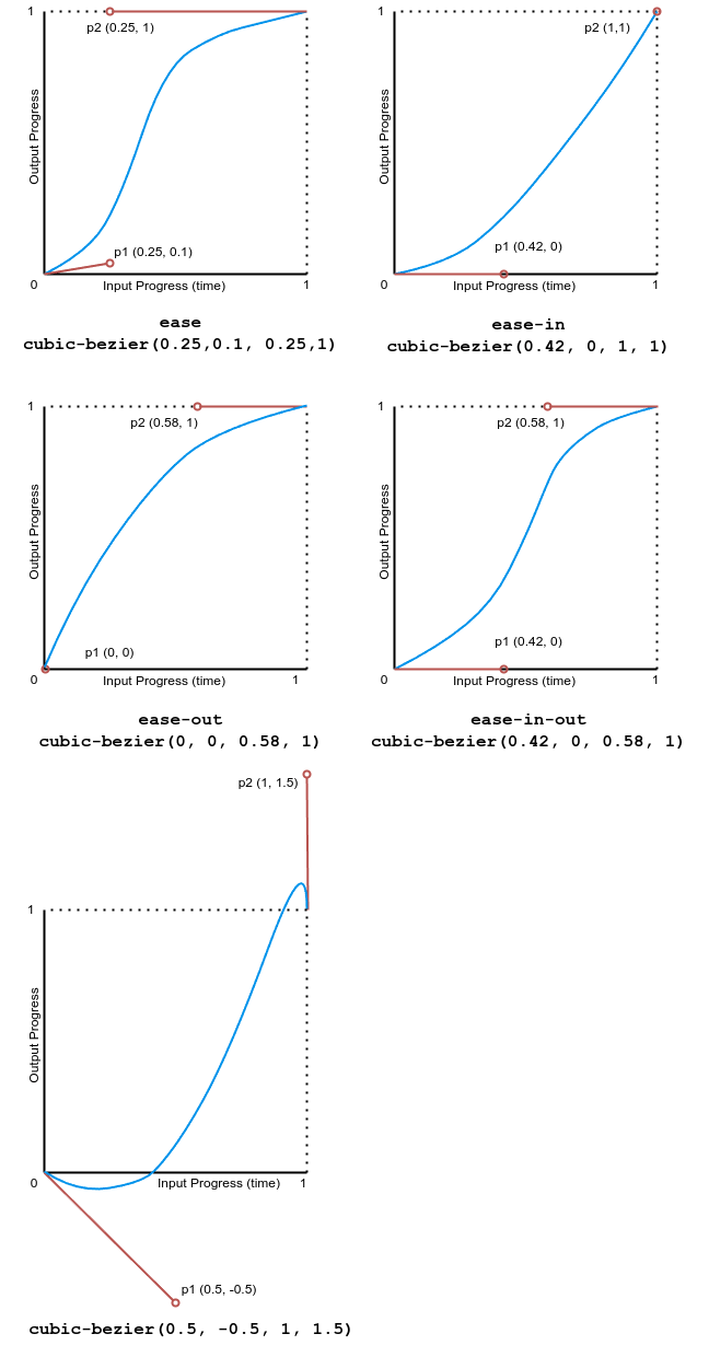
等同於 cubic-bezier(0.0, 0.0, 1.0, 1.0),動畫以均勻的速度執行。
ease-
等同於 cubic-bezier(0.25, 0.1, 0.25, 1.0),為預設值,動畫在中間部分加速,在末尾減速。
ease-in-
等同於 cubic-bezier(0.42, 0, 1.0, 1.0),動畫開始時很慢,然後動畫屬性的過渡速度不斷增加直到完成。
ease-out-
等同於 cubic-bezier(0, 0, 0.58, 1.0),動畫開始時很快,然後隨著動畫的繼續而減慢。
ease-in-out-
等同於 cubic-bezier(0.42, 0, 0.58, 1.0),動畫屬性的過渡開始和結束時都很慢,中間部分加速。
cubic-bezier(<number [0,1]> , <number> , <number [0,1]> , <number>)-
一個由作者定義的三次貝塞爾曲線,其中第一個和第三個值必須在 0 到 1 的範圍內。
linear(<number> <percentage>{1,2}, …)-
該函式在提供的緩動停止點之間進行線性插值。一個停止點是一對輸出進度和輸入百分比。輸入百分比是可選的,如果未指定,則會推斷。如果未提供輸入百分比,則第一個和最後一個停止點分別設定為 0% 和 100%,中間的停止點則透過在具有百分比值的最近的前後點之間進行線性插值得到百分比值。
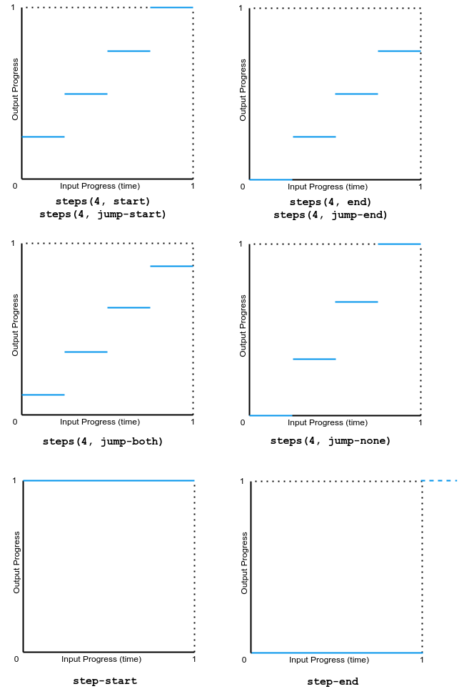
steps(<integer>, <step-position>)-
沿著過渡過程顯示一個包含 n 個停頓點的動畫迭代,每個停頓點顯示相同的時間長度。例如,如果 n 為 5,則有 5 個步驟。動畫是在 0%、20%、40%、60% 和 80% 處短暫保持,還是在 20%、40%、60%、80% 和 100% 處短暫保持,或是在 0% 和 100% 之間建立 5 個停頓點,或是在 0%、25%、50%、75% 和 100% 處建立 5 個停頓點(包括 0% 和 100% 標記),這取決於使用以下哪種步進位置。
jump-start-
表示一個左連續函式,因此第一次跳躍發生在動畫開始時。
jump-end-
表示一個右連續函式,因此最後一次跳躍發生在動畫結束時。這是預設值。
jump-none-
兩端都沒有跳躍,在插值迭代期間有效地移除了一個步驟。相反,它在 0% 標記和 100% 標記處都保持,每個標記保持 1/n 的時長。
jump-both-
在 0% 和 100% 標記處都包含暫停,在動畫迭代期間有效地增加了一個步驟。
start-
與 jump-start 相同。
end-
與 jump-end 相同。
step-start-
等同於 steps(1, jump-start)
step-end-
等同於 steps(1, jump-end)
備註: 在建立 CSS 滾動驅動動畫時,animation-timing-function 的效果與常規的基於時間的動畫相同。
緩動函式可以在 @keyframes 規則中的單個關鍵幀上指定。如果關鍵幀上沒有指定 animation-timing-function,則使用應用動畫的元素上對應的 animation-timing-function 值作為該關鍵幀的值。
在關鍵幀內,animation-timing-function 是一個 at-rule-specific 描述符,而不是同名的屬性。時間節奏本身不會被動畫化。相反,一個關鍵幀的緩動函式會逐個屬性地應用,從指定它的關鍵幀開始,直到下一個指定該屬性的關鍵幀,或者如果沒有後續關鍵幀指定該屬性,則直到動畫結束。因此,在 100% 或 to 關鍵幀上指定的 animation-timing-function 永遠不會被使用。
animation-timing-function =
  <easing-function>#

<easing-function> =
  <linear-easing-function>        |
  <cubic-bezier-easing-function>  |
  <step-easing-function>

<linear-easing-function> =
  linear      |
  <linear()>

<cubic-bezier-easing-function> =
  ease              |
  ease-in           |
  ease-out          |
  ease-in-out       |
  <cubic-bezier()>

<step-easing-function> =
  step-start  |
  step-end    |
  <steps()>

<linear()> =
  linear( [ <number> && <percentage>{0,2} ]# )

<cubic-bezier()> =
  cubic-bezier( [ <number [0,1]> , <number> ]#{2} )

<steps()> =
  steps( <integer> , <step-position>? )

<step-position> =
  jump-start  |
  jump-end    |
  jump-none   |
  jump-both   |
  start       |
  end
本節中的所有示例都使用不同的 animation-timing-function 值對幾個 <div> 元素的 width 和 background-color 屬性進行動畫處理。寬度從 0 動畫到 100%,背景顏色從石灰色動畫到品紅色。
該示例演示了各種 linear() 緩動函式值的效果。
<div class="parent">
  <div class="linear">'linear' value</div>
  <div class="linear-fn1">linear(0, 0.5 50%, 1)</div>
  <div class="linear-fn2">linear(0, 0.25 75%, 1)</div>
  <div class="linear-fn3">linear(0, 0.75 25%, 1)</div>
  <div class="linear-fn4">linear(0, 0.5 25% 75%, 1)</div>
  <div class="linear-fn5">linear(0, 0.25 45%, 0.75 55%, 0.5 70%, 1)</div>
  <div class="linear-fn6">linear(0, 1.2 50%, 0.75 80%, 1)</div>
  <div class="linear-fn7">linear(0, 0.5 75%, 1 120%)</div>
</div>
<div class="x-axis"><span>25%</span><span>50%</span><span>75%</span></div>
<button>Play animation</button>
const btn = document.querySelector("button");
const divs = document.querySelectorAll(".parent > div[class]");

btn.addEventListener("click", () => {
  btn.setAttribute("disabled", "true");
  for (const div of divs) {
    div.classList.remove("animate");
    void div.offsetWidth;
    div.classList.add("animate");
  }
  setTimeout(() => {
    btn.removeAttribute("disabled");
  }, 11000);
});
.x-axis {
  display: flex;
  justify-content: space-evenly;
  width: 80vw;
  margin-left: 4px;
}

.parent {
  background: linear-gradient(
    to right,
    white 24.8%,
    grey 24.8%,
    grey 25.2%,
    white 25.2%,
    white 49.8%,
    grey 49.8%,
    grey 50.2%,
    white 50.2%,
    white 74.8%,
    grey 74.8%,
    grey 75.2%,
    white 75.2%
  );
  width: 80vw;
  font-family: monospace;
  font-weight: bold;
  border: 2px solid grey;
}

.animate {
  animation-name: changeme;
}

.parent > div[class] {
  animation-fill-mode: forwards;
  animation-duration: 10s;

  width: 0;
  margin-bottom: 4px;
  padding: 5px 0;
  box-sizing: border-box;
  text-wrap: nowrap;
  background-color: lime;
}

@keyframes changeme {
  0% {
    width: 0em;
  }
  100% {
    width: 100%;
    background-color: orange;
  }
}

.linear {
  animation-timing-function: linear;
}
.linear-fn1 {
  animation-timing-function: linear(0, 0.5 50%, 1);
}
.linear-fn2 {
  animation-timing-function: linear(0, 0.25 75%, 1);
}
.linear-fn3 {
  animation-timing-function: linear(0, 0.75 25%, 1);
}
.linear-fn4 {
  animation-timing-function: linear(0, 0.5 25% 75%, 1);
}
.linear-fn5 {
  animation-timing-function: linear(0, 0.25 45%, 0.75 55%, 0.5 70%, 1);
}
.linear-fn6 {
  animation-timing-function: linear(0, 1.2 50%, 0.75 80%, 1);
}
.linear-fn7 {
  animation-timing-function: linear(0, 0.5 75%, 1 120%);
}
下圖顯示了本例中使用的所有 linear() 函式值的圖表。輸入進度(時間)繪製在 x 軸上,輸出進度繪製在 y 軸上。根據語法,輸入進度範圍從 0 到 100%,輸出範圍從 0 到 1。
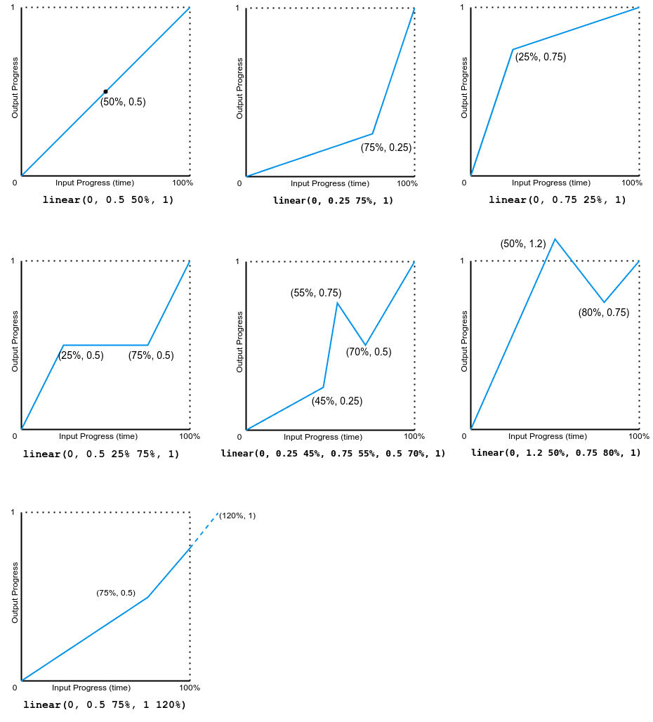
注意,輸出可以前進或後退。
該示例演示了各種貝塞爾曲線緩動函式的效果。
<div class="parent">
  <div class="linear">linear</div>
  <div class="ease">ease</div>
  <div class="ease-in">ease-in</div>
  <div class="ease-out">ease-out</div>
  <div class="ease-in-out">ease-in-out</div>
  <div class="cb">cubic-bezier(.5, -0.5, 1, 1.5)</div>
</div>
<div class="x-axis"><span>50%</span></div>
<button>Play animation</button>
const btn = document.querySelector("button");
const divs = document.querySelectorAll(".parent > div[class]");

btn.addEventListener("click", () => {
  btn.setAttribute("disabled", "true");
  for (const div of divs) {
    div.classList.remove("animate");
    void div.offsetWidth;
    div.classList.add("animate");
  }
  setTimeout(() => {
    btn.removeAttribute("disabled");
  }, 11000);
});
.x-axis {
  display: flex;
  justify-content: space-evenly;
  width: 80vw;
  margin-left: 4px;
}

.parent {
  background: linear-gradient(
    to right,
    white 49.8%,
    grey 49.8%,
    grey 50.2%,
    white 50.2%
  );
  width: 80vw;
  font-family: monospace;
  font-weight: bold;
  border: 2px solid grey;
}

.animate {
  animation-name: changeme;
}

.parent > div[class] {
  animation-fill-mode: forwards;
  animation-duration: 10s;

  width: 0;
  margin-bottom: 4px;
  padding: 5px 0;
  box-sizing: border-box;
  text-wrap: nowrap;
  background-color: lime;
}

@keyframes changeme {
  0% {
    width: 0em;
  }
  100% {
    width: 100%;
    background-color: orange;
  }
}

.linear {
  animation-timing-function: linear;
}
.ease {
  animation-timing-function: ease;
}
.ease-in {
  animation-timing-function: ease-in;
}
.ease-out {
  animation-timing-function: ease-out;
}
.ease-in-out {
  animation-timing-function: ease-in-out;
}
.cb {
  animation-timing-function: cubic-bezier(0.5, -0.5, 1, 1.5);
}
下圖顯示了本例中使用的所有三次貝塞爾函式值的圖表。輸入進度(時間)範圍從 0 到 1,輸出進度範圍從 0 到 1。
此示例演示了幾種步進緩動函式值的效果。
<div class="parent">
  <div class="linear">linear</div>
  <div class="start">steps(4, start)</div>
  <div class="jump-start">steps(4, jump-start)</div>
  <div class="end">steps(4, end)</div>
  <div class="jump-end">steps(4, jump-end)</div>
  <div class="jump-both">steps(4, jump-both)</div>
  <div class="jump-none">steps(4, jump-none)</div>
  <div class="step-start">step-start</div>
  <div class="step-end">step-end</div>
</div>
<div class="x-axis"><span>25%</span><span>50%</span><span>75%</span></div>
<button>Play animation</button>
const btn = document.querySelector("button");
const divs = document.querySelectorAll(".parent > div[class]");

btn.addEventListener("click", () => {
  btn.setAttribute("disabled", "true");
  for (const div of divs) {
    div.classList.remove("animate");
    void div.offsetWidth;
    div.classList.add("animate");
  }
  setTimeout(() => {
    btn.removeAttribute("disabled");
  }, 11000);
});
.x-axis {
  display: flex;
  justify-content: space-evenly;
  width: 80vw;
  margin-left: 4px;
}

.parent {
  background: linear-gradient(
    to right,
    white 24.8%,
    grey 24.8%,
    grey 25.2%,
    white 25.2%,
    white 49.8%,
    grey 49.8%,
    grey 50.2%,
    white 50.2%,
    white 74.8%,
    grey 74.8%,
    grey 75.2%,
    white 75.2%
  );
  width: 80vw;
  font-family: monospace;
  font-weight: bold;
  border: 2px solid grey;
}

.animate {
  animation-name: changeme;
}

.parent > div[class] {
  animation-fill-mode: forwards;
  animation-duration: 10s;

  width: 0;
  margin-bottom: 4px;
  padding: 5px 0;
  box-sizing: border-box;
  text-wrap: nowrap;
  background-color: lime;
}

@keyframes changeme {
  0% {
    width: 0em;
  }
  100% {
    width: 100%;
    background-color: orange;
  }
}
.linear {
  animation-timing-function: linear;
}

.start {
  animation-timing-function: steps(4, start);
}
.jump-start {
  animation-timing-function: steps(4, jump-start);
}
.end {
  animation-timing-function: steps(4, end);
}
.jump-end {
  animation-timing-function: steps(4, jump-end);
}
.jump-both {
  animation-timing-function: steps(4, jump-both);
}
.jump-none {
  animation-timing-function: steps(4, jump-none);
}
.step-start {
  animation-timing-function: step-start;
}
.step-end {
  animation-timing-function: step-end;
}
下圖顯示了本例中使用的所有 step() 函式值的圖表。輸入進度(時間)和輸出進度的範圍都是從 0 到 1。