從盒子值建立形狀
建立形狀的一種簡單方法是使用 CSS 盒模型模組中的值。本文解釋瞭如何做到這一點。
允許作為形狀值的 <box-edge> 盒子值是
content-boxpadding-boxborder-boxmargin-box
還支援 border-radius 值。這意味著你可以給元素一個彎曲的邊框,並讓你的內容圍繞建立的形狀流動。
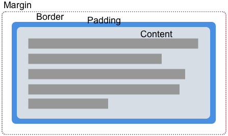
CSS 盒子模型
上面列出的值對應於 CSS 盒模型的各個部分。CSS 中的一個盒子有內容、內邊距、邊框和外邊距。
透過使用盒子值來建立形狀,我們可以讓內容圍繞這些值定義的邊緣環繞。在下面的每個示例中,我都使用了一個定義了內邊距、邊框和外邊距的元素,以便你可以看到內容流動的不同方式。
margin-box
margin-box 是由外部外邊距邊緣定義的形狀,如果元素定義中使用了 border-radius,則包括形狀的圓角。
在下面的示例中,我們有一個紫色的圓形項,它是一個具有高度、寬度和背景色的 <div>。透過設定 border-radius: 50%,使用了 border-radius 屬性來建立一個圓形。由於元素有外邊距,你可以看到內容正在圍繞圓形形狀及其應用的外邊距流動。
<div class="box">
  <div class="shape"></div>
  <p>
    One November night in the year 1782, so the story runs, two brothers sat
    over their winter fire in the little French town of Annonay, watching the
    grey smoke-wreaths from the hearth curl up the wide chimney. Their names
    were Stephen and Joseph Montgolfier, they were papermakers by trade, and
    were noted as possessing thoughtful minds and a deep interest in all
    scientific knowledge and new discovery.
  </p>
</div>
body {
  font: 1.2em sans-serif;
}

.shape {
  background-color: rebeccapurple;
  height: 80px;
  width: 80px;
  padding: 20px;
  margin: 20px;
  border: 10px solid black;
  border-radius: 50%;
  float: left;
  shape-outside: margin-box;
}
border-box
border-box 值是由外部邊框邊緣定義的形狀。此形狀遵循所有正常的邊框半徑塑形規則,用於邊框的外部。即使你沒有使用 CSS border 屬性,你仍然有一個邊框。在這種情況下,它將與 padding-box 相同,即由外部內邊距邊緣定義的形狀。
在下面的示例中,你可以看到文字現在如何沿著邊框建立的線條流動。更改邊框大小,內容將隨之改變。
body {
  font: 1.2em sans-serif;
}
.box {
  width: 70%;
}

.shape {
  background-color: rebeccapurple;
  height: 80px;
  width: 80px;
  padding: 20px;
  margin: 20px;
  border: 10px solid black;
  border-radius: 50%;
  float: left;
  shape-outside: border-box;
}
padding-box
padding-box 值定義了由外部內邊距邊緣包圍的形狀。此形狀遵循所有正常的邊框半徑塑形規則,用於邊框的內部。如果你沒有內邊距,那麼 padding-box 與 content-box 相同。
body {
  font: 1.2em / 1.2 sans-serif;
}
.box {
  width: 70%;
}

.shape {
  background-color: rebeccapurple;
  height: 80px;
  width: 80px;
  padding: 20px;
  margin: 20px;
  border: 10px solid black;
  border-radius: 50%;
  float: left;
  shape-outside: padding-box;
}
content-box
content-box 值定義了由外部內容邊緣包圍的形狀。此盒子的每個角半徑都是 border-radius 減去 border-width 和 padding,或者 0,以較大者為準。這意味著此處不可能有負值。
body {
  font: 1.2em / 1.2 sans-serif;
}
.box {
  width: 70%;
}

.shape {
  background-color: rebeccapurple;
  height: 80px;
  width: 80px;
  padding: 20px;
  margin: 20px;
  border: 10px solid black;
  border-radius: 50%;
  float: left;
  shape-outside: content-box;
}
何時使用盒子值
使用盒子值是建立形狀的一種方式;然而,這自然只適用於可以使用 border-radius 屬性定義的非常基本的形狀。上面顯示的示例展示了這樣一種用例。你可以使用 border-radius 建立一個圓形形狀,然後讓文字圍繞它彎曲。
僅憑這種基本技術,你就可以創造一些有趣的效果。在本節的最後一個示例中,我將兩個元素向左和向右浮動,並給每個元素在最靠近文字的方向上設定了 100% 的邊框半徑。
<div class="box">
  <div class="shape-left"></div>
  <div class="shape-right"></div>
  <p>
    One November night in the year 1782, so the story runs, two brothers sat
    over their winter fire in the little French town of Annonay, watching the
    grey smoke-wreaths from the hearth curl up the wide chimney. Their names
    were Stephen and Joseph Montgolfier, they were papermakers by trade, and
    were noted as possessing thoughtful minds and a deep interest in all
    scientific knowledge and new discovery.
  </p>
</div>
body {
  font: 1.2em / 1.5 sans-serif;
}

.box {
  text-align: justify;
}

.shape-left,
.shape-right {
  height: 100px;
  width: 100px;
}

.shape-left {
  margin: 0 20px 20px 0;
  border-bottom-right-radius: 100%;
  float: left;
  shape-outside: margin-box;
}
.shape-right {
  margin: 0 20px 20px;
  border-bottom-left-radius: 100%;
  float: right;
  shape-outside: margin-box;
}
對於更復雜的形狀,你需要使用 基本形狀之一作為值,或者從影像定義你的形狀,如本節中的其他指南所述。