使用 shape-outside 定義基本形狀
CSS 形狀可以使用 <basic-shape> 型別來定義。在本指南中,我們將討論如何使用 shape-outside 屬性建立矩形、圓形、橢圓和多邊形。這些是在 CSS 形狀模組中定義的特性。
在瞭解形狀之前,有必要先了解兩個使這些形狀成為可能的資訊:
<basic-shape>型別- 參考盒
<basic-shape> 型別
<basic-shape> 型別用作我們所有基本形狀的值。此型別是一種函式表示法:函式括號中包含用於描述形狀的引數。
可接受的引數因你建立的形狀而異。我們將在下面的示例中介紹這些引數。
參考盒
在使用基本形狀時,理解 CSS 形狀所使用的參考盒非常重要,因為它定義了每個形狀的座標系。你已經在《透過盒模型值建立形狀》指南中接觸過參考盒,該指南直接使用參考盒來建立形狀。
下面的截圖顯示了 Firefox 形狀檢查器,它展示了一個使用 shape-outside: circle(50%) 建立的圓形的參考盒。該元素應用了 20 畫素的內邊距、邊框和外邊距。形狀檢查器會高亮顯示這些參考盒。
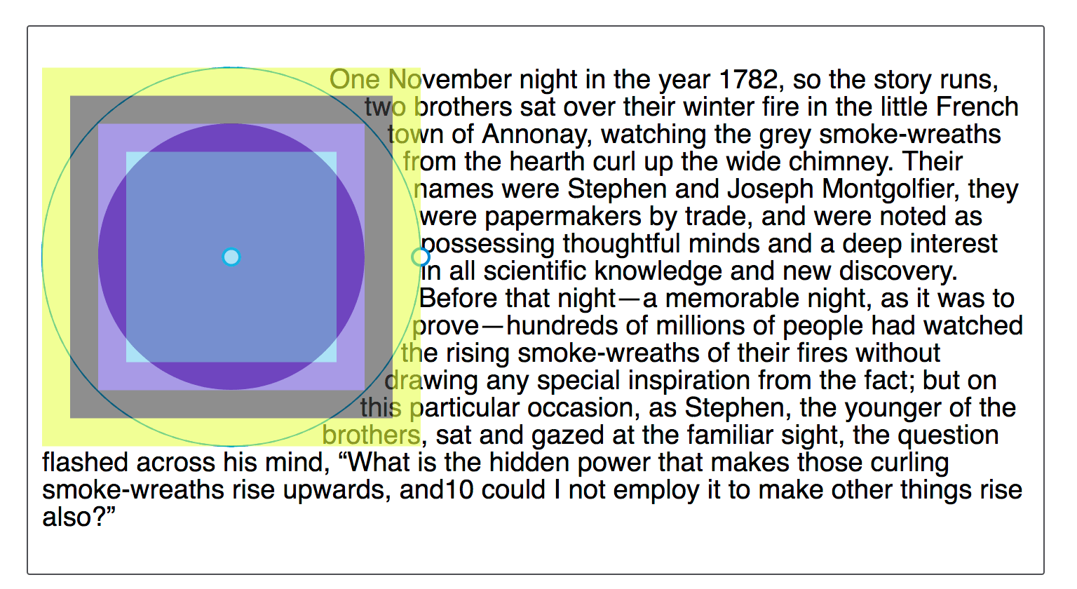
基本形狀的預設參考盒是 margin-box。你可以從截圖中看到,形狀是相對於盒模型的該部分定義的。
雖然預設的參考盒是 margin-box,但可以修改。要設定一個不同的盒作為參考盒,請在你的基本形狀定義之後加上所需的盒值。
這兩個宣告是相同的:
shape-outside: circle(50%);
shape-outside: circle(50%) margin-box;
要讓你的形狀使用不同的參考盒,請包含一個不同的 <box-edge> 值,例如,要使用邊框作為我們圓形的參考盒,請設定為:
.shape {
  shape-outside: circle(50%) border-box;
}
建立的形狀如果超出外邊距盒,將被裁剪到外邊距盒。下面的基本形狀演示了這一點。
inset()
inset() 函式定義一個矩形。這看起來可能不太有用,因為浮動一個專案而不使用形狀,也會在它周圍形成一個矩形。然而,inset() 型別允許定義偏移量,從而將環繞的文字拉到縮小後的矩形周圍,覆蓋在浮動元素的部分割槽域上。
inset() 函式最多接受四個邊偏移值,外加一個可選的 round 關鍵字,後跟一個 border-radius 值。下面的 CSS 建立了一個矩形形狀,它從浮動元素的參考盒向內偏移,上下各 20 畫素,左右各 10 畫素,並且 border-radius 值為 10 畫素。
.shape {
  float: left;
  shape-outside: inset(20px 10px 20px 10px round 10px);
}
偏移值的規則與 margin 簡寫相同。四個以空格分隔的值按順序定義上、右、下、左的偏移量。你也可以一次設定多個偏移量:
- 如果只有一個值,它將應用於所有邊。
- 如果有兩個值,則第一個值設定上下偏移,第二個值設定左右偏移。
- 如果有三個值,則第一個值設定上偏移,第二個值設定左右偏移,第三個值設定下偏移。
因此,上述規則也可以寫成:
.shape {
  float: left;
  shape-outside: inset(20px 10px round 10px);
}
在下面的示例中,我們使用一個 inset() 形狀將內容拉到浮動元素上。改變偏移值,看看形狀如何變化。
<div class="box">
  <div class="shape"></div>
  <p>
    One November night in the year 1782, so the story runs, two brothers sat
    over their winter fire in the little French town of Annonay, watching the
    grey smoke-wreaths from the hearth curl up the wide chimney. Their names
    were Stephen and Joseph Montgolfier, they were papermakers by trade, and
    were noted as possessing thoughtful minds and a deep interest in all
    scientific knowledge and new discovery. Before that night—a memorable night,
    as it was to prove—hundreds of millions of people had watched the rising
    smoke-wreaths of their fires without drawing any special inspiration from
    the fact.
  </p>
</div>
body {
  font: 1.2em sans-serif;
}

.shape {
  float: left;
  width: 150px;
  height: 100px;
  shape-outside: inset(20px 50px 10px 0 round 50px);
  background-color: rebeccapurple;
  border: 2px solid black;
  border-radius: 10px;
  margin: 20px;
  padding: 20px;
}
你還可以新增一個盒值作為備用參考盒。在下面的示例中,嘗試將參考盒從 margin-box 更改為 border-box、padding-box 或 content-box,看看在計算偏移量之前,作為起點的參考盒如何變化。
body {
font: 1.2em sans-serif;
}
.shape {
float: left;
width: 150px;
height: 100px;
shape-outside: inset(20px 50px 10px 0 round 50px) margin-box;
background-color: rebeccapurple;
border: 2px solid black;
border-radius: 10px;
margin: 20px;
padding: 20px;
}
你還可以使用 rect() 函式根據與參考盒上邊緣和左邊緣的距離來建立矩形,或者使用 xywh() 函式根據寬度和高度來建立矩形;這兩種函式都支援可選的圓角。
circle()
shape-outside 的 circle() 值可以接受兩個可能的引數:一個定義大小的 <shape-radius> 和一個定義其位置的 <position>。
circle() 和 ellipse() 的 shape-outside 值都接受 <shape-radius> 作為引數。這可以是一個 <length>、一個 <percentage>,或者關鍵字 closest-side 或 farthest-side 之一。
關鍵字 closest-side 使用從形狀中心到參考盒最近邊的長度來建立半徑長度。關鍵字 farthest-side 使用從形狀中心到參考盒最遠邊的長度。
第二個引數是 position,它接受一個或兩個關鍵字的 <position> 值,用於指示圓心的位置。其指定方式與 background-position 相同;如果省略一個或兩個值,則預設值為 center。
要建立一個圓形,我們包含一個半徑值,後面可以跟一個關鍵字 at 和一個位置值。這個例子將圓形應用於一個 width 和 height 為 210px、margin 為 20px 的 <img>。這使得參考盒的總寬度為 250px。<shape-radius> 的 50% 值意味著半徑為 125px。位置值設定為 30%,即距離左邊 30%,且垂直方向位於預設的 center。
<div class="box">
<img
alt="An orange hot air balloon as seen from below"
src="https://mdn.github.io/shared-assets/images/examples/round-balloon.png" />
<p>
One November night in the year 1782, so the story runs, two brothers sat
over their winter fire in the little French town of Annonay, watching the
grey smoke-wreaths from the hearth curl up the wide chimney. Their names
were Stephen and Joseph Montgolfier, they were papermakers by trade, and
were noted as possessing thoughtful minds and a deep interest in all
scientific knowledge and new discovery. Before that night—a memorable night,
as it was to prove—hundreds of millions of people had watched the rising
smoke-wreaths of their fires without drawing any special inspiration from
the fact.
</p>
</div>
body {
font: 1.2em sans-serif;
}
img {
float: left;
shape-outside: circle(50% at 30%);
margin: 20px;
}
透過改變半徑大小來增大或減小圓形,使用位置值移動圓形,或者像我們對 inset() 那樣設定一個參考盒來玩一下。
下面的示例將生成的內容與一個 circle() 函式結合起來,該函式使用關鍵字 top left 作為位置。這在頁面的左上角建立了一個四分之一圓的形狀,供文字環繞。
<div class="box">
<p>
One November night in the year 1782, so the story runs, two brothers sat
over their winter fire in the little French town of Annonay, watching the
grey smoke-wreaths from the hearth curl up the wide chimney. Their names
were Stephen and Joseph Montgolfier, they were papermakers by trade, and
were noted as possessing thoughtful minds and a deep interest in all
scientific knowledge and new discovery. Before that night—a memorable night,
as it was to prove—hundreds of millions of people had watched the rising
smoke-wreaths of their fires without drawing any special inspiration from
the fact.
</p>
</div>
body {
font: 1.2em sans-serif;
}
.box::before {
content: "";
float: left;
width: 250px;
height: 250px;
shape-outside: circle(50% at top left);
}
形狀將被外邊距盒裁剪
如上文參考盒部分所述,margin-box 會裁剪形狀。你可以透過將圓心位置設定為 60%,使其向內容方向移動來觀察到這一點。圓心將更靠近內容,圓形會延伸到 margin-box 之外。這意味著延伸的部分會被裁剪並變成方形。
img {
float: left;
shape-outside: circle(50% at 60%);
}

ellipse()
橢圓是一個被壓扁的圓。因此,ellipse() 函式的作用與 circle() 非常相似,只是我們必須按順序指定兩個半徑:x 和 y。
然後,這些半徑後面可以跟一個或兩個 <position> 值,就像 circle() 一樣,用來定義橢圓中心的位置。在下面的示例中,我們有一個 x 半徑為 40%、y 半徑為 50% 且 <position> 設定為 left 的橢圓。這意味著橢圓的中心位於參考盒左邊緣的中心。這建立了一個半橢圓形狀,文字將圍繞其環繞。你可以改變這些值,看看橢圓如何變化。
<div class="box">
  <div class="shape"></div>
  <p>
    One November night in the year 1782, so the story runs, two brothers sat
    over their winter fire in the little French town of Annonay, watching the
    grey smoke-wreaths from the hearth curl up the wide chimney. Their names
    were Stephen and Joseph Montgolfier, they were papermakers by trade, and
    were noted as possessing thoughtful minds and a deep interest in all
    scientific knowledge and new discovery. Before that night—a memorable night,
    as it was to prove—hundreds of millions of people had watched the rising
    smoke-wreaths of their fires without drawing any special inspiration from
    the fact.
  </p>
</div>
body {
  font: 1.2em sans-serif;
}
.shape {
  float: left;
  shape-outside: ellipse(40% 50% at left);
  margin: 20px;
  width: 100px;
  height: 200px;
}
關鍵字 closest-side 和 farthest-side 對於根據浮動元素參考盒的大小快速建立橢圓非常有用。
body {
  font: 1.2em sans-serif;
}

.shape {
  float: left;
  shape-outside: ellipse(closest-side farthest-side at 30%);
  margin: 20px;
  width: 100px;
  height: 140px;
}
polygon()
polygon() 函式更為複雜,能夠建立多邊形形狀。此形狀接受三對或更多對值(一個多邊形至少要畫一個三角形)。每對以空格分隔的值用逗號隔開,表示相對於參考盒繪製的單個頂點的座標。每對座標定義了多邊形的一條邊,最後一條邊由第一組和最後一組座標定義。
下面的示例使用 polygon() 函式建立了一個供文字跟隨的形狀。嘗試改變座標值,看看形狀如何變化。
body {
  font: 1.2em sans-serif;
}

.shape {
  float: left;
  shape-outside: polygon(
    0px 0px,
    0px 189px,
    100.48% 94.71%,
    200px 120px,
    80.67% 37.17%
  );
  width: 200px;
  height: 200px;
}
要建立更復雜的形狀,你可以使用 path() 或 shape() 函式來定義任何形狀的輪廓。
inset()、circle()、ellipse() 和 polygon() 都可以使用 Firefox 開發者工具的形狀檢查器進行檢查和編輯。下面的截圖顯示了在工具中高亮顯示的形狀。
另一個資源是 Clippy,這是一個用於建立形狀的工具,其中的示例使用了 CSS clip-path 屬性,該屬性使用的基本形狀函式和值與 shape-outside 屬性相同。