如何構建自定義表單控制元件
在某些情況下,可用的原生 HTML 表單控制元件可能看起來不夠用。例如,如果您需要對某些控制元件(例如 <select> 元素)執行高階樣式設定,或者您想要提供自定義行為,則可以考慮構建自己的控制元件。
在本文中,我們將討論如何構建自定義控制元件。為此,我們將以一個示例為例:重建 <select> 元素。我們還將討論何時以及是否構建自己的控制元件是有意義的,以及在構建控制元件成為必要條件時需要考慮哪些因素。
注意:我們將重點關注構建控制元件,而不是如何使程式碼通用和可重用;這將涉及一些非簡單的 JavaScript 程式碼和在未知上下文中進行的 DOM 操作,這超出了本文的範圍。
設計、結構和語義
在構建自定義控制元件之前,您應該首先確定自己想要什麼。這將為您節省寶貴的時間。特別是,清楚地定義控制元件的所有狀態非常重要。為此,最好從一個狀態和行為眾所周知的現有控制元件開始,以便您可以儘可能地模仿它們。
在我們的示例中,我們將重建 <select> 元素。以下是我們想要達到的效果
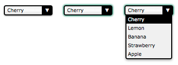
此螢幕截圖顯示了我們控制元件的三個主要狀態:正常狀態(左側);活動狀態(中間)和開啟狀態(右側)。
在行為方面,我們正在重新建立原生 HTML 元素。因此,它應該具有與原生 HTML 元素相同的行為和語義。我們要求我們的控制元件既可以使用滑鼠也可以使用鍵盤,並且像任何原生控制元件一樣,螢幕閱讀器可以理解它。讓我們從定義控制元件如何到達每個狀態開始
控制元件處於其正常狀態時
- 頁面載入。
- 控制元件處於活動狀態,使用者點選了控制元件外部的任何位置。
- 控制元件處於活動狀態,使用者使用鍵盤(例如 Tab 鍵)將焦點移動到另一個控制元件。
控制元件處於其活動狀態時
- 使用者點選它或在觸控式螢幕上觸控它。
- 使用者按下 Tab 鍵並獲得焦點。
- 控制元件處於其開啟狀態,使用者點選它。
控制元件處於其開啟狀態時
- 控制元件處於除開啟狀態以外的任何狀態,並且使用者點選它。
一旦我們知道如何更改狀態,定義如何更改控制元件的值就非常重要
值在以下情況下更改
- 使用者在控制元件處於開啟狀態時點選選項。
- 使用者在控制元件處於活動狀態時按下向上或向下箭頭鍵。
值在以下情況下不會更改
- 使用者在選中第一個選項時按下向上箭頭鍵。
- 使用者在選中最後一個選項時按下向下箭頭鍵。
最後,讓我們定義控制元件的選項將如何執行
- 當控制元件開啟時,選定的選項會被突出顯示
- 當滑鼠懸停在選項上時,該選項會被突出顯示,先前突出顯示的選項將恢復到其正常狀態
出於我們示例的目的,我們將就此停止;但是,如果您是一位細心的讀者,您會注意到缺少一些行為。例如,您認為如果使用者在控制元件處於開啟狀態時按下 Tab 鍵會發生什麼?答案是什麼也不會發生。好的,正確的行為似乎很明顯,但事實是,由於它在我們規範中沒有定義,因此很容易忽略這種行為。在團隊環境中尤其如此,因為設計控制元件行為的人員與實施控制元件的人員不同。
另一個有趣的例子:如果使用者在控制元件處於開啟狀態時按下向上或向下箭頭鍵會發生什麼?這有點棘手。如果您認為活動狀態和開啟狀態完全不同,則答案再次是“什麼也不會發生”,因為我們沒有為開啟狀態定義任何鍵盤互動。另一方面,如果您認為活動狀態和開啟狀態有一點重疊,則值可能會更改,但選項肯定不會相應地突出顯示,這再次是因為我們沒有在控制元件處於開啟狀態時定義任何鍵盤與選項的互動(我們只定義了控制元件開啟時應該發生什麼,但之後什麼也沒有)。
我們必須進一步思考:Esc 鍵怎麼樣?按下 Esc 鍵關閉開啟的 select。請記住,如果您想提供與現有原生 <select> 相同的功能,它應該對所有使用者(從鍵盤到滑鼠到觸控到螢幕閱讀器,以及任何其他輸入裝置)的行為與 select 完全相同。
在我們的示例中,缺少的規範很明顯,因此我們將處理它們,但這對於奇特的全新控制元件來說可能是一個真正的問題。當涉及到 <select> 這樣的標準化元素時,規範作者花費了大量時間來指定每個用例中每個輸入裝置的所有互動。建立新控制元件並非易事,尤其是在您建立以前從未做過的事情時,因此沒有人知道預期的行為和互動是什麼。至少 select 以前做過,所以我們知道它應該如何執行!
設計新的互動通常只適用於擁有足夠影響力的非常大型的行業參與者,他們建立的互動可以成為標準。例如,蘋果公司於 2001 年在 iPod 中引入了滾輪。他們擁有市場份額,可以成功地引入一種全新的裝置互動方式,這是大多數裝置公司無法做到的。
最好不要發明新的使用者互動。對於您新增的任何互動,在設計階段花費時間至關重要;如果您對行為定義不佳,或忘記定義某個行為,一旦使用者習慣了該行為,就很難重新定義它。如果您有疑問,請徵求他人的意見,如果您有預算,請不要猶豫執行使用者測試。此過程稱為 UX 設計。如果您想了解有關此主題的更多資訊,則應檢視以下有用的資源
定義 HTML 結構和(一些)語義
現在控制元件的基本功能已確定,是時候開始構建它了。第一步是定義其 HTML 結構並賦予其一些基本語義。以下是重建 <select> 元素所需的內容
<!-- This is our main container for our control.
     The tabindex attribute is what allows the user to focus on the control.
     We'll see later that it's better to set it through JavaScript. -->
<div class="select" tabindex="0">
  <!-- This container will be used to display the current value of the control -->
  <span class="value">Cherry</span>

  <!-- This container will contain all the options available for our control.
       Because it's a list, it makes sense to use the ul element. -->
  <ul class="optList">
    <!-- Each option only contains the value to be displayed, we'll see later
         how to handle the real value that will be sent with the form data -->
    <li class="option">Cherry</li>
    <li class="option">Lemon</li>
    <li class="option">Banana</li>
    <li class="option">Strawberry</li>
    <li class="option">Apple</li>
  </ul>
</div>
請注意類名的使用;這些標識每個相關部分,而不管使用的實際底層 HTML 元素是什麼。這對於確保我們不會將 CSS 和 JavaScript 繫結到強 HTML 結構非常重要,以便我們以後可以進行實現更改而不會破壞使用該控制元件的程式碼。例如,如果您希望稍後實現 <optgroup> 元素的等效項怎麼辦?
但是,類名不提供任何語義值。在此當前狀態下,螢幕閱讀器使用者只能“看到”一個無序列表。我們稍後將新增 ARIA 語義。
使用 CSS 建立外觀和感覺
現在我們有了結構,我們可以開始設計我們的控制元件了。構建此自定義控制元件的全部意義在於能夠完全按照我們想要的方式對其進行樣式設定。為此,我們將 CSS 工作分成兩部分:第一部分將是使控制元件像 <select> 元素一樣執行所需的 CSS 規則,第二部分將包含用於使其看起來像我們想要的樣子花哨的樣式。
必需樣式
必需樣式是處理控制元件的三種狀態所需的樣式。
.select {
  /* This will create a positioning context for the list of options;
     adding this to `.select:focus-within` will be a better option when fully supported
  */
  position: relative;

  /* This will make our control become part of the text flow and sizable at the same time */
  display: inline-block;
}
我們需要一個額外的類 active 來定義控制元件在其活動狀態下的外觀和感覺。因為我們的控制元件是可聚焦的,所以我們使用 :focus 偽類將此自定義樣式加倍,以確保它們的行為相同。
.select.active,
.select:focus {
  outline-color: transparent;

  /* This box-shadow property is not exactly required, however it's imperative to ensure
     active state is visible, especially to keyboard users, that we use it as a default value. */
  box-shadow: 0 0 3px 1px #227755;
}
現在,讓我們處理選項列表
/* The .select selector here helps to make sure we only select
   element inside our control. */
.select .optList {
  /* This will make sure our list of options will be displayed below the value
     and out of the HTML flow */
  position: absolute;
  top: 100%;
  left: 0;
}
我們需要一個額外的類來處理選項列表隱藏時的狀態。這對於管理活動狀態和開啟狀態之間的差異(它們並不完全匹配)是必要的。
.select .optList.hidden {
  /* This is a simple way to hide the list in an accessible way;
     we will talk more about accessibility in the end */
  max-height: 0;
  visibility: hidden;
}
注意:我們還可以使用 transform: scale(1, 0) 使選項列表沒有高度和全寬。
美化
所以現在我們有了基本的功能,樂趣就可以開始了。以下是可能的示例,並將與本文開頭的螢幕截圖匹配。但是,您應該隨時嘗試並檢視您可以想出什麼。
.select {
  /* The computations are made assuming 1em equals 16px which is the default value in most browsers.
     If you are lost with px to em conversion, try https://nekocalc.com/px-to-em-converter */
  font-size: 0.625em; /* this (10px) is the new font size context for em value in this context */
  font-family: Verdana, Arial, sans-serif;

  box-sizing: border-box;

  /* We need extra room for the down arrow we will add */
  padding: 0.1em 2.5em 0.2em 0.5em;
  width: 10em; /* 100px */

  border: 0.2em solid #000;
  border-radius: 0.4em;
  box-shadow: 0 0.1em 0.2em rgb(0 0 0 / 45%);

  /* The first declaration is for browsers that do not support linear gradients. */
  background: #f0f0f0;
  background: linear-gradient(0deg, #e3e3e3, #fcfcfc 50%, #f0f0f0);
}

.select .value {
  /* Because the value can be wider than our control, we have to make sure it will not
     change the control's width. If the content overflows, we display an ellipsis */
  display: inline-block;
  width: 100%;
  overflow: hidden;
  white-space: nowrap;
  text-overflow: ellipsis;
  vertical-align: top;
}
我們不需要額外的元素來設計向下箭頭;相反,我們使用 ::after 偽元素。它也可以使用 select 類上的簡單背景影像來實現。
.select::after {
  content: "▼"; /* We use the unicode character U+25BC; make sure to set a charset meta tag */
  position: absolute;
  z-index: 1; /* This will be important to keep the arrow from overlapping the list of options */
  top: 0;
  right: 0;

  box-sizing: border-box;

  height: 100%;
  width: 2em;
  padding-top: 0.1em;

  border-left: 0.2em solid #000;
  border-radius: 0 0.1em 0.1em 0;

  background-color: #000;
  color: #fff;
  text-align: center;
}
接下來,讓我們為選項列表設定樣式
.select .optList {
  z-index: 2; /* We explicitly said the list of options will always be on top of the down arrow */

  /* this will reset the default style of the ul element */
  list-style: none;
  margin: 0;
  padding: 0;

  box-sizing: border-box;

  /* If the values are smaller than the control, the list of options
     will be as wide as the control itself */
  min-width: 100%;

  /* In case the list is too long, its content will overflow vertically
     (which will add a vertical scrollbar automatically) but never horizontally
     (because we haven't set a width, the list will adjust its width automatically.
     If it can't, the content will be truncated) */
  max-height: 10em; /* 100px */
  overflow-y: auto;
  overflow-x: hidden;

  border: 0.2em solid #000;
  border-top-width: 0.1em;
  border-radius: 0 0 0.4em 0.4em;

  box-shadow: 0 0.2em 0.4em rgb(0 0 0 / 40%);
  background: #f0f0f0;
}
對於選項,我們需要新增一個 highlight 類才能識別使用者將選擇的(或已選擇的)值。
.select .option {
  padding: 0.2em 0.3em; /* 2px 3px */
}

.select .highlight {
  background: #000;
  color: #ffffff;
}
因此,以下是我們三種狀態的結果(在此處檢視原始碼)
基本狀態
活動狀態
開啟狀態
使用 JavaScript 使您的控制元件栩栩如生
現在我們的設計和結構已準備就緒,我們可以編寫 JavaScript 程式碼以使控制元件真正起作用。
警告:以下是教育程式碼,而不是生產程式碼,不應按原樣使用。它既不是面向未來的,也不會在舊版瀏覽器上執行。它還包含在生產程式碼中應最佳化的冗餘部分。
為什麼不起作用?
在開始之前,務必記住**瀏覽器中的 JavaScript 是一種不可靠的技術**。自定義控制元件依靠 JavaScript 將所有內容聯絡在一起。但是,在某些情況下,JavaScript 無法在瀏覽器中執行
- 使用者已關閉 JavaScript:這很少見;如今很少有人關閉 JavaScript。
- 指令碼未載入:這是最常見的情況之一,尤其是在網路不太可靠的移動領域。
- 指令碼有錯誤:您應該始終考慮這種可能性。
- 指令碼與第三方指令碼衝突:這可能發生在跟蹤指令碼或使用者使用的任何書籤中。
- 指令碼與瀏覽器擴充套件衝突或受其影響(例如 Firefox 的 NoScript 擴充套件或 Chrome 的 ScriptBlock 擴充套件)。
- 使用者正在使用舊版瀏覽器,並且您需要的功能之一不受支援:當您使用尖端 API 時,這種情況經常會發生。
- 使用者在 JavaScript 完全下載、解析和執行之前與內容進行互動。
由於存在這些風險,認真考慮 JavaScript 不起作用時會發生什麼非常重要。我們將討論需要考慮的選項並在我們的示例中介紹基礎知識(針對所有場景解決此問題的全面討論需要一本書)。請記住,使您的指令碼通用和可重用至關重要。
在我們的示例中,如果 JavaScript 程式碼沒有執行,我們將回退到顯示標準的 <select> 元素。我們包含了我們的自定義控制元件和 <select>;哪個元素顯示取決於 body 元素的類,body 元素的類由使控制元件起作用的指令碼在成功載入時更新。
為了實現這一點,我們需要兩件事
首先,我們需要在自定義控制元件的每個例項之前新增一個常規的 <select> 元素。即使我們的 JavaScript 按預期工作,擁有這個“額外”的 select 也有好處:我們將使用此 select 將來自自定義控制元件的資料與表單的其他資料一起傳送。我們將在後面更詳細地討論這一點。
<body class="no-widget">
<form>
<select name="myFruit">
<option>Cherry</option>
<option>Lemon</option>
<option>Banana</option>
<option>Strawberry</option>
<option>Apple</option>
</select>
<div class="select">
  <span class="value">Cherry</span>
  <ul class="optList hidden">
    <li class="option">Cherry</li>
    <li class="option">Lemon</li>
    <li class="option">Banana</li>
    <li class="option">Strawberry</li>
    <li class="option">Apple</li>
  </ul>
</div>
</form>
</body>
其次,我們需要兩個新類來讓我們隱藏不需要的元素:如果我們的指令碼沒有執行,則視覺上隱藏自定義控制元件,或者如果指令碼正在執行,則隱藏“真實”的 <select> 元素。請注意,預設情況下,我們的 HTML 程式碼會隱藏我們的自定義控制元件。
.widget select,
.no-widget .select {
  /* This CSS selector basically says:
     - either we have set the body class to "widget" and thus we hide the actual <select> element
     - or we have not changed the body class, therefore the body class is still "no-widget",
       so the elements whose class is "select" must be hidden */
  position: absolute;
  left: -5000em;
  height: 0;
  overflow: hidden;
}
此 CSS 視覺上隱藏了其中一個元素,但它仍然可供螢幕閱讀器使用。
現在我們需要一個 JavaScript 開關來確定指令碼是否正在執行。此開關只有幾行:如果在頁面載入時我們的指令碼正在執行,它將刪除 no-widget 類並新增 widget 類,從而交換 <select> 元素和自定義控制元件的可見性。
window.addEventListener("load", () => {
  document.body.classList.remove("no-widget");
  document.body.classList.add("widget");
});
無 JS
檢視 完整原始碼。
有 JS
檢視 完整原始碼。
簡化工作
在我們即將構建的程式碼中,我們將使用標準的 JavaScript 和 DOM API 來完成我們需要的所有工作。我們計劃使用的功能如下
構建事件回撥
基礎工作已經完成。我們現在可以開始定義每次使用者與我們的控制元件互動時將使用的所有函式。
// This function will be used each time we want to deactivate a custom control
// It takes one parameter
// select : the DOM node with the `select` class to deactivate
function deactivateSelect(select) {
  // If the control is not active there is nothing to do
  if (!select.classList.contains("active")) return;

  // We need to get the list of options for the custom control
  const optList = select.querySelector(".optList");

  // We close the list of option
  optList.classList.add("hidden");

  // and we deactivate the custom control itself
  select.classList.remove("active");
}

// This function will be used each time the user wants to activate the control
// (which, in turn, will deactivate other select controls)
// It takes two parameters:
// select : the DOM node with the `select` class to activate
// selectList : the list of all the DOM nodes with the `select` class
function activeSelect(select, selectList) {
  // If the control is already active there is nothing to do
  if (select.classList.contains("active")) return;

  // We have to turn off the active state on all custom controls
  // Because the deactivateSelect function fulfills all the requirements of the
  // forEach callback function, we use it directly without using an intermediate
  // anonymous function.
  selectList.forEach(deactivateSelect);

  // And we turn on the active state for this specific control
  select.classList.add("active");
}

// This function will be used each time the user wants to open/closed the list of options
// It takes one parameter:
// select : the DOM node with the list to toggle
function toggleOptList(select) {
  // The list is kept from the control
  const optList = select.querySelector(".optList");

  // We change the class of the list to show/hide it
  optList.classList.toggle("hidden");
}

// This function will be used each time we need to highlight an option
// It takes two parameters:
// select : the DOM node with the `select` class containing the option to highlight
// option : the DOM node with the `option` class to highlight
function highlightOption(select, option) {
  // We get the list of all option available for our custom select element
  const optionList = select.querySelectorAll(".option");

  // We remove the highlight from all options
  optionList.forEach((other) => {
    other.classList.remove("highlight");
  });

  // We highlight the right option
  option.classList.add("highlight");
}
您需要這些來處理自定義控制元件的各種狀態。
接下來,我們將這些函式繫結到相應的事件
// We handle the event binding when the document is loaded.
window.addEventListener("load", () => {
  const selectList = document.querySelectorAll(".select");

  // Each custom control needs to be initialized
  selectList.forEach((select) => {
    // as well as all its `option` elements
    const optionList = select.querySelectorAll(".option");

    // Each time a user hovers their mouse over an option, we highlight the given option
    optionList.forEach((option) => {
      option.addEventListener("mouseover", () => {
        // Note: the `select` and `option` variable are closures
        // available in the scope of our function call.
        highlightOption(select, option);
      });
    });

    // Each times the user clicks on or taps a custom select element
    select.addEventListener("click", (event) => {
      // Note: the `select` variable is a closure
      // available in the scope of our function call.

      // We toggle the visibility of the list of options
      toggleOptList(select);
    });

    // In case the control gains focus
    // The control gains the focus each time the user clicks on it or each time
    // they use the tabulation key to access the control
    select.addEventListener("focus", (event) => {
      // Note: the `select` and `selectList` variable are closures
      // available in the scope of our function call.

      // We activate the control
      activeSelect(select, selectList);
    });

    // In case the control loses focus
    select.addEventListener("blur", (event) => {
      // Note: the `select` variable is a closure
      // available in the scope of our function call.

      // We deactivate the control
      deactivateSelect(select);
    });

    // Loose focus if the user hits `esc`
    select.addEventListener("keyup", (event) => {
      // deactivate on keyup of `esc`
      if (event.key === "Escape") {
        deactivateSelect(select);
      }
    });
  });
});
此時,我們的控制元件將根據我們的設計更改狀態,但其值尚未更新。我們將在下一步處理這個問題。
即時示例
檢視 完整原始碼。
處理控制元件的值
現在我們的控制元件正在工作,我們必須新增程式碼來根據使用者輸入更新其值,並使其能夠將值與表單資料一起傳送。
最簡單的方法是在幕後使用原生控制元件。這樣的控制元件將使用瀏覽器提供的所有內建控制元件跟蹤值,並且在提交表單時,該值將照常傳送。當我們可以讓所有這些都為我們完成時,沒有必要重新發明輪子。
如前所述,我們已經使用原生 select 控制元件作為輔助功能的回退;我們可以將其值與自定義控制元件的值同步
// This function updates the displayed value and synchronizes it with the native control.
// It takes two parameters:
// select : the DOM node with the class `select` containing the value to update
// index  : the index of the value to be selected
function updateValue(select, index) {
  // We need to get the native control for the given custom control
  // In our example, that native control is a sibling of the custom control
  const nativeWidget = select.previousElementSibling;

  // We also need to get the value placeholder of our custom control
  const value = select.querySelector(".value");

  // And we need the whole list of options
  const optionList = select.querySelectorAll(".option");

  // We set the selected index to the index of our choice
  nativeWidget.selectedIndex = index;

  // We update the value placeholder accordingly
  value.textContent = optionList[index].textContent;

  // And we highlight the corresponding option of our custom control
  highlightOption(select, optionList[index]);
}

// This function returns the current selected index in the native control
// It takes one parameter:
// select : the DOM node with the class `select` related to the native control
function getIndex(select) {
  // We need to access the native control for the given custom control
  // In our example, that native control is a sibling of the custom control
  const nativeWidget = select.previousElementSibling;

  return nativeWidget.selectedIndex;
}
使用這兩個函式,我們可以將原生控制元件繫結到自定義控制元件
// We handle event binding when the document is loaded.
window.addEventListener("load", () => {
  const selectList = document.querySelectorAll(".select");

  // Each custom control needs to be initialized
  selectList.forEach((select) => {
    const optionList = select.querySelectorAll(".option");
    const selectedIndex = getIndex(select);

    // We make our custom control focusable
    select.tabIndex = 0;

    // We make the native control no longer focusable
    select.previousElementSibling.tabIndex = -1;

    // We make sure that the default selected value is correctly displayed
    updateValue(select, selectedIndex);

    // Each time a user clicks on an option, we update the value accordingly
    optionList.forEach((option, index) => {
      option.addEventListener("click", (event) => {
        updateValue(select, index);
      });
    });

    // Each time a user uses their keyboard on a focused control, we update the value accordingly
    select.addEventListener("keyup", (event) => {
      let index = getIndex(select);
      // When the user hits the Escape key, deactivate the custom control
      if (event.key === "Escape") {
        deactivateSelect(select);
      }

      // When the user hits the down arrow, we jump to the next option
      if (event.key === "ArrowDown" && index < optionList.length - 1) {
        index++;
        // Prevent the default action of the ArrowDown key press.
        // Without this, the page would scroll down when the ArrowDown key is pressed.
        event.preventDefault();
      }

      // When the user hits the up arrow, we jump to the previous option
      if (event.key === "ArrowUp" && index > 0) {
        index--;
        // Prevent the default action of the ArrowUp key press.
        event.preventDefault();
      }
      if (event.key === "Enter" || event.key === " ") {
        // If Enter or Space is pressed, toggle the option list
        toggleOptList(select);
      }

      updateValue(select, index);
    });
  });
});
在上面的程式碼中,值得注意的是 tabIndex 屬性的使用。使用此屬性是必要的,以確保原生控制元件永遠不會獲得焦點,並確保當用戶使用鍵盤或滑鼠時,我們的自定義控制元件獲得焦點。
這樣,我們就完成了!
即時示例
檢視 此處原始碼。
但是等一下,我們真的完成了麼?
使其可訪問
我們構建了一些可以工作的東西,儘管我們距離一個功能齊全的 select 框還很遠,但它執行良好。但我們所做的只不過是修改 DOM。它沒有真正的語義,即使它看起來像一個 select 框,但在瀏覽器的角度來看,它並不是一個,因此輔助技術將無法理解它是一個 select 框。簡而言之,這個漂亮的新 select 框是不可訪問的!
幸運的是,有一個解決方案,它被稱為 ARIA。ARIA 代表“可訪問的富網際網路應用程式”,它是 W3C 規範,專門為我們在這裡做的事情而設計:使 Web 應用程式和自定義控制元件可訪問。它基本上是一組擴充套件 HTML 的屬性,以便我們可以更好地描述角色、狀態和屬性,就好像我們剛剛設計出的元素是它試圖傳遞的原生元素一樣。可以透過編輯 HTML 標記來使用這些屬性。我們還透過 JavaScript 更新 ARIA 屬性,因為使用者更新了他們的所選值。
role 屬性
ARIA 使用的關鍵屬性是 role 屬性。role 屬性接受一個值來定義元素的使用目的。每個角色都定義了自己的要求和行為。在我們的示例中,我們將使用 listbox 角色。它是一個“複合角色”,這意味著具有該角色的元素期望具有子元素,每個子元素都具有特定角色(在本例中,至少一個具有 option 角色的子元素)。
同樣值得注意的是,ARIA 定義了預設應用於標準 HTML 標記的角色。例如,<table> 元素匹配角色 grid,而 <ul> 元素匹配角色 list。因為我們使用了一個 <ul> 元素,所以我們要確保控制元件的 listbox 角色將取代 <ul> 元素的 list 角色。為此,我們將使用角色 presentation。此角色旨在讓我們指示元素沒有任何特殊含義,僅用於呈現資訊。我們將將其應用於我們的 <ul> 元素。
要支援 listbox 角色,我們只需像這樣更新我們的 HTML
<!-- We add the role="listbox" attribute to our top element -->
<div class="select" role="listbox">
  <span class="value">Cherry</span>
  <!-- We also add the role="presentation" to the ul element -->
  <ul class="optList" role="presentation">
    <!-- And we add the role="option" attribute to all the li elements -->
    <li role="option" class="option">Cherry</li>
    <li role="option" class="option">Lemon</li>
    <li role="option" class="option">Banana</li>
    <li role="option" class="option">Strawberry</li>
    <li role="option" class="option">Apple</li>
  </ul>
</div>
注意:包含 role 屬性和 class 屬性都是沒有必要的。不要使用 .option,而是在 CSS 中使用 [role="option"] 屬性選擇器。
aria-selected 屬性
僅使用 role 屬性是不夠的。ARIA 還提供了許多狀態和屬性屬性。您使用它們越多越好,輔助技術就越能更好地理解您的控制元件。在我們的例子中,我們將使用限制為一個屬性:aria-selected。
aria-selected 屬性用於標記當前選中的選項;這使輔助技術能夠告知使用者當前的選擇是什麼。我們將在 JavaScript 中動態使用它,以便在使用者每次選擇一個選項時標記所選選項。為此,我們需要修改 updateValue() 函式
function updateValue(select, index) {
  const nativeWidget = select.previousElementSibling;
  const value = select.querySelector(".value");
  const optionList = select.querySelectorAll('[role="option"]');

  // We make sure that all the options are not selected
  optionList.forEach((other) => {
    other.setAttribute("aria-selected", "false");
  });

  // We make sure the chosen option is selected
  optionList[index].setAttribute("aria-selected", "true");

  nativeWidget.selectedIndex = index;
  value.textContent = optionList[index].textContent;
  highlightOption(select, optionList[index]);
}
讓螢幕閱讀器聚焦在螢幕外的 select 上並忽略我們風格化的 select 似乎更簡單,但這並不是一個可訪問的解決方案。螢幕閱讀器不僅限於盲人;視力低下的人甚至視力完美的人也使用它們。因此,您不能讓螢幕閱讀器聚焦在螢幕外的元素上。
以下是所有這些更改的最終結果(透過使用輔助技術(如 NVDA 或 VoiceOver)進行嘗試,您將對此有更好的瞭解)。
即時示例
檢視 此處完整原始碼。
如果您想繼續前進,此示例中的程式碼在變得通用且可重用之前需要一些改進。這是一個您可以嘗試執行的練習。兩個提示可以幫助您:所有函式的第一個引數都是相同的,這意味著這些函式需要相同的上下文。構建一個物件來共享該上下文將是明智之舉。
另一種方法:使用單選按鈕
在上面的示例中,我們使用非語義 HTML、CSS 和 JavaScript 重新發明了一個 <select> 元素。此 select 從有限數量的選項中選擇一個選項,這與一組同名 radio 按鈕的功能相同。
因此,我們可以使用 radio 按鈕重新發明它;讓我們看看這個選項。
我們可以從一個完全語義化、可訪問的、無序的 radio 按鈕列表開始,該列表與關聯的 <label> 結合使用,並使用語義上合適的 <fieldset> 和 <legend> 對標記整個組。
<fieldset>
  <legend>Pick a fruit</legend>
  <ul class="styledSelect">
    <li>
      <input
        type="radio"
        name="fruit"
        value="Cherry"
        id="fruitCherry"
        checked />
      <label for="fruitCherry">Cherry</label>
    </li>
    <li>
      <input type="radio" name="fruit" value="Lemon" id="fruitLemon" />
      <label for="fruitLemon">Lemon</label>
    </li>
    <li>
      <input type="radio" name="fruit" value="Banana" id="fruitBanana" />
      <label for="fruitBanana">Banana</label>
    </li>
    <li>
      <input
        type="radio"
        name="fruit"
        value="Strawberry"
        id="fruitStrawberry" />
      <label for="fruitStrawberry">Strawberry</label>
    </li>
    <li>
      <input type="radio" name="fruit" value="Apple" id="fruitApple" />
      <label for="fruitApple">Apple</label>
    </li>
  </ul>
</fieldset>
我們將對 radio 按鈕列表(而不是 legend/fieldset)進行一些樣式設定,使其看起來有點像前面的示例,只是為了表明可以做到這一點
.styledSelect {
  display: inline-block;
  padding: 0;
}
.styledSelect li {
  list-style-type: none;
  padding: 0;
  display: flex;
}
.styledSelect [type="radio"] {
  position: absolute;
  left: -100vw;
  top: -100vh;
}
.styledSelect label {
  margin: 0;
  line-height: 2;
  padding: 0 0 0 4px;
}
.styledSelect:not(:focus-within) input:not(:checked) + label {
  height: 0;
  outline-color: transparent;
  overflow: hidden;
}
.styledSelect:not(:focus-within) input:checked + label {
  border: 0.2em solid #000;
  border-radius: 0.4em;
  box-shadow: 0 0.1em 0.2em rgb(0 0 0 / 45%);
}
.styledSelect:not(:focus-within) input:checked + label::after {
  content: "▼";
  background: black;
  float: right;
  color: white;
  padding: 0 4px;
  margin: 0 -4px 0 4px;
}
.styledSelect:focus-within {
  border: 0.2em solid #000;
  border-radius: 0.4em;
  box-shadow: 0 0.1em 0.2em rgb(0 0 0 / 45%);
}
.styledSelect:focus-within input:checked + label {
  background-color: #333;
  color: #fff;
  width: 100%;
}
無需 JavaScript,只需一點 CSS,我們就可以設定 radio 按鈕列表的樣式,使其僅顯示選中的專案。當焦點在 <fieldset> 中的 <ul> 內時,列表會展開,向上和向下(以及向左和向右)箭頭可以用來選擇前一項和下一項。試試看
在某種程度上,這在沒有 JavaScript 的情況下也能工作。我們建立了一個與自定義控制元件類似的控制元件,即使 JavaScript 失敗也能工作。看起來像一個很棒的解決方案,對吧?好吧,不是 100%。它確實可以與鍵盤一起使用,但滑鼠點選的效果並不如預期。依靠 Web 標準作為自定義控制元件的基礎,而不是依賴框架來建立沒有原生語義的元素,可能更有意義。但是,我們的控制元件沒有 <select> 本身具有的相同功能。
從好的方面來說,此控制元件對螢幕閱讀器完全可訪問,並且可以透過鍵盤完全導航。但是,此控制元件不是 <select> 的替代品。存在不同和/或缺少的功能。例如,所有四個箭頭都在選項中導航,但是當用戶位於最後一個按鈕上時點擊向下箭頭會將他們帶到第一個按鈕;它不會像 <select> 一樣停止在選項列表的頂部和底部。
我們將新增此缺失功能作為讀者練習留給讀者。
結論
我們已經瞭解了構建自定義表單控制元件的基本知識,但正如你所看到的,這並非易事。在建立自己的自定義控制元件之前,請考慮 HTML 是否提供了可用於充分滿足您需求的替代元素。如果您確實需要建立自定義控制元件,通常依靠第三方庫比自己構建更容易。但是,如果您確實要建立自己的控制元件、修改現有元素或使用框架來實現預製控制元件,請記住,建立可用且可訪問的表單控制元件比看起來要複雜得多。
以下是一些您在編寫自己的程式碼之前應該考慮的庫
如果您確實透過單選按鈕、您自己的 JavaScript 或第三方庫建立了替代控制元件,請確保它是可訪問的且功能完善的;也就是說,它需要能夠更好地與各種瀏覽器配合使用,這些瀏覽器與它們使用的 Web 標準的相容性各不相同。玩得開心!
另請參閱
學習路徑
高階主題
- 透過 JavaScript 傳送表單
- 如何構建自定義表單控制元件
- 舊版瀏覽器中的 HTML 表單
- HTML 表單的高階樣式
- 表單控制元件的屬性相容性表