使用 CSS 樣式化 Vue 元件
終於到了讓我們的應用看起來更漂亮的時候了。在本文中,我們將探討使用 CSS 對 Vue 元件進行樣式設定的不同方法。
| 先決條件 |
熟悉核心 HTML、CSS 和 JavaScript 語言,瞭解 終端/命令列。 Vue 元件以 JavaScript 物件的組合形式編寫,這些物件管理應用程式的資料,以及一個基於 HTML 的模板語法,該語法對映到底層 DOM 結構。對於安裝,以及使用 Vue 的一些更高階功能(如單檔案元件或渲染函式),您需要一個安裝了 node + npm 的終端。 |
|---|---|
| 目標 | 瞭解如何對 Vue 元件進行樣式設定。 |
使用 CSS 樣式化 Vue 元件
在我們繼續為我們的應用新增更多高階功能之前,我們應該新增一些基本的 CSS 來讓它看起來更好。Vue 有三種常見的應用程式樣式方法
- 外部 CSS 檔案。
- 單檔案元件(
.vue檔案)中的全域性樣式。 - 單檔案元件中的元件範圍樣式。
為了幫助您熟悉每個方法,我們將結合使用這三種方法來使我們的應用程式擁有更美觀的外觀和感覺。
使用外部 CSS 檔案樣式化
您可以包含外部 CSS 檔案,並將其全域性應用於您的應用程式。讓我們看看如何做到這一點。
首先,在 src/assets 目錄中建立一個名為 reset.css 的檔案。此資料夾中的檔案由 Webpack 處理。這意味著我們可以使用 CSS 預處理器(如 SCSS)或後處理器(如 PostCSS)。
雖然本教程不會使用這些工具,但您應該知道,在將此類程式碼包含在 assets 資料夾中時,它將自動處理。
將以下內容新增到 reset.css 檔案中
/*reset.css*/
/* RESETS */
*,
*::before,
*::after {
  box-sizing: border-box;
}
*:focus {
  outline: 3px dashed #228bec;
}
html {
  font: 62.5% / 1.15 sans-serif;
}
h1,
h2 {
  margin-bottom: 0;
}
ul {
  list-style: none;
  padding: 0;
}
button {
  border: none;
  margin: 0;
  padding: 0;
  width: auto;
  overflow: visible;
  background: transparent;
  color: inherit;
  font: inherit;
  line-height: normal;
  -webkit-font-smoothing: inherit;
  -moz-osx-font-smoothing: inherit;
  appearance: none;
}
button::-moz-focus-inner {
  border: 0;
}
button,
input,
optgroup,
select,
textarea {
  font-family: inherit;
  font-size: 100%;
  line-height: 1.15;
  margin: 0;
}
button,
input {
  /* 1 */
  overflow: visible;
}
input[type="text"] {
  border-radius: 0;
}
body {
  width: 100%;
  max-width: 68rem;
  margin: 0 auto;
  font:
    1.6rem/1.25 "Helvetica Neue",
    Helvetica,
    Arial,
    sans-serif;
  background-color: #f5f5f5;
  color: #4d4d4d;
  -moz-osx-font-smoothing: grayscale;
  -webkit-font-smoothing: antialiased;
}
@media screen and (min-width: 620px) {
  body {
    font-size: 1.9rem;
    line-height: 1.31579;
  }
}
/*END RESETS*/
接下來,在 src/main.js 檔案中,像這樣匯入 reset.css 檔案
import "./assets/reset.css";
這將導致該檔案在構建步驟中被拾取,並自動新增到我們的站點。
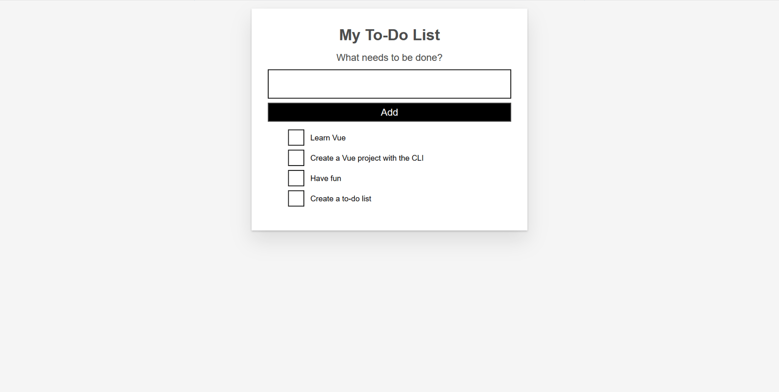
現在應將重置樣式應用於應用程式。以下圖片顯示了應用程式在應用重置之前和之後的外觀。
之前
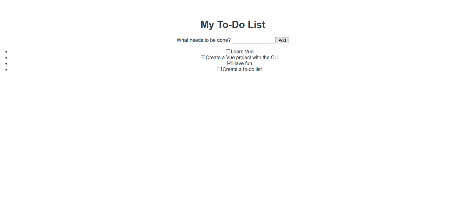
之後
明顯的變化包括刪除列表專案符號、背景顏色更改以及基本按鈕和輸入樣式的更改。
將全域性樣式新增到單檔案元件
現在我們已經將 CSS 重置為在所有瀏覽器中保持一致,我們需要進一步自定義樣式。我們希望在應用程式中的元件之間應用一些樣式。雖然直接將這些檔案新增到 reset.css 樣式表中也能正常工作,但我們將改為將其新增到 App.vue 中的 <style> 標籤中,以演示如何使用它。
該檔案中已經有一些樣式存在。讓我們刪除它們,並用以下樣式替換它們。這些樣式執行一些操作 - 為按鈕和輸入新增一些樣式,以及自定義 #app 元素及其子元素。
更新您的 App.vue 檔案的 <style> 元素,使其看起來像這樣
<style>
  /* Global styles */
  .btn {
    padding: 0.8rem 1rem 0.7rem;
    border: 0.2rem solid #4d4d4d;
    cursor: pointer;
    text-transform: capitalize;
  }
  .btn__danger {
    color: #fff;
    background-color: #ca3c3c;
    border-color: #bd2130;
  }
  .btn__filter {
    border-color: lightgrey;
  }
  .btn__danger:focus {
    outline-color: #c82333;
  }
  .btn__primary {
    color: #fff;
    background-color: #000;
  }
  .btn-group {
    display: flex;
    justify-content: space-between;
  }
  .btn-group > * {
    flex: 1 1 auto;
  }
  .btn-group > * + * {
    margin-left: 0.8rem;
  }
  .label-wrapper {
    margin: 0;
    flex: 0 0 100%;
    text-align: center;
  }
  [class*="__lg"] {
    display: inline-block;
    width: 100%;
    font-size: 1.9rem;
  }
  [class*="__lg"]:not(:last-child) {
    margin-bottom: 1rem;
  }
  @media screen and (min-width: 620px) {
    [class*="__lg"] {
      font-size: 2.4rem;
    }
  }
  .visually-hidden {
    position: absolute;
    height: 1px;
    width: 1px;
    overflow: hidden;
    clip: rect(1px 1px 1px 1px);
    clip: rect(1px, 1px, 1px, 1px);
    clip-path: rect(1px, 1px, 1px, 1px);
    white-space: nowrap;
  }
  [class*="stack"] > * {
    margin-top: 0;
    margin-bottom: 0;
  }
  .stack-small > * + * {
    margin-top: 1.25rem;
  }
  .stack-large > * + * {
    margin-top: 2.5rem;
  }
  @media screen and (min-width: 550px) {
    .stack-small > * + * {
      margin-top: 1.4rem;
    }
    .stack-large > * + * {
      margin-top: 2.8rem;
    }
  }
  /* End global styles */
  #app {
    background: #fff;
    margin: 2rem 0 4rem 0;
    padding: 1rem;
    padding-top: 0;
    position: relative;
    box-shadow:
      0 2px 4px 0 rgb(0 0 0 / 20%),
      0 2.5rem 5rem 0 rgb(0 0 0 / 10%);
  }
  @media screen and (min-width: 550px) {
    #app {
      padding: 4rem;
    }
  }
  #app > * {
    max-width: 50rem;
    margin-left: auto;
    margin-right: auto;
  }
  #app > form {
    max-width: 100%;
  }
  #app h1 {
    display: block;
    min-width: 100%;
    width: 100%;
    text-align: center;
    margin: 0;
    margin-bottom: 1rem;
  }
</style>
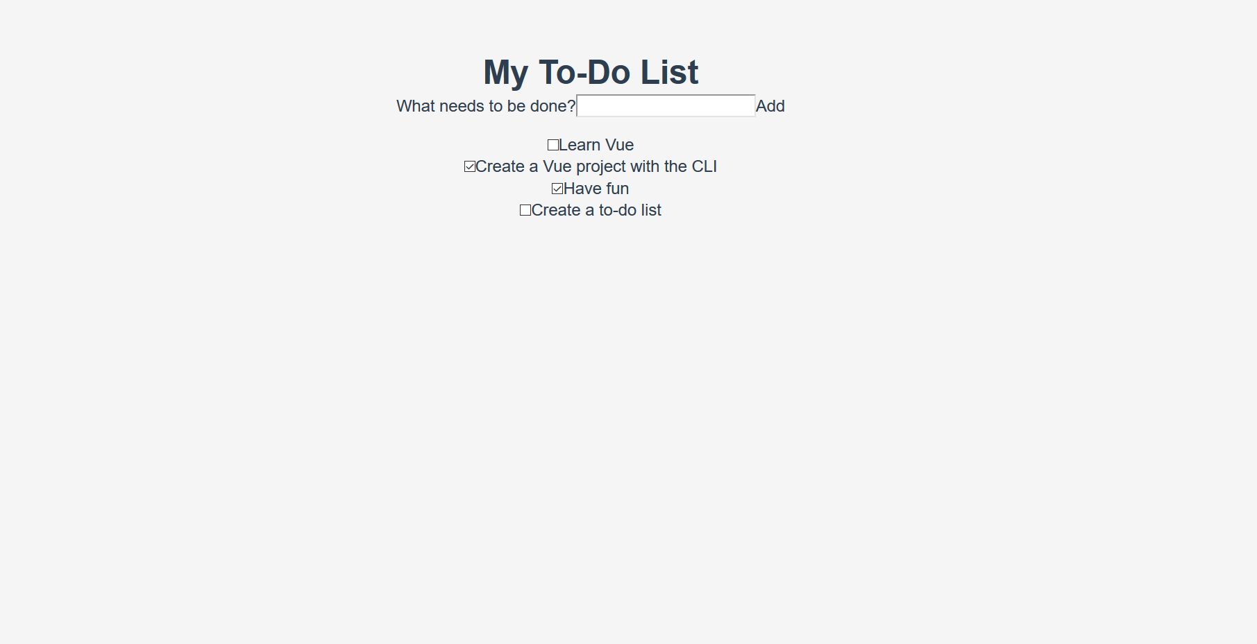
如果檢查應用程式,您會看到我們的待辦事項列表現在在一個卡片中,並且我們對待辦事項的格式進行了更好的格式化。現在我們可以繼續編輯我們的元件,以使用其中的一些樣式。
在 Vue 中新增 CSS 類
我們應該將按鈕 CSS 類應用於 ToDoForm 元件中的 <button>。由於 Vue 模板是有效的 HTML,因此與在普通 HTML 中進行操作的方式相同 - 透過向元素新增 class="" 屬性。
將 class="btn btn__primary btn__lg" 新增到表單的 <button> 元素
<button type="submit" class="btn btn__primary btn__lg">Add</button>
趁我們在這裡,我們還可以進行一項語義和樣式更改。由於我們的表單表示頁面中的特定部分,因此它可以從 <h2> 元素中受益。但是,標籤已經表示了表單的目的。為了避免重複,讓我們將標籤包裝在 <h2> 中。我們還可以新增一些其他全域性 CSS 樣式。我們還將 input__lg 類新增到 <input> 元素中。
更新您的 ToDoForm 模板,使其看起來像這樣
<template>
  <form @submit.prevent="onSubmit">
    <h2 class="label-wrapper">
      <label for="new-todo-input" class="label__lg">
        What needs to be done?
      </label>
    </h2>
    <input
      type="text"
      id="new-todo-input"
      name="new-todo"
      autocomplete="off"
      v-model.lazy.trim="label"
      class="input__lg" />
    <button type="submit" class="btn btn__primary btn__lg">Add</button>
  </form>
</template>
讓我們還將 stack-large 類新增到 App.vue 檔案中的 <ul> 標籤中。這將有助於稍微改善待辦事項的間距。
按如下方式更新它
<ul aria-labelledby="list-summary" class="stack-large">
  …
</ul>
新增作用域樣式
我們想要設定樣式的最後一個元件是 ToDoItem 元件。為了使樣式定義更靠近元件,我們可以在其中新增一個 <style> 元素。但是,如果這些樣式改變了此元件之外的內容,則可能難以追蹤導致樣式問題的樣式,並解決問題。這就是 scoped 屬性可以派上用場的地方 - 它將唯一的 HTML data 屬性選擇器附加到您的所有樣式,防止它們在全域性範圍內衝突。
要使用 scoped 修飾符,請在 ToDoItem.vue 中,在檔案底部建立一個 <style> 元素,並賦予它一個 scoped 屬性
<style scoped>
  /* … */
</style>
接下來,將以下 CSS 複製到新建立的 <style> 元素中
.custom-checkbox > .checkbox-label {
  font-family: Arial, sans-serif;
  -webkit-font-smoothing: antialiased;
  -moz-osx-font-smoothing: grayscale;
  font-weight: 400;
  font-size: 16px;
  font-size: 1rem;
  line-height: 1.25;
  color: #0b0c0c;
  display: block;
  margin-bottom: 5px;
}
.custom-checkbox > .checkbox {
  font-family: Arial, sans-serif;
  -webkit-font-smoothing: antialiased;
  -moz-osx-font-smoothing: grayscale;
  font-weight: 400;
  font-size: 16px;
  font-size: 1rem;
  line-height: 1.25;
  box-sizing: border-box;
  width: 100%;
  height: 40px;
  height: 2.5rem;
  margin-top: 0;
  padding: 5px;
  border: 2px solid #0b0c0c;
  border-radius: 0;
  appearance: none;
}
.custom-checkbox > input:focus {
  outline: 3px dashed #fd0;
  outline-offset: 0;
  box-shadow: inset 0 0 0 2px;
}
.custom-checkbox {
  font-family: Arial, sans-serif;
  -webkit-font-smoothing: antialiased;
  font-weight: 400;
  font-size: 1.6rem;
  line-height: 1.25;
  display: block;
  position: relative;
  min-height: 40px;
  margin-bottom: 10px;
  padding-left: 40px;
  clear: left;
}
.custom-checkbox > input[type="checkbox"] {
  -webkit-font-smoothing: antialiased;
  cursor: pointer;
  position: absolute;
  z-index: 1;
  top: -2px;
  left: -2px;
  width: 44px;
  height: 44px;
  margin: 0;
  opacity: 0;
}
.custom-checkbox > .checkbox-label {
  font-size: inherit;
  font-family: inherit;
  line-height: inherit;
  display: inline-block;
  margin-bottom: 0;
  padding: 8px 15px 5px;
  cursor: pointer;
  touch-action: manipulation;
}
.custom-checkbox > label::before {
  content: "";
  box-sizing: border-box;
  position: absolute;
  top: 0;
  left: 0;
  width: 40px;
  height: 40px;
  border: 2px solid currentcolor;
  background: transparent;
}
.custom-checkbox > input[type="checkbox"]:focus + label::before {
  border-width: 4px;
  outline: 3px dashed #228bec;
}
.custom-checkbox > label::after {
  box-sizing: content-box;
  content: "";
  position: absolute;
  top: 11px;
  left: 9px;
  width: 18px;
  height: 7px;
  transform: rotate(-45deg);
  border: solid;
  border-width: 0 0 5px 5px;
  border-top-color: transparent;
  opacity: 0;
  background: transparent;
}
.custom-checkbox > input[type="checkbox"]:checked + label::after {
  opacity: 1;
}
@media only screen and (min-width: 40rem) {
  label,
  input,
  .custom-checkbox {
    font-size: 19px;
    font-size: 1.9rem;
    line-height: 1.31579;
  }
}
現在我們需要向我們的模板新增一些 CSS 類來連線樣式。
對於根 <div>,新增一個 custom-checkbox 類。對於 <input>,新增一個 checkbox 類。最後,對於 <label>,新增一個 checkbox-label 類。更新後的模板如下
<template>
  <div class="custom-checkbox">
    <input type="checkbox" :id="id" :checked="isDone" class="checkbox" />
    <label :for="id" class="checkbox-label">{{label}}</label>
  </div>
</template>
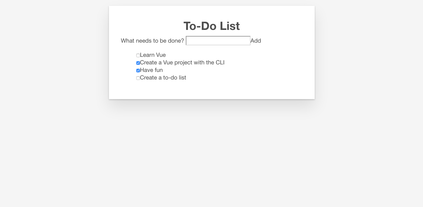
應用程式現在應該具有自定義複選框。您的應用程式應該看起來像下面的螢幕截圖。