基礎佈局理解
如果您已經完成了本模組,那麼您已經掌握了當前 CSS 佈局以及舊版 CSS 的基本知識。本任務將透過開發一個使用各種技術的簡單網頁佈局來測試您的某些知識。
| 先決條件 | 在嘗試本評估之前,您應該已經完成本模組中的所有文章。 |
|---|---|
| 目標 | 測試對 CSS 佈局方法的理解,包括 flexbox、網格、浮動和定位。 |
起點
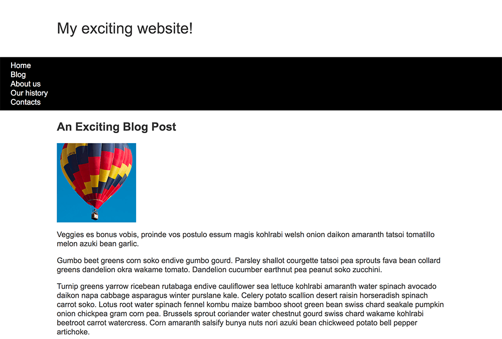
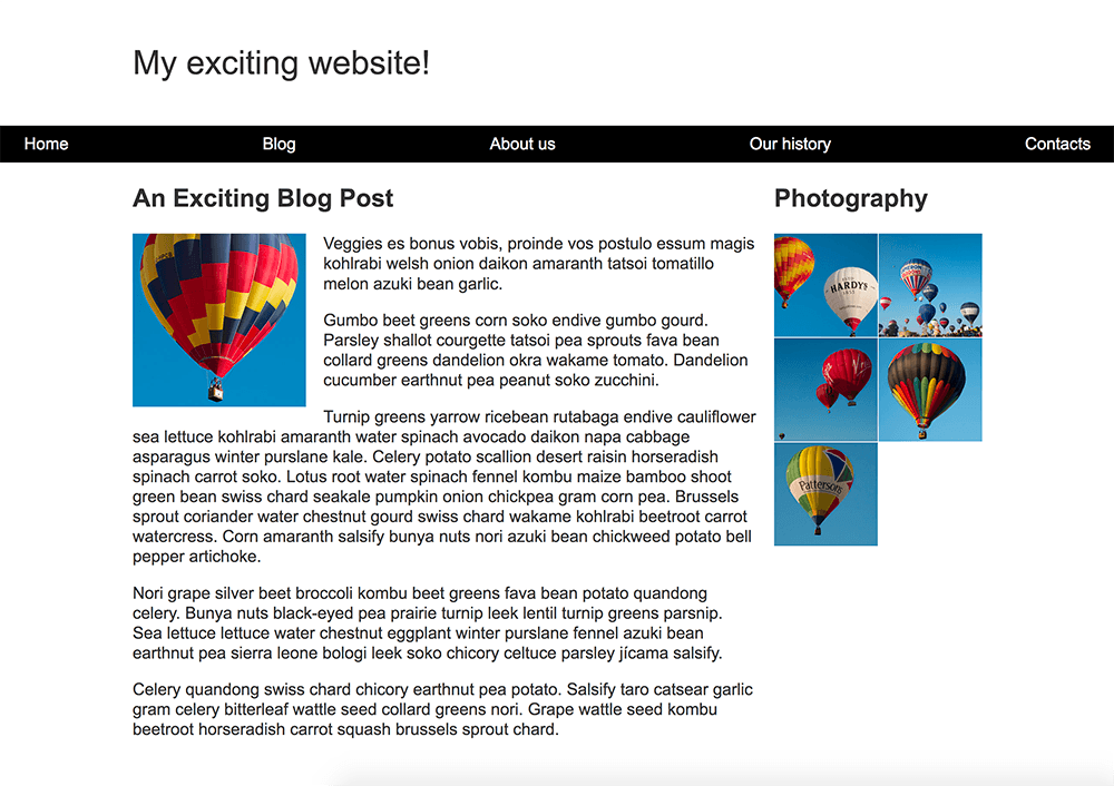
專案簡要
您已獲得一些原始 HTML、基本 CSS 和影像 — 現在您需要為設計建立一個佈局。
您的任務
提示和技巧
您無需編輯 HTML 即可實現此佈局,您應該使用的技術是
- Flexbox
- 網格
- 浮動
- 定位
您可以透過多種方式完成其中一些任務,而且通常沒有單一正確或錯誤的方式。嘗試幾種不同的方法,看看哪種效果最好。在您嘗試的過程中做筆記。