使用 CSS 為 Vue 元件設定樣式
終於到了讓我們的應用程式看起來更漂亮的時候了。在本文中,我們將探討使用 CSS 為 Vue 元件設定樣式的各種方法。
| 預備知識 |
熟悉核心 HTML、CSS 和 JavaScript 語言,瞭解 終端/命令列。 Vue 元件由管理應用程式資料的 JavaScript 物件和對映到底層 DOM 結構的基於 HTML 的模板語法組合編寫而成。為了安裝和使用 Vue 的一些更高階功能(如單檔案元件或渲染函式),您需要一個安裝了 Node + npm 的終端。 |
|---|---|
| 目標 | 學習如何為 Vue 元件設定樣式。 |
使用 CSS 為 Vue 元件設定樣式
在我們將更多高階功能新增到應用程式之前,我們應該新增一些基本的 CSS 來使其看起來更好。Vue 有三種常見的應用程式樣式設定方法:
- 外部 CSS 檔案。
- 單檔案元件(
.vue檔案)中的全域性樣式。 - 單檔案元件中的元件作用域樣式。
為了幫助您熟悉其中的每一種,我們將結合使用這三種方法,讓我們的應用程式擁有更美觀的外觀和感覺。
使用外部 CSS 檔案進行樣式設定
您可以包含外部 CSS 檔案並將它們全域性應用於您的應用程式。讓我們看看如何做到這一點。
首先,在 src/assets 目錄中建立一個名為 reset.css 的檔案。此資料夾中的檔案會經過 webpack 處理。這意味著我們可以使用 CSS 預處理器(如 SCSS)或後處理器(如 PostCSS)。
儘管本教程不會使用此類工具,但值得注意的是,當將此類程式碼包含在 assets 資料夾中時,它將自動進行處理。
將以下內容新增到 reset.css 檔案中
/* reset.css */
/* RESETS */
*,
*::before,
*::after {
  box-sizing: border-box;
}
*:focus {
  outline: 3px dashed #228bec;
}
html {
  font: 62.5% / 1.15 sans-serif;
}
h1,
h2 {
  margin-bottom: 0;
}
ul {
  list-style: none;
  padding: 0;
}
button {
  border: none;
  margin: 0;
  padding: 0;
  width: auto;
  overflow: visible;
  background: transparent;
  color: inherit;
  font: inherit;
  line-height: normal;
  -webkit-font-smoothing: inherit;
  -moz-osx-font-smoothing: inherit;
  appearance: none;
}
button::-moz-focus-inner {
  border: 0;
}
button,
input,
optgroup,
select,
textarea {
  font-family: inherit;
  font-size: 100%;
  line-height: 1.15;
  margin: 0;
}
button,
input {
  /* 1 */
  overflow: visible;
}
input[type="text"] {
  border-radius: 0;
}
body {
  width: 100%;
  max-width: 68rem;
  margin: 0 auto;
  font:
    1.6rem/1.25 "Helvetica Neue",
    "Helvetica",
    "Arial",
    sans-serif;
  background-color: whitesmoke;
  color: #4d4d4d;
  -moz-osx-font-smoothing: grayscale;
  -webkit-font-smoothing: antialiased;
}
@media screen and (width >= 620px) {
  body {
    font-size: 1.9rem;
    line-height: 1.31579;
  }
}
/* END RESETS */
接下來,在您的 src/main.js 檔案中,像這樣匯入 reset.css 檔案
import "./assets/reset.css";
這將導致該檔案在構建步驟中被拾取並自動新增到我們的站點。
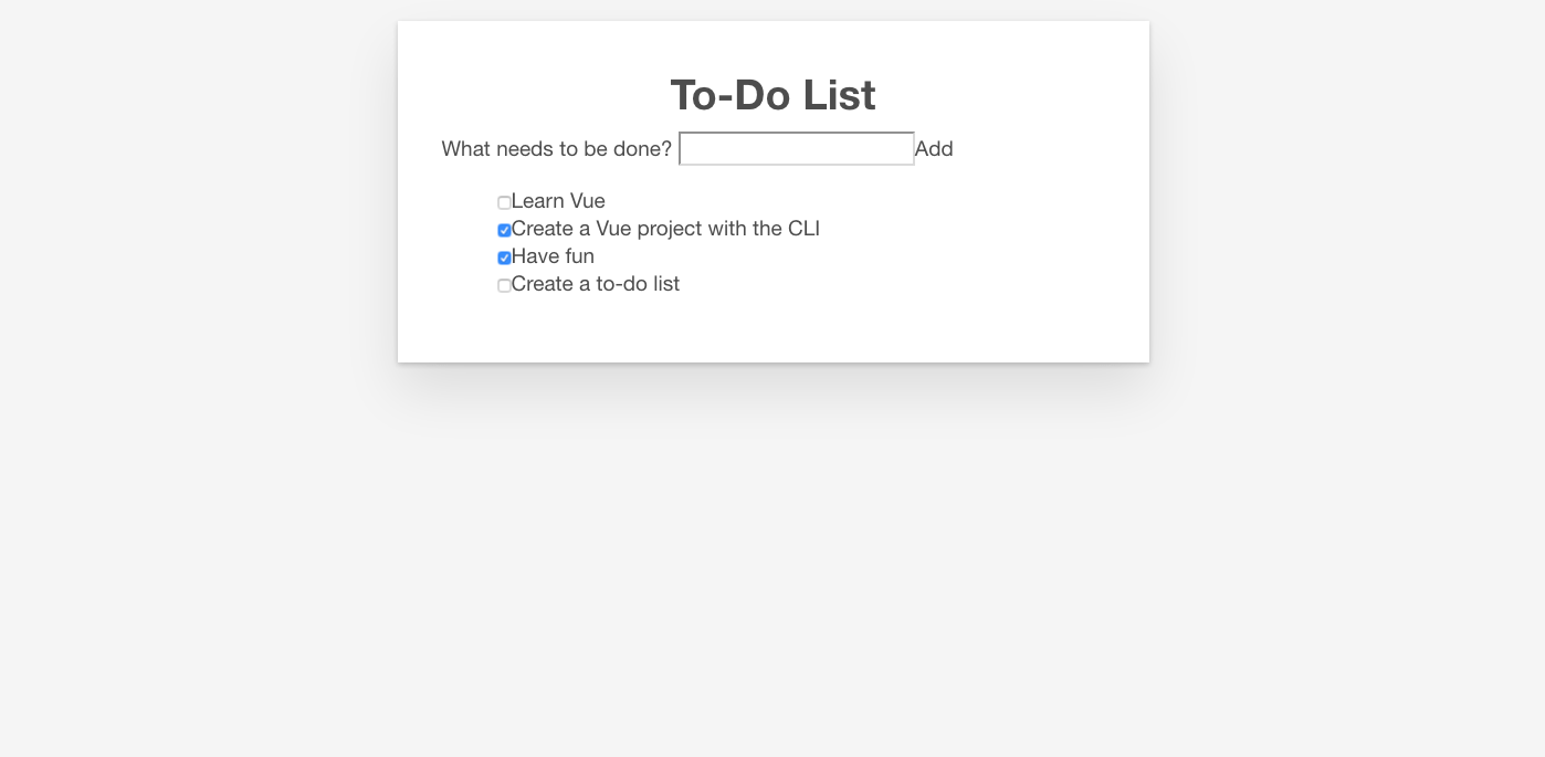
現在應該已經將重置樣式應用於應用程式。下圖顯示了應用重置樣式之前和之後的應用程式外觀。
之前

之後
明顯的變化包括列表專案符號的移除、背景顏色的改變,以及基本按鈕和輸入框樣式的改變。
在單檔案元件中新增全域性樣式
現在我們已經將 CSS 重置為在瀏覽器之間保持一致,我們需要進一步自定義樣式。有一些樣式是我們希望應用於應用程式中所有元件的。雖然將這些樣式直接新增到 reset.css 樣式表中也可以,但我們將把它們新增到 App.vue 的 <style> 標籤中,以演示如何使用它。
檔案中已經存在一些樣式。讓我們刪除它們,並用下面的樣式替換它們。這些樣式做了幾件事——為按鈕和輸入框添加了一些樣式,並自定義了 #app 元素及其子元素。
更新您的 App.vue 檔案的 <style> 元素,使其看起來像這樣
<style>
/* Global styles */
.btn {
  padding: 0.8rem 1rem 0.7rem;
  border: 0.2rem solid #4d4d4d;
  cursor: pointer;
  text-transform: capitalize;
}
.btn__danger {
  color: white;
  background-color: #ca3c3c;
  border-color: #bd2130;
}
.btn__filter {
  border-color: lightgrey;
}
.btn__danger:focus {
  outline-color: #c82333;
}
.btn__primary {
  color: white;
  background-color: black;
}
.btn-group {
  display: flex;
  justify-content: space-between;
}
.btn-group > * {
  flex: 1 1 auto;
}
.btn-group > * + * {
  margin-left: 0.8rem;
}
.label-wrapper {
  margin: 0;
  flex: 0 0 100%;
  text-align: center;
}
[class*="__lg"] {
  display: inline-block;
  width: 100%;
  font-size: 1.9rem;
}
[class*="__lg"]:not(:last-child) {
  margin-bottom: 1rem;
}
@media screen and (width >= 620px) {
  [class*="__lg"] {
    font-size: 2.4rem;
  }
}
.visually-hidden {
  position: absolute;
  height: 1px;
  width: 1px;
  overflow: hidden;
  clip: rect(1px, 1px, 1px, 1px);
  clip-path: rect(1px 1px 1px 1px);
  white-space: nowrap;
}
[class*="stack"] > * {
  margin-top: 0;
  margin-bottom: 0;
}
.stack-small > * + * {
  margin-top: 1.25rem;
}
.stack-large > * + * {
  margin-top: 2.5rem;
}
@media screen and (width >= 550px) {
  .stack-small > * + * {
    margin-top: 1.4rem;
  }
  .stack-large > * + * {
    margin-top: 2.8rem;
  }
}
/* End global styles */
#app {
  background: white;
  margin: 2rem 0 4rem 0;
  padding: 1rem;
  padding-top: 0;
  position: relative;
  box-shadow:
    0 2px 4px 0 rgb(0 0 0 / 20%),
    0 2.5rem 5rem 0 rgb(0 0 0 / 10%);
}
@media screen and (width >= 550px) {
  #app {
    padding: 4rem;
  }
}
#app > * {
  max-width: 50rem;
  margin-left: auto;
  margin-right: auto;
}
#app > form {
  max-width: 100%;
}
#app h1 {
  display: block;
  min-width: 100%;
  width: 100%;
  text-align: center;
  margin: 0;
  margin-bottom: 1rem;
}
</style>
如果您檢視應用程式,您會發現我們的待辦事項列表現在在一個卡片中,並且我們的待辦事項項的格式也更好。現在我們可以開始編輯我們的元件以使用其中一些樣式了。
在 Vue 中新增 CSS 類
我們應該將按鈕 CSS 類應用於 ToDoForm 元件中的 <button>。由於 Vue 模板是有效的 HTML,這與在純 HTML 中完成的方式相同——透過向元素新增 class="" 屬性。
將 class="btn btn__primary btn__lg" 新增到您的表單的 <button> 元素
<button type="submit" class="btn btn__primary btn__lg">Add</button>
既然我們在這裡,還可以進行一項語義和樣式上的更改。由於我們的表單表示頁面的一個特定部分,因此它可以受益於一個 <h2> 元素。然而,標籤已經表明了表單的用途。為了避免重複,讓我們將標籤包裝在一個 <h2> 中。我們還可以新增其他一些全域性 CSS 樣式。我們還將 input__lg 類新增到我們的 <input> 元素。
更新您的 ToDoForm 模板,使其看起來像這樣
<template>
  <form @submit.prevent="onSubmit">
    <h2 class="label-wrapper">
      <label for="new-todo-input" class="label__lg">
        What needs to be done?
      </label>
    </h2>
    <input
      type="text"
      id="new-todo-input"
      name="new-todo"
      autocomplete="off"
      v-model.lazy.trim="label"
      class="input__lg" />
    <button type="submit" class="btn btn__primary btn__lg">Add</button>
  </form>
</template>
我們還將在 App.vue 檔案中的 <ul> 標籤中新增 stack-large 類。這將有助於稍微改善待辦事項項之間的間距。
將其更新為如下所示
<ul aria-labelledby="list-summary" class="stack-large">
  …
</ul>
新增作用域樣式
我們要設定樣式的最後一個元件是我們的 ToDoItem 元件。為了使樣式定義靠近元件,我們可以在其中新增一個 <style> 元素。但是,如果這些樣式會影響該元件之外的內容,那麼追蹤負責設定樣式的程式碼並修復問題可能會很困難。這時 scoped 屬性就很有用了——它會向您的所有樣式附加一個唯一的 HTML data 屬性選擇器,從而防止它們與全域性樣式衝突。
要使用 scoped 修飾符,請在 ToDoItem.vue 檔案底部建立一個 <style> 元素,併為其指定一個 scoped 屬性
<style scoped>
/* … */
</style>
接下來,將以下 CSS 複製到新建立的 <style> 元素中
.custom-checkbox > .checkbox-label {
  font-family: "Arial", sans-serif;
  -webkit-font-smoothing: antialiased;
  -moz-osx-font-smoothing: grayscale;
  font-weight: normal;
  font-size: 1rem;
  line-height: 1.25;
  color: #0b0c0c;
  display: block;
  margin-bottom: 5px;
}
.custom-checkbox > .checkbox {
  font-family: "Arial", sans-serif;
  -webkit-font-smoothing: antialiased;
  -moz-osx-font-smoothing: grayscale;
  font-weight: normal;
  font-size: 1rem;
  line-height: 1.25;
  box-sizing: border-box;
  width: 100%;
  height: 2.5rem;
  margin-top: 0;
  padding: 5px;
  border: 2px solid #0b0c0c;
  border-radius: 0;
  appearance: none;
}
.custom-checkbox > input:focus {
  outline: 3px dashed #ffdd00;
  outline-offset: 0;
  box-shadow: inset 0 0 0 2px;
}
.custom-checkbox {
  font-family: "Arial", sans-serif;
  -webkit-font-smoothing: antialiased;
  font-weight: normal;
  font-size: 1.6rem;
  line-height: 1.25;
  display: block;
  position: relative;
  min-height: 40px;
  margin-bottom: 10px;
  padding-left: 40px;
  clear: left;
}
.custom-checkbox > input[type="checkbox"] {
  -webkit-font-smoothing: antialiased;
  cursor: pointer;
  position: absolute;
  z-index: 1;
  top: -2px;
  left: -2px;
  width: 44px;
  height: 44px;
  margin: 0;
  opacity: 0;
}
.custom-checkbox > .checkbox-label {
  font-size: inherit;
  font-family: inherit;
  line-height: inherit;
  display: inline-block;
  margin-bottom: 0;
  padding: 8px 15px 5px;
  cursor: pointer;
  touch-action: manipulation;
}
.custom-checkbox > label::before {
  content: "";
  box-sizing: border-box;
  position: absolute;
  top: 0;
  left: 0;
  width: 40px;
  height: 40px;
  border: 2px solid currentColor;
  background: transparent;
}
.custom-checkbox > input[type="checkbox"]:focus + label::before {
  border-width: 4px;
  outline: 3px dashed #228bec;
}
.custom-checkbox > label::after {
  box-sizing: content-box;
  content: "";
  position: absolute;
  top: 11px;
  left: 9px;
  width: 18px;
  height: 7px;
  transform: rotate(-45deg);
  border: solid;
  border-width: 0 0 5px 5px;
  border-top-color: transparent;
  opacity: 0;
  background: transparent;
}
.custom-checkbox > input[type="checkbox"]:checked + label::after {
  opacity: 1;
}
@media only screen and (width >= 40rem) {
  label,
  input,
  .custom-checkbox {
    font-size: 1.9rem;
    line-height: 1.31579;
  }
}
現在我們需要將一些 CSS 類新增到我們的模板中,以連線這些樣式。
向根 <div> 新增 custom-checkbox 類。向 <input> 新增 checkbox 類。最後,向 <label> 新增 checkbox-label 類。更新後的模板如下
<template>
  <div class="custom-checkbox">
    <input type="checkbox" :id="id" :checked="isDone" class="checkbox" />
    <label :for="id" class="checkbox-label">{{label}}</label>
  </div>
</template>
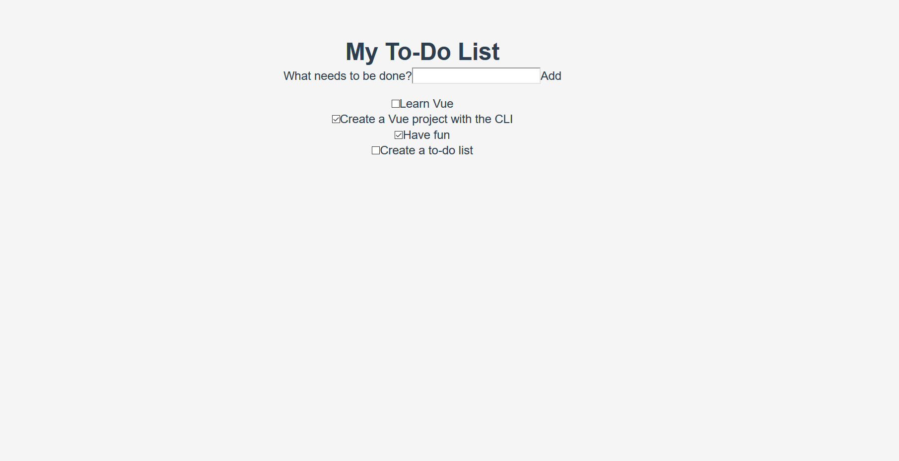
應用程式現在應該有自定義複選框了。您的應用程式外觀應類似於下面的截圖。
總結
我們的示例應用程式的樣式工作已完成。在下一篇文章中,我們將繼續新增更多功能,即使用計算屬性在應用程式中新增已完成待辦事項項的計數。