挑戰:移動優先佈局
起始點
我們將讓你在本地開發環境中解決此挑戰;理想情況下,你將需要在完整的瀏覽器視窗中檢視示例,以確保佈局功能按預期工作。
-
在你的計算機上建立一個名為
mobile-first-challenge的新資料夾。 -
在該資料夾中,建立一個
index.html檔案,並將以下內容貼上到其中。html<!DOCTYPE html> <html lang="en-US"> <head> <meta charset="utf-8" /> <title>RWD Task</title> <link href="style.css" rel="stylesheet" type="text/css" /> <script defer src="script.js"></script> </head> <body> <header> <div class="logo">My exciting website!</div> <button aria-label="Open menu">☰</button> </header> <main class="grid"> <nav> <ul> <li><a href="#">Home</a></li> <li><a href="#">Blog</a></li> <li><a href="#">About us</a></li> <li><a href="#">Our history</a></li> <li><a href="#">Contacts</a></li> </ul> </nav> <article> <h1>An Exciting Blog Post</h1> <img src="images/square6.jpg" alt="placeholder" class="feature" /> <p> Veggies es bonus vobis, proinde vos postulo essum magis kohlrabi welsh onion daikon amaranth tatsoi tomatillo melon azuki bean garlic. </p> <p> Turnip greens yarrow ricebean rutabaga endive cauliflower sea lettuce kohlrabi amaranth water spinach avocado daikon napa asparagus winter purslane kale. Celery potato scallion desert raisin horseradish spinach carrot soko. Lotus root water spinach fennel kombu maize bamboo shoot green bean swiss chard seakale pumpkin onion chickpea gram corn pea. Brussels sprout coriander water chestnut gourd swiss chard wakame kohlrabi beetroot carrot watercress. Corn amaranth salsify bunya nuts nori azuki bean chickweed potato bell pepper artichoke. </p> <p> Gumbo beet greens corn soko endive gumbo gourd. Parsley shallot courgette tatsoi pea sprouts fava bean collard greens dandelion okra wakame tomato. Dandelion cucumber earthnut pea peanut soko zucchini. </p> <p> Nori grape silver beet broccoli kombu beet greens fava bean potato quandong celery. Bunya nuts black-eyed pea prairie turnip leek lentil turnip greens parsnip. Sea lettuce lettuce water chestnut eggplant winter purslane fennel azuki bean earthnut pea sierra leone bologi leek soko chicory celtuce parsley jícama salsify. </p> <p> Celery quandong swiss chard chicory earthnut pea potato. Salsify taro garlic gram celery wattle seed collard greens nori. Grape wattle seed kombu beetroot horseradish carrot squash brussels sprout chard. </p> <p> Veggies es bonus vobis, proinde vos postulo essum magis kohlrabi welsh onion daikon amaranth tatsoi tomatillo melon azuki bean garlic. </p> <p> Turnip greens yarrow ricebean rutabaga endive cauliflower sea lettuce kohlrabi amaranth water spinach avocado daikon napa asparagus winter purslane kale. Celery potato scallion desert raisin horseradish spinach carrot soko. Lotus root water spinach fennel kombu maize bamboo shoot green bean swiss chard seakale pumpkin onion chickpea gram corn pea. Brussels sprout coriander water chestnut gourd swiss chard wakame kohlrabi beetroot carrot watercress. Corn amaranth salsify bunya nuts nori azuki bean chickweed potato bell pepper artichoke. </p> </article> <aside> <h2>Photography</h2> <ul class="photos"> <li><img src="images/square1.jpg" alt="placeholder" /></li> <li><img src="images/square2.jpg" alt="placeholder" /></li> <li><img src="images/square3.jpg" alt="placeholder" /></li> <li><img src="images/square4.jpg" alt="placeholder" /></li> <li><img src="images/square5.jpg" alt="placeholder" /></li> </ul> </aside> </main> </body> </html> -
在該資料夾中,建立一個
style.css檔案,並將以下內容貼上到其中。css/* General styles */ * { box-sizing: border-box; } body { background-color: white; color: #333333; margin: 0; font: 1.2em / 1.6 sans-serif; padding: 0 20px 20px 20px; } img { display: block; border: 1px solid black; } /* Mobile layout */ header { padding: 50px 0; display: flex; gap: 20px; justify-content: space-between; align-items: center; } .logo { font-size: 200%; } button { font-size: 250%; border: 0; background: none; cursor: pointer; } button:hover, button:focus { text-shadow: 0 0 2px black; } nav { position: fixed; inset: 10%; background-color: white; display: none; } nav ul { margin: 0; padding: 0; list-style: none; text-align: center; height: 100%; display: flex; gap: 10px; flex-direction: column; } nav li { flex: 1; } nav a { display: flex; justify-content: center; align-items: center; font-size: 150%; width: 100%; height: 100%; background-color: black; color: white; text-decoration: none; } nav a:hover, nav a:focus { font-weight: bold; } .photos { list-style: none; margin: 0; padding: 0; display: grid; gap: 5px; grid-template-columns: 1fr 1fr; } .feature { width: 200px; float: left; margin: 8px 30px 20px 0; } -
在該資料夾中,建立一個
script.js檔案,並將以下內容貼上到其中。jsconst btn = document.querySelector("button"); const nav = document.querySelector("nav"); function showNav() { nav.style.display = "block"; } function hideNav() { nav.style.display = "none"; } function hideNavEsc(e) { if (e.key === "Escape") { nav.style.display = "none"; } } function handleEventListeners() { if (matchMedia("(width > 800px)").matches) { btn.removeEventListener("click", showNav); nav.removeEventListener("click", hideNav); document.body.removeEventListener("keydown", hideNavEsc); if (nav.style.display === "none") { nav.style.display = "block"; } } else { btn.addEventListener("click", showNav); nav.addEventListener("click", hideNav); document.body.addEventListener("keydown", hideNavEsc); if (nav.style.display === "block") { nav.style.display = "none"; } } } handleEventListeners(); window.addEventListener("resize", handleEventListeners); -
在該資料夾中,建立一個名為
images的子資料夾,並將以下影像檔案儲存到其中。 -
儲存你的檔案並在瀏覽器中載入
index.html,準備進行測試。在狹窄的視口中檢視時,頁面的起始點應該看起來像這樣: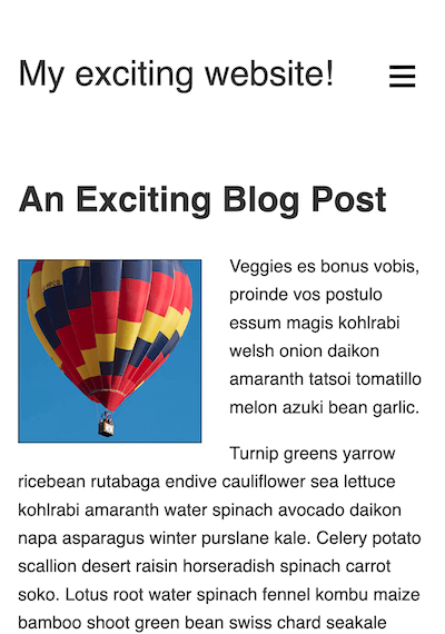
專案簡介
本示例提供的內容與上一個挑戰(基本佈局理解)的內容相同,只是在結構上略有不同。它從一開始就有一個大致完整的佈局,儘管你可能已經注意到,它在寬屏視口中看起來很糟糕!
這是因為我們為你提供了一個移動佈局作為起點。請注意,導航選單透過按“漢堡選單”圖示訪問,並且可以透過單擊選單項或按 Esc 鍵關閉。此功能透過 JavaScript 處理,並且僅在視口寬度小於 800px 時才有效,這樣它就不會干擾你將要實現的更寬屏幕布局。
具體來說,我們希望你實現兩種佈局:第一種在寬度超過 800px 時觸發,第二種在寬度超過 1300px 時觸發。我們還將讓你修復現有程式碼中的幾個問題並實現一些附加功能。
修復幾個顯示問題
首先,你需要解決我們在起始模板中留下的一些問題。
- 目前,你的佈局無法在移動瀏覽器中正常顯示。在
<html>文件的<head>中新增一個標籤來解決此問題。 - 將瀏覽器視窗設定為狹窄寬度時,檢視頁面底部——你會發現照片庫顯示不正常,因為照片超出了其容器。在 CSS 檔案中新增一個宣告來解決此問題。
建立中間佈局
中間佈局需要應用於視口寬度大於 800px 的頁面。按照以下步驟完成佈局:
- 隱藏選單
<button>並顯示<nav>。我們只希望在移動佈局中使用隱藏/顯示選單。 - 更改
<nav>的定位,使其不再位於大部分內容上方,而是位於網站頂部,就在“我的精彩網站!”標誌下方。我們還希望它在內容滾動到該位置後粘附在視口頂部。 - 導航列表專案前以列的形式顯示。對於此佈局,你希望它們以行跨越整個螢幕的形式顯示。
- 調整列表項內的
<a>元素,為它們提供10px的上下內邊距和更小的字型大小(例如100%)。 <nav>、<article>和<aside>元素都是<main>元素的子元素。我們希望你使用命名網格模板區域以以下結構佈局它們:┌----------------------------------------┐ | <nav> | ├------------------------------┬---------┤ | <article> | <aside> | | | |
<article>元素的寬度應是<aside>元素寬度的三倍;兩個元素應位於同一行。<nav>元素應位於另外兩個元素上方的單獨一行,並跨越所有可用寬度。我們還希望你在不同的網格項之間包含20px的間距。
建立寬屏佈局
寬屏佈局需要應用於視口寬度大於 1300px 的頁面。按照以下步驟完成佈局:
- 將你為中間佈局實現的網格佈局更改為不同的佈局,再次使用命名網格模板區域。這次,結構應如下所示:
┌--------┬------------------------------┬---------┐
| <nav>  |           <article>          | <aside> |
|        |                              |         |
這次,所有三個元素都在同一行。<nav>和<aside>元素的寬度應相同;<article>元素的寬度應是另外兩個元素寬度的三倍。 - 由於中間佈局,導航列表項以行的形式顯示;為了使寬屏佈局工作,你需要調整列表樣式,使列表項再次以列的形式顯示,就像它們在移動佈局中一樣。
- 列表專案前具有
flex值1,這意味著它們將拉伸以填充列的整個高度。調整此屬性值,使導航項的高度僅與其內容和設定的padding一樣高。
實現響應式排版
我們希望你調整 <h1> 和 <h2> 元素的樣式,使它們:
- 移除它們的上下
margin,使其更緊密地與上方和下方的內容配合。 - 在視口變寬或變窄時響應式地改變其大小,同時仍可縮放。你應該選擇合適的單位,使標題很好地填充可用空間,而不會斷開成多行。
調整列印佈局
新增一個樣式塊,在列印頁面時從佈局中刪除 <button> 和 <nav> 元素。
提示和技巧
- 你不需要編輯 JavaScript 來完成此挑戰。
- 有幾種方法可以完成專案簡報中的某些任務,而且通常沒有單一的正確或錯誤的方法。嘗試幾種不同的方法,看看哪種效果最好。在實驗時做好筆記。
- 有時,為先前佈局設定的屬性值會導致後續佈局出現問題。響應式設計的一些技巧在於知道何時取消設定或覆蓋先前設定的屬性值。
示例
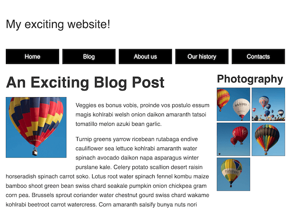
以下螢幕截圖顯示了完成的中間佈局應該是什麼樣子:
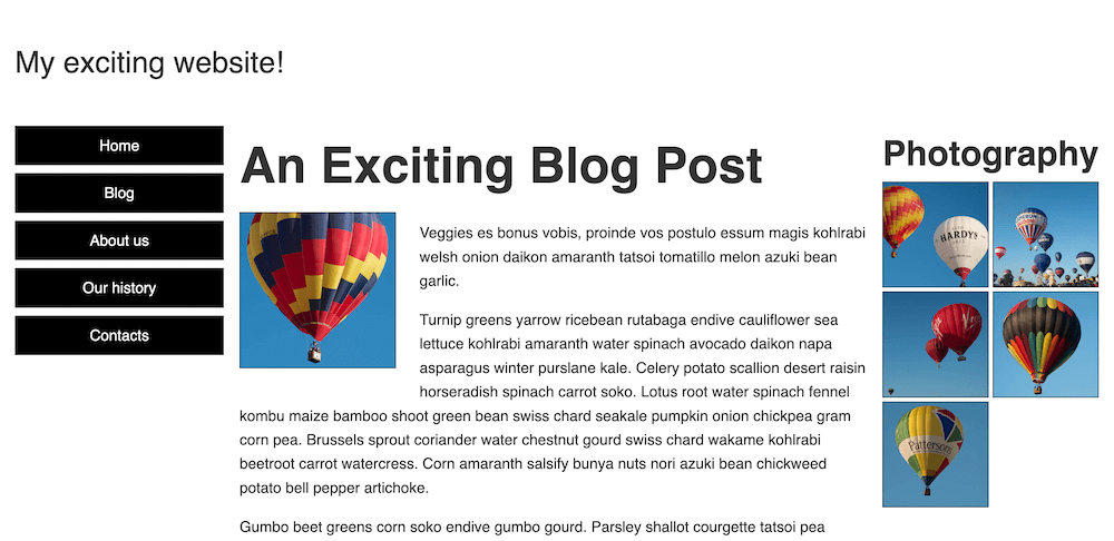
以下螢幕截圖顯示了完成的寬屏佈局應該是什麼樣子:
點選此處顯示可能的解決方案
為了使佈局在移動瀏覽器中正常顯示,你需要在 HTML 文件的 <head> 中新增一個視口 <meta> 標籤。
<meta name="viewport" content="width=device-width, initial-scale=1" />
完成的 CSS 應該像這樣:
/* General styles */

* {
  box-sizing: border-box;
}

body {
  background-color: white;
  color: #333333;
  margin: 0;
  font: 1.2em / 1.6 sans-serif;
  padding: 0 20px 20px 20px;
}

img {
  display: block;
  border: 1px solid black;
  /* Solution: Stop the photographs from breaking out of
  their containers */
  max-width: 100%;
}

/* Mobile layout */

header {
  padding: 50px 0;
  display: flex;
  gap: 20px;
  justify-content: space-between;
  align-items: center;
}

.logo {
  font-size: 200%;
}

button {
  font-size: 250%;
  border: 0;
  background: none;
  cursor: pointer;
}

button:hover,
button:focus {
  text-shadow: 0 0 2px black;
}

nav {
  position: fixed;
  inset: 10%;
  background-color: white;
  display: none;
}

nav ul {
  margin: 0;
  padding: 0;
  list-style: none;
  text-align: center;
  height: 100%;
  display: flex;
  gap: 10px;
  flex-direction: column;
}

nav li {
  flex: 1;
}

nav a {
  display: flex;
  justify-content: center;
  align-items: center;
  font-size: 150%;
  width: 100%;
  height: 100%;
  background-color: black;
  color: white;
  text-decoration: none;
}

nav a:hover,
nav a:focus {
  font-weight: bold;
}

.photos {
  list-style: none;
  margin: 0;
  padding: 0;
  display: grid;
  gap: 5px;
  grid-template-columns: 1fr 1fr;
}

.feature {
  width: 200px;
  float: left;
  margin: 8px 30px 20px 0;
}

/* Solution: Creating the middle layout (breakpoint: 800px) */

@media (width > 800px) {
  /* Sort out navigation styling for middle breakpoint */
  button {
    display: none;
  }

  nav {
    display: block;
    inset: unset;
    position: sticky;
    top: 0;
  }

  nav ul {
    flex-direction: row;
  }

  nav a {
    font-size: 100%;
    padding: 10px 0;
  }

  /* Create grid layout for middle breakpoint */

  nav {
    grid-area: nav;
  }

  article {
    grid-area: main;
  }

  aside {
    grid-area: photos;
  }

  .grid {
    display: grid;
    grid-template-columns: 3fr 1fr;
    grid-template-areas:
      "nav nav"
      "main photos";
    gap: 20px;
  }
}

/* Solution: Creating the widescreen layout (breakpoint: 1300px) */

@media (width > 1300px) {
  .grid {
    grid-template-columns: 1fr 3fr 1fr;
    grid-template-areas: "nav main photos";
  }

  nav ul {
    flex-direction: column;
  }

  nav li {
    flex: unset;
  }
}

/* 4. Solution: Implementing responsive typography */

h1 {
  font-size: calc(1.3rem + 3vw);
  margin: 0;
}

h2 {
  font-size: calc(1rem + 2vw);
  margin: 0;
}

/* 5. Solution: Adjusting the layout for print */

@media print {
  nav,
  button {
    display: none;
  }
}