起始點
我們將讓你在本地開發環境中解決這個挑戰;最好在全屏瀏覽器視窗中檢視示例,以確保佈局功能按預期工作。
-
在你的電腦上建立一個名為
layout-challenge的新資料夾。 -
在該資料夾中,建立一個
index.html檔案,並將以下內容貼上到其中。html<!DOCTYPE html> <html lang="en-US"> <head> <meta charset="utf-8" /> <meta name="viewport" content="width=device-width, initial-scale=1" /> <title>Layout Task</title> <link href="style.css" rel="stylesheet" type="text/css" /> </head> <body> <div class="logo">My exciting website!</div> <nav> <ul> <li><a href="">Home</a></li> <li><a href="">Blog</a></li> <li><a href="">About us</a></li> <li><a href="">Our history</a></li> <li><a href="">Contacts</a></li> </ul> </nav> <main class="grid"> <article> <h1>An Exciting Blog Post</h1> <img src="images/square6.jpg" alt="placeholder" class="feature" /> <p> Lorem ipsum dolor sit amet, consectetur adipiscing elit. Duis non justo at erat egestas porttitor vel nec tortor. Mauris in molestie ipsum. Vivamus diam elit, ornare ornare nisi vitae, ullamcorper pharetra ligula. In vel lacus quis nulla sollicitudin pellentesque. </p> <p> Nunc vitae eleifend odio, eget tincidunt sem. Cras et varius justo. Nulla sollicitudin quis urna vitae efficitur. Pellentesque hendrerit molestie arcu sit amet lacinia. Vivamus vulputate sed purus at eleifend. Phasellus malesuada sem vel libero hendrerit, sed finibus massa porta. Vestibulum luctus scelerisque libero, sit amet sagittis eros sollicitudin ac. Class aptent taciti sociosqu ad litora torquent per conubia nostra, per inceptos himenaeos. </p> <p> Phasellus tincidunt eros iaculis, feugiat mi at, eleifend mauris. Quisque porttitor lacus eu massa condimentum, eu tincidunt nisl consequat. Nunc egestas lacus dolor, id scelerisque ante tincidunt ac. In risus massa, sodales ac enim eu, iaculis eleifend lorem. </p> <p> Maecenas euismod condimentum enim, non rhoncus neque tempor ut. Vestibulum eget nisi ornare, vehicula felis id, aliquet nibh. Donec in mauris in diam aliquam commodo nec ac nunc. Aliquam nisl risus, eleifend a iaculis id, tempor vel tortor. Nam ullamcorper dictum tellus id rhoncus. Sed quis nulla in mi aliquam euismod nec eu metus. </p> <p> Nam orci nulla, convallis aliquet ante ut, lobortis hendrerit risus. Nulla malesuada porta turpis in consequat. Duis suscipit nulla a mauris pellentesque vehicula. Fusce euismod, mi malesuada venenatis vestibulum, metus erat faucibus dui, vel rutrum turpis nibh ut diam. </p> <p> Nam ornare et mauris eget tincidunt. Nam ornare et mauris eget tincidunt. Donec et ipsum a orci elementum commodo et ut ex. Vivamus porttitor sem in purus maximus, eu imperdiet felis lobortis. </p> <p> Pellentesque ullamcorper dolor ut ullamcorper convallis. Duis a orci aliquet, pretium neque ut, auctor purus. Proin viverra tincidunt nisi id fringilla. Maecenas interdum risus in ultricies finibus. Vestibulum volutpat tincidunt libero, a feugiat leo suscipit in. Sed eget lacus rutrum, semper ligula a, vestibulum ipsum. Mauris in odio fringilla, accumsan eros blandit, mattis odio. Ut viverra mollis augue, vitae ullamcorper velit hendrerit eu. Curabitur mi lacus, condimentum in auctor sed, ornare sed leo. </p> </article> <aside> <h2>Photography</h2> <ul class="photos"> <li><img src="images/square1.jpg" alt="placeholder" /></li> <li><img src="images/square2.jpg" alt="placeholder" /></li> <li><img src="images/square3.jpg" alt="placeholder" /></li> <li><img src="images/square4.jpg" alt="placeholder" /></li> <li><img src="images/square5.jpg" alt="placeholder" /></li> </ul> </aside> </main> </body> </html> -
在該資料夾中,建立一個
style.css檔案,並將以下內容貼上到其中。css* { box-sizing: border-box; } body { background-color: white; color: #333333; margin: 0; font: 1.2em / 1.6 sans-serif; } img { max-width: 100%; display: block; border: 1px solid black; } .logo { font-size: 200%; padding: 50px 20px; margin: 0 auto; max-width: 980px; } .grid { margin: 0 auto; max-width: 980px; } nav { background-color: black; padding: 0.5em; } nav ul { margin: 0; padding: 0; list-style: none; } nav a { color: white; text-decoration: none; padding: 0.5em 1em; } .photos { list-style: none; margin: 0; padding: 0; } .feature { width: 200px; } -
在該資料夾內,建立一個名為
images的子資料夾,並將以下影像檔案儲存在其中 -
儲存你的檔案,並在瀏覽器中載入
index.html,準備進行測試。頁面的起始點具有基本樣式但沒有佈局,應該看起來像這樣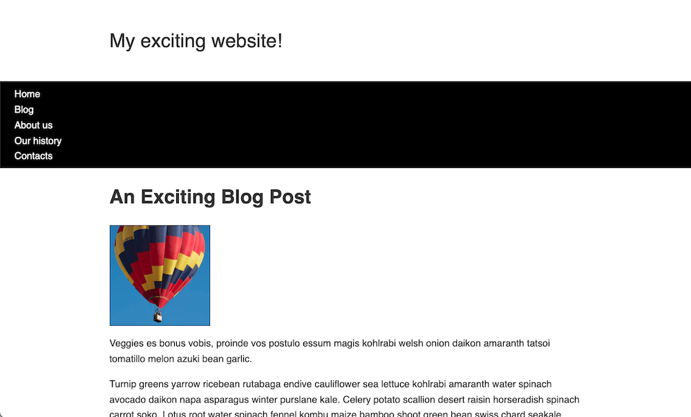
專案簡介
你已獲得一些原始 HTML、基本 CSS 和圖片 — 現在你需要為設計建立一個佈局。
你需要完成的任務包括
提示和技巧
- 你無需編輯 HTML 即可完成此挑戰。
- 在專案中,有幾種方法可以實現一些任務,並且通常沒有一個絕對正確或錯誤的方法。嘗試幾種不同的方法,看看哪種效果最好。在實驗時做筆記。
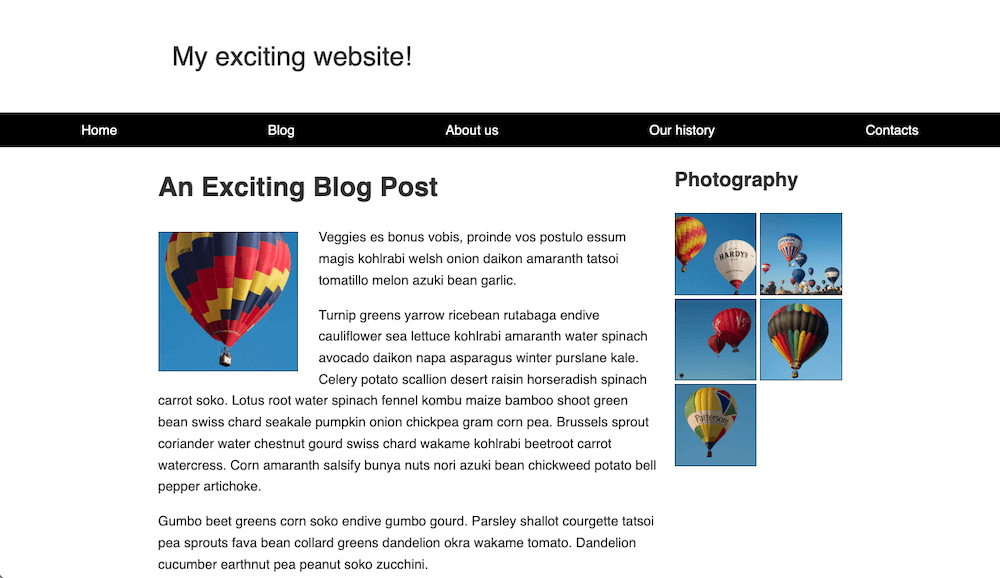
示例
以下螢幕截圖顯示了設計完成佈局的示例外觀
單擊此處顯示一個可能的解決方案
完成後的 CSS 如下所示
css
* {
  box-sizing: border-box;
}

body {
  background-color: white;
  color: #333333;
  margin: 0;
  font: 1.2em / 1.6 sans-serif;
}

img {
  max-width: 100%;
  display: block;
  border: 1px solid black;
}

.logo {
  font-size: 200%;
  padding: 50px 20px;
  margin: 0 auto;
  max-width: 980px;
}

.grid {
  margin: 0 auto;
  max-width: 980px;
  /* Solution: Display <article> and <aside> as two flexible
  columns, with <article> three times the width of <aside>,
  and a 20px gap */
  display: grid;
  grid-template-columns: 3fr 1fr;
  gap: 20px;
}

nav {
  background-color: black;
  padding: 0.5em;
  /* Solution: Make navigation bar scroll with content normally but
  then stick to top of viewport */
  top: 0;
  position: sticky;
}

nav ul {
  margin: 0;
  padding: 0;
  list-style: none;
  /* Solution: Display the navigation items in a row with equal space
  in between and less space at the ends  */
  display: flex;
  justify-content: space-around;
}

nav a {
  color: white;
  text-decoration: none;
  padding: 0.5em 1em;
}

.photos {
  list-style: none;
  margin: 0;
  padding: 0;
  /* Solution: Display photos in two-column grid with equal columns
  and a 5px gap */
  display: grid;
  gap: 5px;
  grid-template-columns: 1fr 1fr;
}

.feature {
  width: 200px;
  /* Solution: Wrap text around the "feature" image to the right and bottom,
  with suitable space between image and text */
  float: left;
  margin: 8px 30px 20px 0;
}