填充和描邊
填充和描邊屬性
繪製
可以透過在節點上設定兩個屬性來完成基本的著色:fill 和 stroke。使用 fill 設定物件內部的顏色,而 stroke 設定圍繞物件繪製的線條的顏色。您可以使用與在 HTML 中相同的 CSS 顏色命名方案,無論是顏色名稱(如 red)、rgb 值(如 rgb(255 0 0))、十六進位制值等。
<?xml version="1.0" standalone="no"?>
<svg width="160" height="140" xmlns="http://www.w3.org/2000/svg" version="1.1">
  <rect
    x="10"
    y="10"
    width="100"
    height="100"
    stroke="blue"
    fill="purple"
    fill-opacity="0.5"
    stroke-opacity="0.8"
    stroke-width="15" />
</svg>
此外,您可以在 SVG 中分別指定 fill 或 stroke 的不透明度。這些由 fill-opacity 和 stroke-opacity 屬性控制。
描邊
除了其顏色屬性外,還有其他一些屬性可用於控制線上條上繪製描邊的方式。
<?xml version="1.0" standalone="no"?>
<svg width="160" height="140" xmlns="http://www.w3.org/2000/svg" version="1.1">
  <line x1="40" x2="120" y1="20" y2="20" stroke="black" stroke-width="20" stroke-linecap="butt"/>
  <line x1="40" x2="120" y1="60" y2="60" stroke="black" stroke-width="20" stroke-linecap="square"/>
  <line x1="40" x2="120" y1="100" y2="100" stroke="black" stroke-width="20" stroke-linecap="round"/>
</svg>
stroke-width 屬性定義此描邊的寬度。描邊圍繞路徑居中繪製。在上面的示例中,路徑顯示為粉紅色,描邊顯示為黑色。
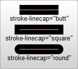
第二個影響描邊的屬性是 stroke-linecap 屬性,如上所示。這控制線條末端的形狀。
stroke-linecap 有三個可能的值
butt使用與描邊方向垂直(90 度)的直邊關閉線條,並穿過其末端。square具有基本相同的顯示效果,但會將描邊稍微延伸到實際路徑之外。描邊超出路徑的距離是stroke-width的一半。round在描邊末端產生圓形效果。此曲線的半徑也由stroke-width控制。
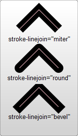
使用 stroke-linejoin 控制如何繪製兩條線段之間的連線。
<?xml version="1.0" standalone="no"?>
<svg width="160" height="280" xmlns="http://www.w3.org/2000/svg" version="1.1">
  <polyline points="40 60 80 20 120 60" stroke="black" stroke-width="20"
      stroke-linecap="butt" fill="none" stroke-linejoin="miter"/>

  <polyline points="40 140 80 100 120 140" stroke="black" stroke-width="20"
      stroke-linecap="round" fill="none" stroke-linejoin="round"/>

  <polyline points="40 220 80 180 120 220" stroke="black" stroke-width="20"
      stroke-linecap="square" fill="none" stroke-linejoin="bevel"/>
</svg>
這些折線每條都有兩條線段。兩條線段相交處的連線由 stroke-linejoin 屬性控制。此屬性有三個可能的值。miter 將線條稍微延伸到其正常寬度之外,在只使用一個角度的地方建立一個方形角。round 建立一個圓形的線段。bevel 建立一個新角度以幫助兩條線段之間的過渡。
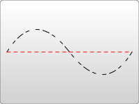
最後,您還可以透過指定 stroke-dasharray 屬性在描邊上使用虛線型別。
<?xml version="1.0" standalone="no"?>
<svg width="200" height="150" xmlns="http://www.w3.org/2000/svg" version="1.1">
  <path d="M 10 75 Q 50 10 100 75 T 190 75" stroke="black"
    stroke-linecap="round" stroke-dasharray="5,10,5" fill="none"/>
  <path d="M 10 75 L 190 75" stroke="red"
    stroke-linecap="round" stroke-width="1" stroke-dasharray="5,5" fill="none"/>
</svg>
stroke-dasharray 屬性可以將其引數作為一系列用逗號和/或空格分隔的數字。
第一個數字指定填充區域的距離,第二個數字指定未填充區域的距離。因此,在上面的示例中,第二條路徑填充 5 個畫素單位,然後是 5 個空白單位,直到下一個 5 個單位的虛線。如果您想要更復雜的虛線圖案,可以指定更多數字。第一個示例指定了三個數字,在這種情況下,渲染器會將這些數字迴圈兩次以建立偶數圖案。因此,第一條路徑渲染 5 個填充、10 個空、5 個填充,然後迴圈回以建立 5 個空、10 個填充、5 個空。然後圖案重複。
還有其他可用的 stroke 和 fill 屬性,包括 fill-rule, 它指定如何為自身重疊的形狀著色;stroke-miterlimit,它確定描邊是否應該繪製斜接;以及 stroke-dashoffset,它指定線上條上開始虛線圖案的位置。
繪製順序
可以使用 paint-order 屬性控制填充和描邊的繪製順序。
<?xml version="1.0" standalone="no"?>
<svg width="400" height="180" xmlns="http://www.w3.org/2000/svg" version="1.1">
  <polyline
    points="40 80 80 40 120 80"
    stroke-width="15"
    stroke="black"
    fill="coral"
    paint-order="fill" />

  <polyline
    points="40 140 80 100 120 140"
    stroke-width="15"
    stroke="black"
    fill="coral"
    paint-order="stroke" />
</svg>
對於第一個形狀,填充已在描邊之前渲染,因此黑色描邊出現在填充之上。對於第二個形狀,描邊已在填充之前渲染。
使用 CSS
除了在物件上設定屬性外,您還可以使用 CSS 來設定填充和描邊的樣式。並非所有屬性都可以透過 CSS 設定。處理繪製和填充的屬性通常可用,因此 fill、stroke、stroke-dasharray 等都可以透過這種方式設定,此外還有下面顯示的這些屬性的漸變和圖案版本。諸如 width、height 或 <path> 命令之類的屬性無法透過 CSS 設定。最簡單的方法就是測試並找出哪些可用,哪些不可用。
注意:SVG 規範 嚴格區分屬性和其他屬性。前者可以使用 CSS 修改,後者則不能。
CSS 可以透過 style 屬性內聯到元素中
<rect x="10" height="180" y="10" width="180" style="stroke: black; fill: red;"/>
或者它可以移動到您包含的特殊樣式部分。但是,與在 HTML 中的操作不同,您不會將此類部分塞入 <head> 部分,而是將其包含在一個名為 <defs> 的區域中。
<defs> 代表定義,您可以在此處建立不直接出現在 SVG 中但由其他元素使用的元素。
<?xml version="1.0" standalone="no"?>
<svg width="200" height="200" xmlns="http://www.w3.org/2000/svg" version="1.1">
  <defs>
    <style><![CDATA[
       #MyRect {
         stroke: black;
         fill: red;
         paint-order: stroke;
       }
    ]]></style>
  </defs>
  <rect x="10" height="180" y="10" width="180" id="MyRect"/>
</svg>
將樣式移動到這樣的區域可以更容易地調整大量元素的屬性。您還可以使用諸如:hover偽類之類的功能來建立懸停效果。
#MyRect:hover {
  stroke: black;
  fill: blue;
}
您還可以透過標準的 XML-stylesheet 語法為 CSS 規則指定外部樣式表。
<?xml version="1.0" standalone="no"?>
<?xml-stylesheet type="text/css" href="style.css"?>

<svg width="200" height="150" xmlns="http://www.w3.org/2000/svg" version="1.1">
  <rect height="10" width="10" id="MyRect"/>
</svg>
其中style.css看起來像這樣
#MyRect {
  fill: red;
  stroke: black;
}