Window: devicePixelRatio 屬性
Window 介面的 devicePixelRatio 屬性返回當前顯示裝置的物理畫素解析度與CSS 畫素解析度的比率。
此值也可以解釋為畫素尺寸的比率:一個CSS 畫素與一個物理畫素的尺寸之比。簡單來說,它告訴瀏覽器應該使用螢幕的多少實際畫素來繪製單個 CSS 畫素。
頁面縮放會影響 devicePixelRatio 的值。當頁面放大(變大)時,CSS 畫素的大小會增加,因此 devicePixelRatio 的值也會增加。捏拉縮放不會影響 devicePixelRatio,因為它會放大頁面而不改變 CSS 畫素的大小。
在處理標準顯示器與 HiDPI 或 Retina 顯示器之間的差異時,這一點非常有用,因為 HiDPI 或 Retina 顯示器使用更多的螢幕畫素來繪製相同的物件,從而產生更清晰的影像。
您可以使用 window.matchMedia() 來檢查 devicePixelRatio 的值是否發生變化(例如,當用戶將視窗拖到具有不同畫素密度的顯示器上時,這種情況可能會發生)。請參閱 下面的示例。
值
一個雙精度浮點值,表示顯示器的物理畫素解析度與 CSS 畫素解析度的比率。值為 1 表示經典的 96 DPI 顯示器,而 HiDPI/Retina 顯示器的值通常為 2。
在解析度異常低的顯示器的情況下,或者更常見的是,當螢幕的畫素密度高於標準 96 DPI 解析度的兩倍時,可能會返回其他值。現代移動裝置螢幕——以非常小的物理尺寸提供高顯示解析度——通常會產生大於 2 的 devicePixelRatio 值。
示例
糾正 <canvas> 中的解析度
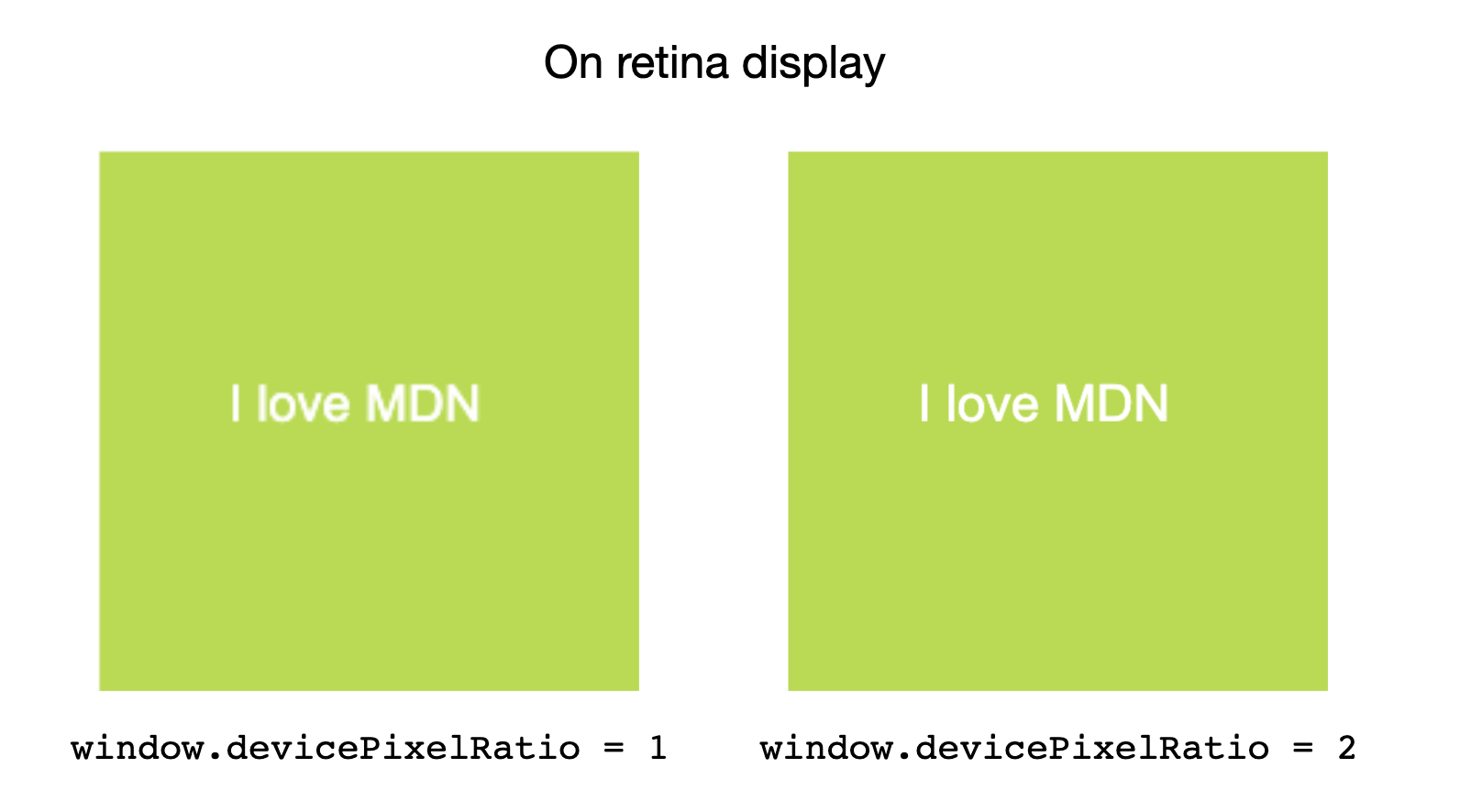
在 Retina 螢幕上,<canvas> 可能會顯得過於模糊。使用 window.devicePixelRatio 來確定應新增多少額外的畫素密度以獲得更清晰的影像。
HTML
<canvas id="canvas"></canvas>
JavaScript
const canvas = document.getElementById("canvas");
const ctx = canvas.getContext("2d");

// Set display size (css pixels).
const size = 200;
canvas.style.width = `${size}px`;
canvas.style.height = `${size}px`;

// Set actual size in memory (scaled to account for extra pixel density).
const scale = window.devicePixelRatio; // Change to 1 on retina screens to see blurry canvas.
canvas.width = Math.floor(size * scale);
canvas.height = Math.floor(size * scale);

// Normalize coordinate system to use CSS pixels.
ctx.scale(scale, scale);

ctx.fillStyle = "#bada55";
ctx.fillRect(10, 10, 300, 300);
ctx.fillStyle = "white";
ctx.font = "18px Arial";
ctx.textAlign = "center";
ctx.textBaseline = "middle";

const x = size / 2;
const y = size / 2;

const textString = "I love MDN";
ctx.fillText(textString, x, y);
監控螢幕解析度或縮放級別變化
在此示例中,我們將設定一個媒體查詢並對其進行監視,以檢視裝置解析度何時變化,並記錄新解析度。
HTML
<div id="container">
  <p>
    This example demonstrates the effect of zooming the page in and out (or
    moving it to a screen with a different scaling factor) on the value of the
    <code>devicePixelRatio</code> property.
  </p>
  <p>Try it and watch what happens!</p>
</div>
<div id="output"></div>
CSS
body {
  font:
    22px "Arial",
    sans-serif;
}

#container {
  border: 2px solid #2222dd;
  margin: 1rem auto;
  padding: 1rem;
  background-color: #aa99ff;
}
JavaScript
字串 mqString 設定為媒體查詢,用於檢查當前顯示解析度是否與每 px 的特定裝置點數匹配。
media 變數是一個使用媒體查詢字串初始化的 MediaQueryList 物件。當使用文件執行 mqString 的結果發生更改時,media 物件的 change 事件會觸發,並且程式碼會記錄新解析度。
請注意,每次解析度更改時,示例都必須基於新解析度建立一個新的媒體查詢和一個新的 MediaQueryList 例項。
let remove = null;
const output = document.querySelector("#output");

const updatePixelRatio = () => {
  remove?.();
  const mqString = `(resolution: ${window.devicePixelRatio}dppx)`;
  const media = matchMedia(mqString);
  media.addEventListener("change", updatePixelRatio);
  remove = () => {
    media.removeEventListener("change", updatePixelRatio);
  };

  output.textContent = `devicePixelRatio: ${window.devicePixelRatio}`;
};

updatePixelRatio();
結果
要測試此示例,請嘗試放大和縮小頁面,並注意記錄的 devicePixelRatio 值的差異。
規範
| 規範 |
|---|
| CSSOM 檢視模組 # dom-window-devicepixelratio |
瀏覽器相容性
載入中…