
使用 linear() 函式在 CSS 動畫中建立自定義緩動效果
 Michelle Barker
閱讀時間 10 分鐘
Michelle Barker
閱讀時間 10 分鐘
動畫不僅僅是將事物從一個地方移動到另一個地方。事物移動(或以某種方式改變)的方式與傳達目的感同等重要。在動畫界,一個物件在一段時間內從一種狀態過渡到另一種狀態的方式被稱為緩動。
在這篇文章中,我們將比較 CSS 中不同的緩動函式。CSS 中的 linear() 函式是一個新的緩動函式,它讓我們能夠更精細地控制動畫的製作。我們將探討 linear() 函式的工作原理,並看一些實際的應用示例。
CSS 中的緩動
正確選擇緩動方式對於使動畫看起來自然逼真至關重要。想象一下在地板上滾動一個球。它不會一直以相同的速度移動:它可能會迅速加速到最大速度,然後逐漸減慢速度並停止(這稱為cubic-bezier 緩動)。將其與一個在整個動畫時間線上以相同速度移動的球進行比較(這稱為linear 緩動)。這感覺不太自然,不是嗎?
控制 CSS 動畫中的緩動
在 CSS 中,我們使用 animation-timing-function 屬性為元素的動畫應用緩動。
.box {
  animation-name: move;
  animation-duration: 2000ms;
  animation-timing-function: ease-in;
}
讓我們回顧一下一些已有的 CSS 緩動技術。如果您已經熟悉這些,可以安全地跳過本節,直接閱讀關於使用 linear() 函式應用自定義緩動 的部分。
緩動關鍵字
在 CSS 中製作動畫時,我們可以從一些關鍵字中進行選擇:ease-in、ease-out、ease-in-out、ease(預設)和 linear。它們也可以透過簡寫屬性 animation 來應用。
.box {
  animation: move 2000ms ease-in;
}
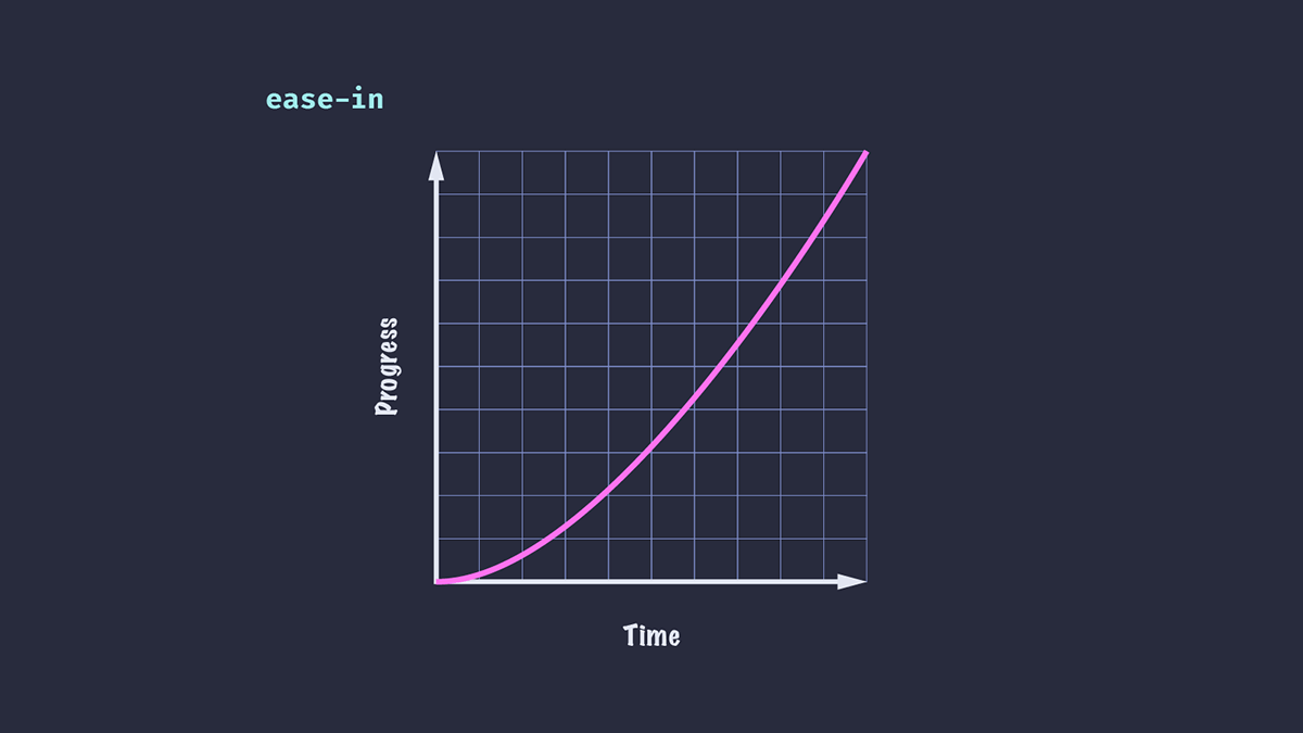
Ease-in (慢速開始)
動畫開始緩慢,然後加速,最終達到最大速度。例如,汽車啟動。
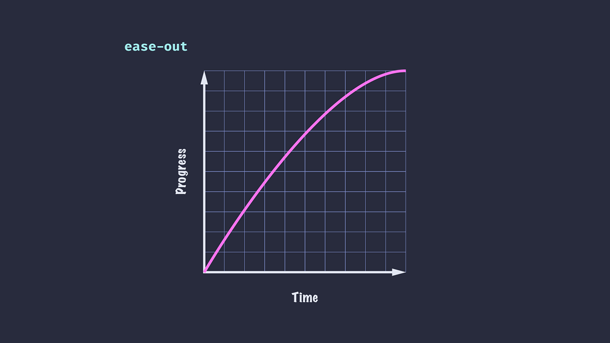
Ease-out (慢速結束)
動畫開始快速,然後在一段時間內減慢速度——有點像在地板上滾動的球。這裡的區別在於 ease-out 沒有顯示初始加速。
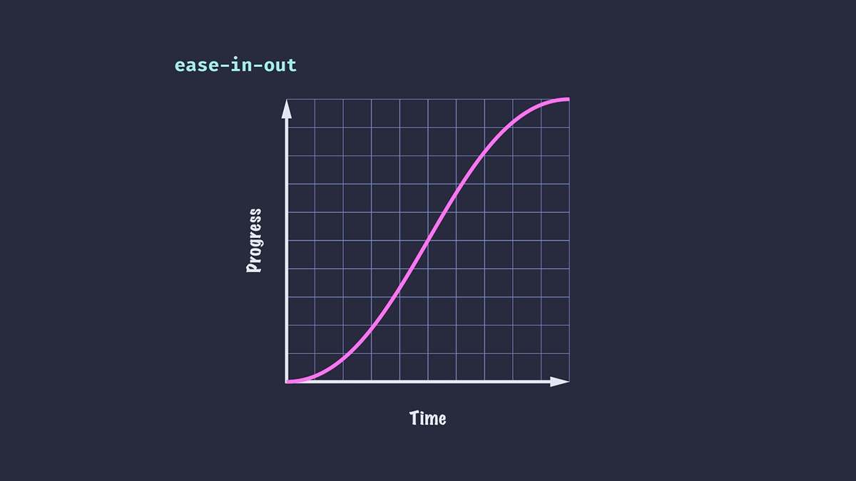
Ease-in-out (慢速開始,慢速結束)
動畫同時使用上述兩種原理:開始時逐漸加速,然後到結尾時逐漸減速。
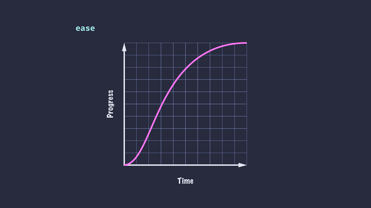
Ease (預設)
這是預設值。與 ease-in-out 類似,它既有加速也有減速,但它們不是均勻的。在這種情況下,動畫有時看起來比 ease-in-out 更自然。
下面是兩種關鍵字效果的並排比較。
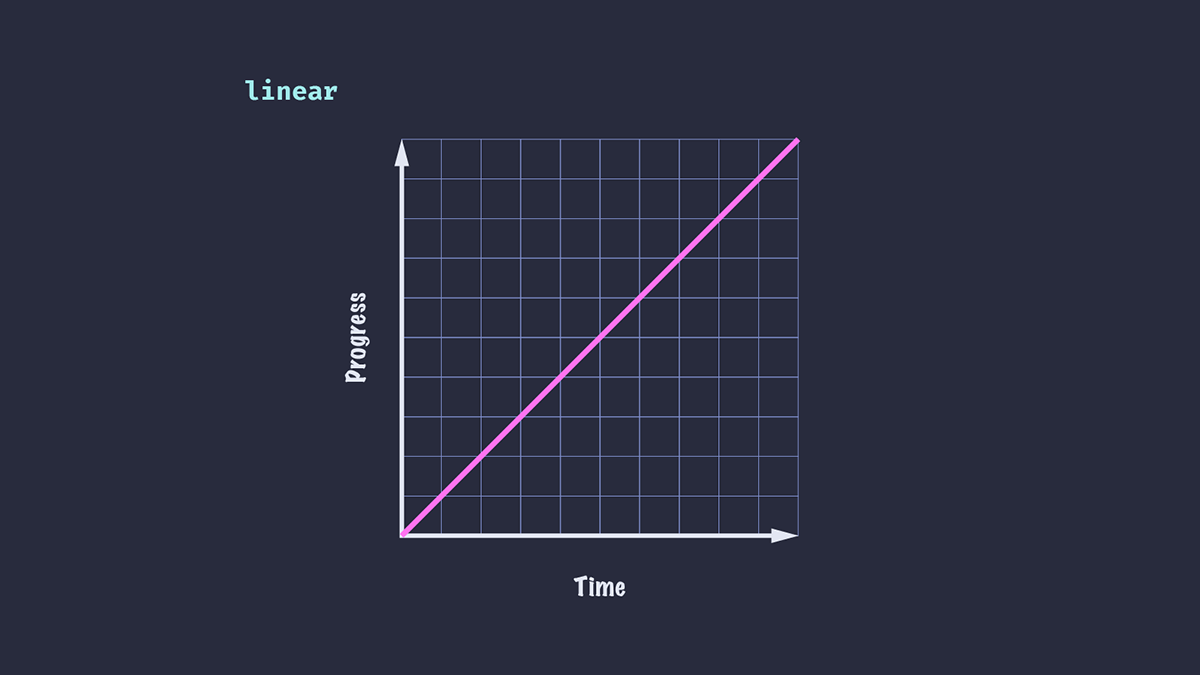
Linear (線性)
在整個動畫過程中速度沒有變化。雖然總體上不太逼真,但線性緩動在 UI 動畫中很有用,例如滾動的 logo 或圖片列表。
緩動函式
緩動關鍵字對於簡單的 UI 元素(例如,應用於按鈕的懸停狀態)很有用,但對於更復雜的動畫或我們想要更精細地控制速度的情況,它們並不總是足夠。CSS 為我們提供了一些函式來建立自定義緩動:steps() 和 cubic-bezier()。
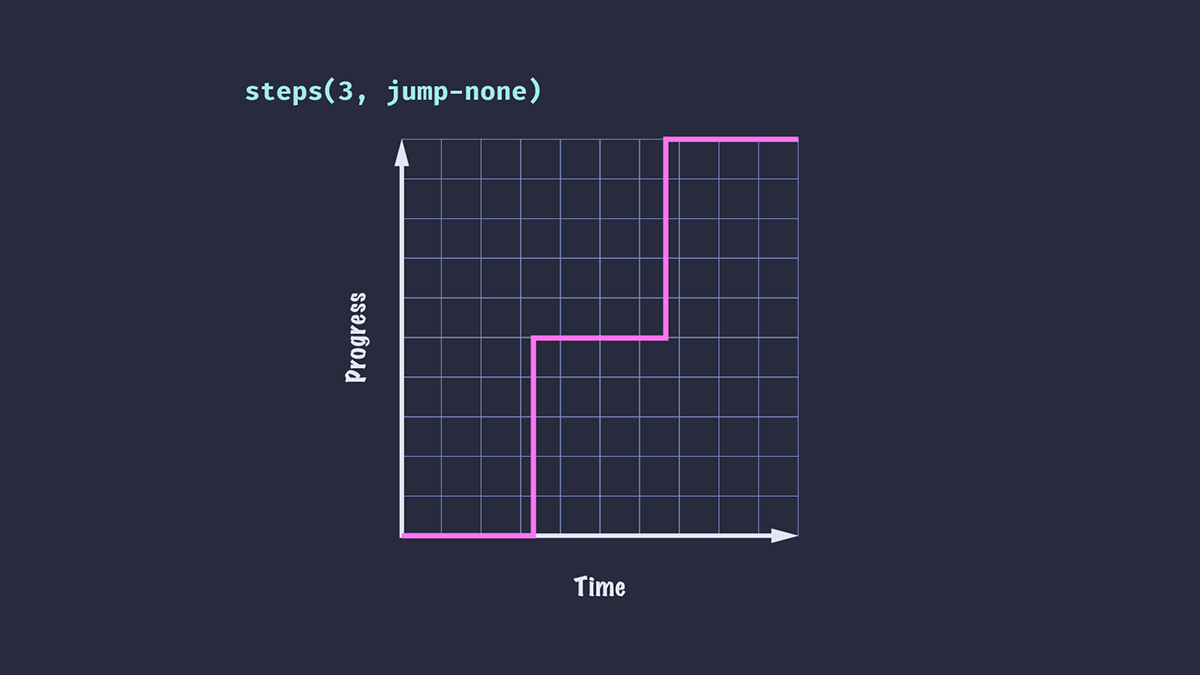
Steps (分步)
steps() 函式將輸入時間劃分為指定的間隔數——因此我們的動畫將在一個值跳到下一個值。我們可以透過指定步數和跳轉位置(可選)來完成。本文不打算深入探討 steps() 緩動,但我建議閱讀關於Steps 緩動函式 的內容,以瞭解不同值的效果。
.box {
  animation-timing-function: steps(3, jump-none);
}
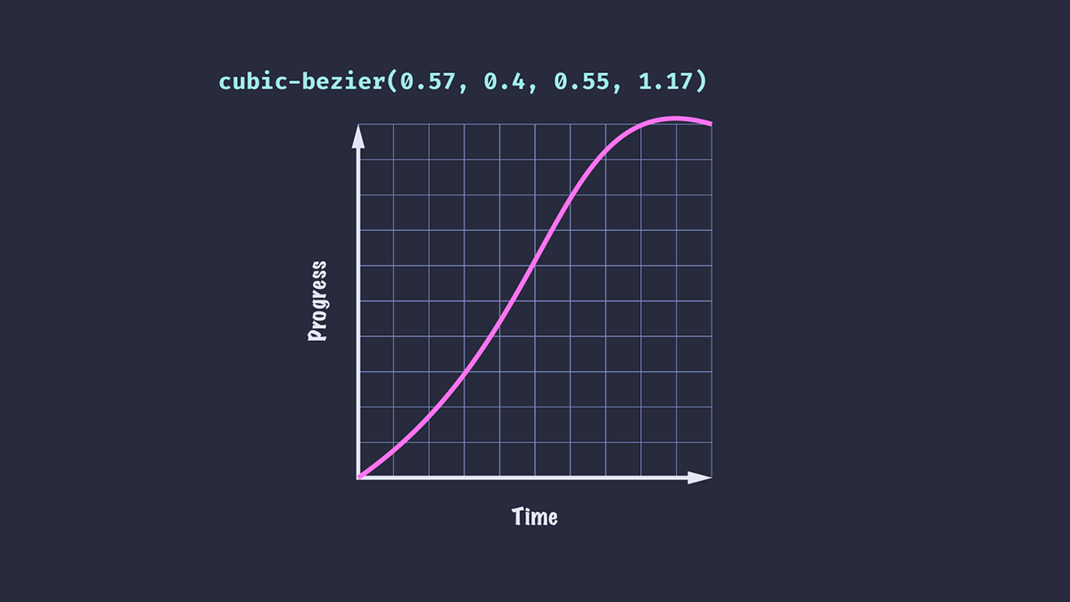
Cubic-bezier (三次貝塞爾)
cubic-bezier() 函式讓我們能夠更精細地控制 CSS 動畫中的緩動。該函式接受四個值,它們對應於三次貝塞爾曲線的兩個控制點。
我們可以使用 cubic-bezier() 建立更逼真的效果,例如讓元素稍微超過其最終位置,然後再靜止下來。
.ball {
  animation-timing-function: cubic-bezier(0.57, 0.4, 0.55, 1.17);
}
如果您理解其背後的數學原理,就可以非常有創意地定義自己的自定義曲線,例如 Temani Afif 在這篇《使用 cubic-bezier() 進行高階 CSS 動畫》文章中展示的那樣!
幸運的是,我們不必成為數學天才也能使用 cubic-bezier() 建立令人愉悅的緩動效果:Lea Verou 的Cubic Bezier 工具允許我們調整和視覺化自定義緩動曲線並匯出結果。
cubic-bezier 緩動函式的侷限性
儘管 cubic-bezier() 非常通用,但它也有其侷限性,因為我們只能控制三次貝塞爾曲線的兩個點。
假設我們想讓元素從左向右滑動,然後以遞減的距離和速度彈跳幾次,直到停止。如果我們檢視easings.net,可以看到一系列緩動曲線,它們可能適合我們不同場景的需求(或可以進行調整以適應)。不幸的是,使用 cubic-bezier() 無法重現所有這些。
使用關鍵幀應用自定義緩動
實現自定義緩動的一種方法是使用關鍵幀動畫。我們可以為元素的精確位置定義一系列關鍵幀,並應用整體線性緩動(因為我們的緩動實際上是由關鍵幀決定的)。
@keyframes easeOutElastic {
  0% { transform: translateX(0%); }
  16% { transform: translateX(-132.27%); }
  28% { transform: translateX(-86.88%); }
  44% { transform: translateX(-104.63%); }
  59% { transform: translateX(-98.36%); }
  73% { transform: translateX(-100.58%); }
  88% { transform: translateX(-99.8%); }
  100% { transform: translateX(-100%); }
}
注意:這個關鍵幀示例是摘自easings.net 的 "easeOutElastic" 示例。
這感覺有些笨拙,並且不易於調整以滿足我們的需求。還有另一個問題:我們的動畫只能朝一個方向播放。如果想從右到左應用相同的動畫,我們需要建立另一組關鍵幀。
介紹 linear 定時函式
與其透過關鍵幀將緩動構建到動畫中,不如使用新的 CSS linear() 函式來建立完全自定義的效果。
linear() 函式(不要與上面介紹的 linear 關鍵字混淆)需要一個逗號分隔的停止點列表,其值範圍從 0 到 1。這些停止點在時間線上均勻分佈。值為 linear(0, 1) 等同於 linear 關鍵字,動畫進度速率在整個持續時間內沒有變化。
傳遞三個停止點,值為 0、0.75 和 1,意味著在時間週期的 50% 時,動畫將完成其進度的 75%。
.box {
  animation-timing-function: linear(0, 0.75, 1);
}
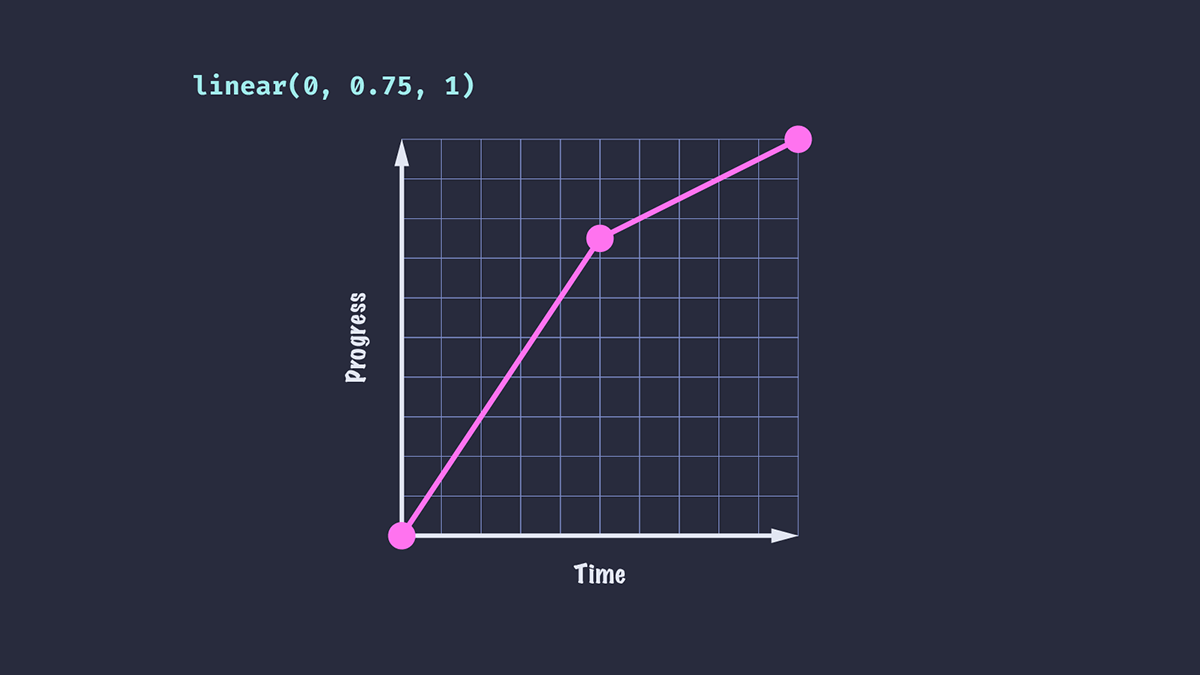
將此緩動應用於 translate 動畫的結果是,元素在動畫持續時間的前半段看起來比後半段移動得更快。
或者,讓我們嘗試給緩動函式傳遞一個負值。
.box {
  animation-timing-function: linear(0, -0.1, 0.75, 1);
}
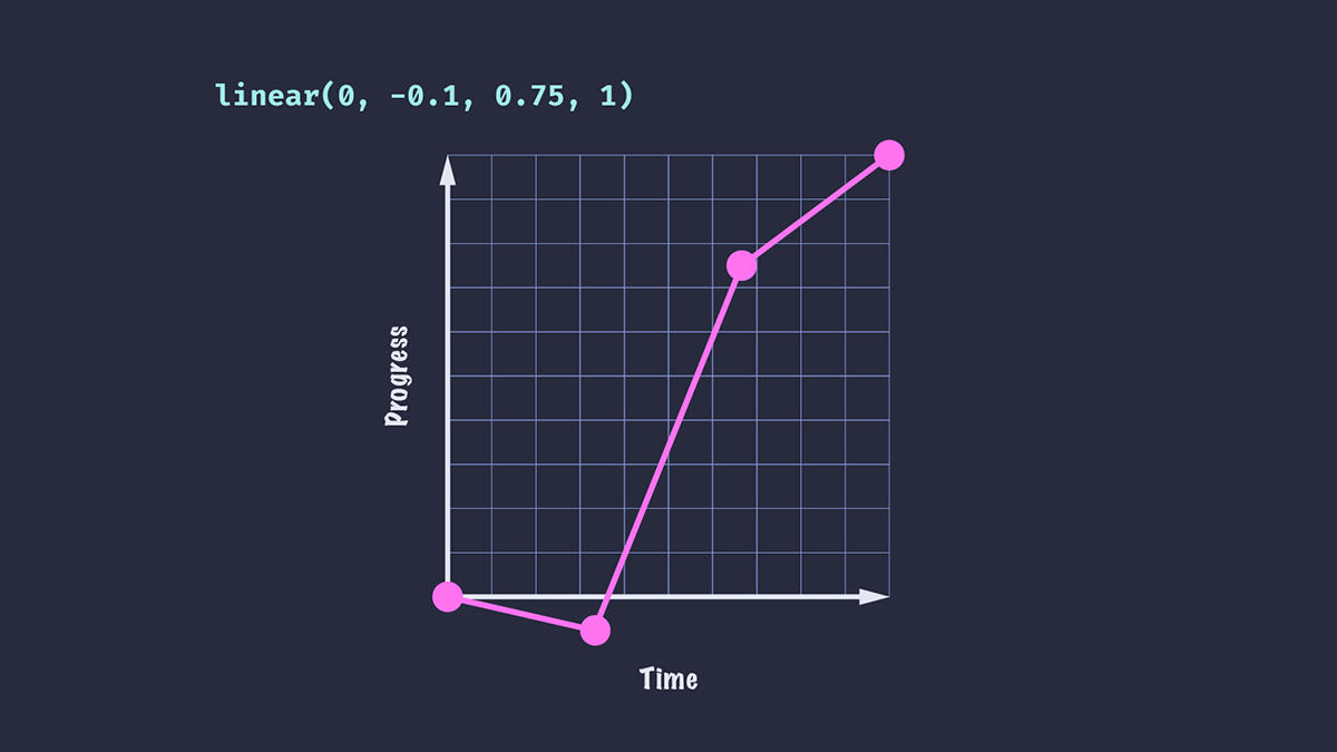
我們看到動畫元素向後移動了一小段距離,然後才被推向終點。從 0 到 -0.1 所花費的時間與從 -0.1 到 0.75 所花費的時間相同。
我們還添加了一個額外的停止點,這意味著到達每個停止點所需的時間比第一個示例要短:在持續時間為 1 秒的動畫中,每個停止點需要 1/3 秒,而不是第一個示例的 0.5 秒。
起始和結束停止點
我們的停止點列表不必從 0 到 1。我們可以從時間線的稍晚位置開始動畫,動畫將從該位置開始播放,持續時間相同。在這裡,您可以看到第二和第三個框花費相同的時間來移動第一個框一半的距離,從其時間線的不同位置開始和結束。
.box {
  animation: slide 3000ms linear(0, 1);
}

.box:nth-child(2) {
  animation-timing-function: linear(0.5, 1);
}

.box:nth-child(3) {
  animation-timing-function: linear(0, 0.5);
}
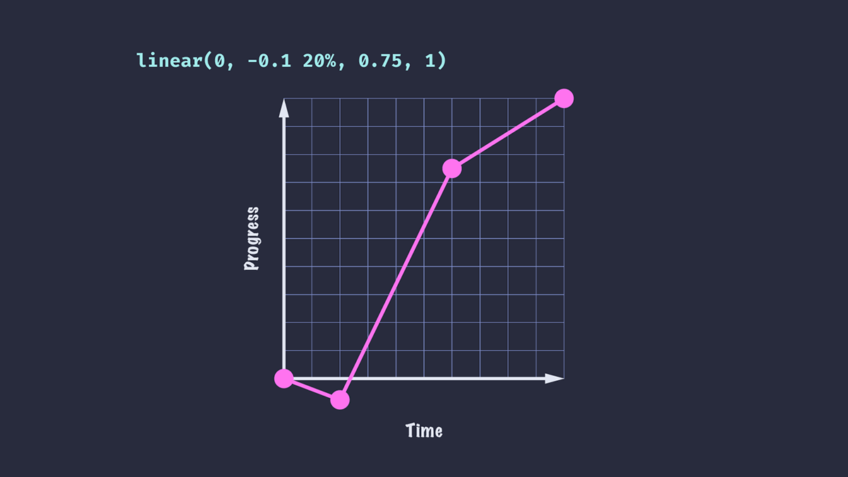
停止點時長
我們可以透過額外傳遞停止點時長來控制動畫持續時間內的停止點位置。如果我們希望元素在 33.33%(當有四個停止點時)而不是 20% 的持續時間內達到第二個停止點值,我們可以在 linear() 函式中指定該值。
.box {
  animation-timing-function: linear(0, -0.1 20%, 0.75, 1);
}
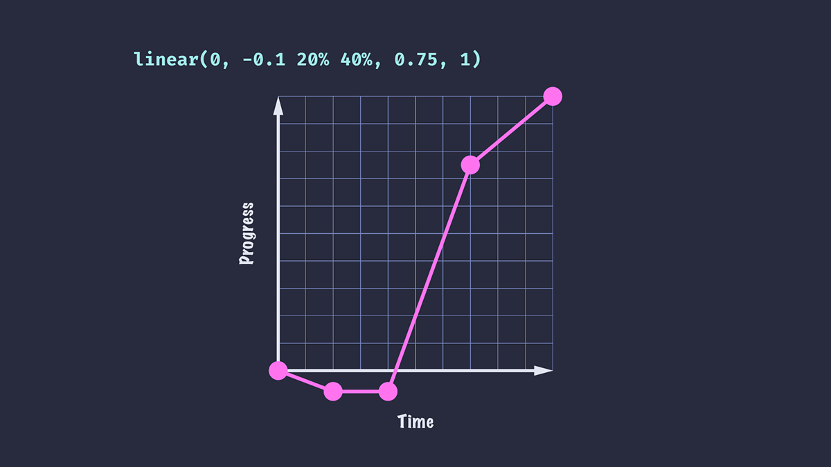
我們還可以為停止點設定一個可選的結束值。
.box {
  animation-timing-function: linear(0, -0.1 20% 40%, 0.75, 1);
}
我們的動畫將在持續時間的 20% 時達到第二個停止點值,暫停到 40%,然後進行到結束。
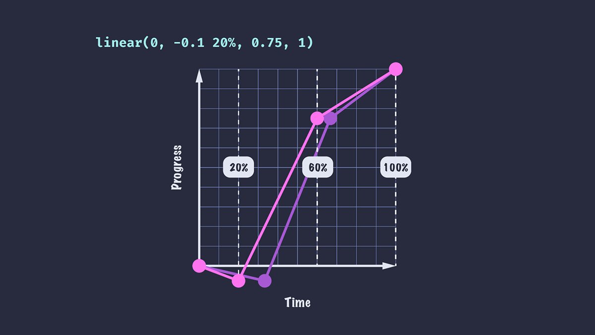
緩動曲線現在看起來像這樣。
您可能會注意到,一旦我們添加了停止點時長,剩餘的停止點就會均勻分佈在剩餘的持續時間內。對於值 linear(0, -0.1 20%, 0.75, 1),停止點 0.75 不再出現在持續時間的 2/3 處,而是位於 60%;這是因為持續時間的最後 80% 在最後三個停止點之間均勻分佈。
使用 linear 緩動函式建立平滑曲線
我們的動畫緩動看起來仍然相當線性。現在還不能說這是“逼真”的動畫!在第一個示例中,元素快速移動到 0.75 的位置,然後突然切換到較慢的速度。如果我們想建立更平滑的減速,我們需要新增更多的停止點。
animation-timing-function: linear(0, -0.1 20%, 0.4, 0.63, 0.75, 0.84, 0.92, 0.97, 1);
現在元素的減速不是完全平滑的,但對於快速動畫來說可能已經足夠平滑了。如果我們的動畫持續時間更長,值的變化可能會更明顯。
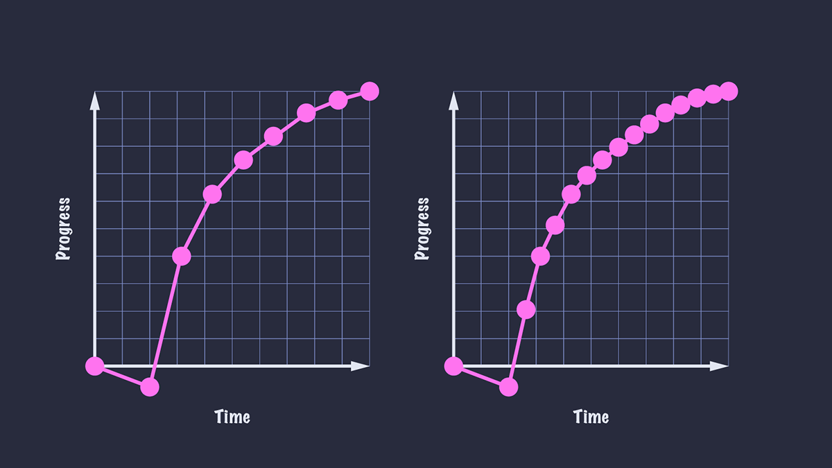
通常來說,我們使用的停止點越多,動畫就越平滑,因為停止點之間的變化將難以察覺。
使用 JavaScript 重現流行的緩動效果
當然,手動建立所有這些停止點可能會很麻煩!如果我們知道建立緩動曲線所需的函式,就可以使用 JavaScript 來建立具有大量點的平滑曲線。
此示例中的 easeOutBounce 函式改編自 easings.net。我們可以將這些緩動效果設定為自定義屬性,以便在我們的程式碼中使用。
const easeOutBounce = (x) => {
  const n1 = 7.5625;
  const d1 = 2.75;

  if (x < 1 / d1) {
    return n1 * x * x;
  } else if (x < 2 / d1) {
    return n1 * (x -= 1.5 / d1) * x + 0.75;
  } else if (x < 2.5 / d1) {
    return n1 * (x -= 2.25 / d1) * x + 0.9375;
  } else {
    return n1 * (x -= 2.625 / d1) * x + 0.984375;
  }
};

const createEase = (fn, points = 50) => {
  const result = [...new Array(points)]
    .map((d, i) => {
      const x = i * (1 / points);
      return fn(x);
    })
    .join(",");

  return `linear(${result})`;
};

document.body.style.setProperty("--easeOutBounce", createEase(easeOutBounce));
.bounce {
  animation-timing-function: var(--easeOutBounce);
}
將 linear 緩動函式與 SVG 路徑結合使用
如果我們能直接給 linear() 函式一個 SVG 路徑值,那不是很好嗎?雖然我們不能直接這樣做,但有一個工具可以幫助我們。Linear() generator 可將 SVG 路徑轉換為 linear() 函式的停止點,並允許我們預覽結果。是不是很有用!
該工具還允許我們視覺化 JavaScript 函式並將其輸出為 CSS,因此我們可以從類似於上述函式的建立停止點,而無需傳送任何客戶端 JavaScript。“bounce”函式已在工具的預設中提供,從而生成以下 CSS。
:root {
  --bounce-easing: linear(0, 0.004, 0.016, 0.035, 0.063, 0.098, 0.141 13.6%, 0.25, 0.391, 0.563, 0.765, 1, 0.891 40.9%, 0.848, 0.813, 0.785, 0.766, 0.754, 0.75, 0.754, 0.766, 0.785, 0.813, 0.848, 0.891 68.2%, 1 72.7%, 0.973, 0.953, 0.941, 0.938, 0.941, 0.953, 0.973, 1, 0.988, 0.984, 0.988, 1);
}
瀏覽器支援
linear() 函式目前在 Safari 中不受支援。但是,如果我們將 animation-timing-function 用作獨立屬性,而不是使用簡寫屬性,則可以輕鬆地回退到預設的 ease 關鍵字(或一些其他支援良好的動畫)。不支援 linear() 函式的瀏覽器將回退到宣告的值,因為瀏覽器會忽略它們不識別的任何屬性/值對。
/* Using the shorthand, the animation will not be applied in browsers that do not support `linear()` */
.box {
  animation: slide 3000ms linear(0, 0.75, 1);
}

/* This way, non-supporting browsers will fall back to `ease-out` */
.box {
  animation: slide 3000ms ease-out;
  animation-timing-function: linear(0, 0.75, 1);
}
或者,我們可以使用特性查詢來檢測對 linear() 的支援,並提供替代方案。
/* Fallback animation. You could define an alternative animation with keyframes if you choose. */
.box {
  animation: alternativeSlide 3000ms;
}

/* Browsers that support `linear()` will get these styles */
@supports (animation-timing-function: linear(0, 1)) {
  .box {
    animation: slide 3000ms linear(0, 0.75, 1);
  }
}