影片播放器樣式基礎
在之前的 跨瀏覽器影片播放器文章 中,我們描述瞭如何使用媒體和全屏 API 構建跨瀏覽器 HTML 影片播放器。本後續文章將介紹如何對這個自定義播放器進行樣式設定,包括使其具有響應性。
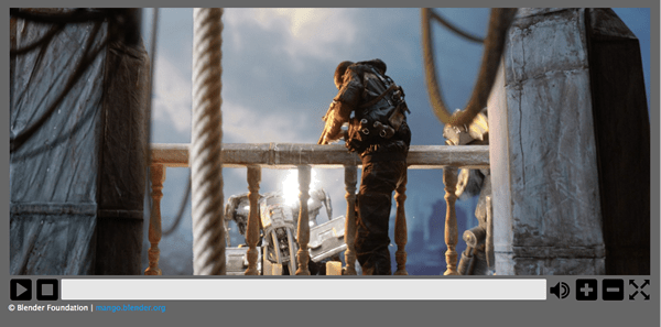
示例實際操作
來自原始示例的初步修改
本節概述了對 原始影片播放器示例 進行的修改,以便在開始大量工作之前,簡化樣式設定任務。
HTML 標記
對之前文章中顯示的 HTML 標記進行了一些更改。自定義影片控制元件和 <progress> 元素現在包含在 <div> 元素中,而不是位於無序列表項中。
自定義控制元件的標記現在如下所示
<div id="video-controls" class="controls" data-state="hidden">
  <button id="playpause" type="button" data-state="play">Play/Pause</button>
  <button id="stop" type="button" data-state="stop">Stop</button>
  <div class="progress">
    <progress id="progress" value="0" min="0">
      <span id="progress-bar"></span>
    </progress>
  </div>
  <button id="mute" type="button" data-state="mute">Mute/Unmute</button>
  <button id="volinc" type="button" data-state="volup">Vol+</button>
  <button id="voldec" type="button" data-state="voldown">Vol-</button>
  <button id="fs" type="button" data-state="go-fullscreen">Fullscreen</button>
</div>
相關 CSS 更改
之前文章將影片控制元件的 display 屬性設定為 block 以便顯示它們。現在已更改為使用 data-state 屬性,該程式碼已經使用該屬性來處理其 全屏實現。
這個“data-state”概念也用於設定影片控制元件集中按鈕的當前狀態,這允許特定狀態的樣式設定。
JavaScript
如上所述,data-state 屬性在各種地方用於樣式設定目的,這些屬性使用 JavaScript 設定。具體的實現將在下面的相應位置提到。
樣式
這裡使用的影片播放器樣式相當基礎 - 這是故意的,因為目的是展示如何對這樣的影片播放器進行樣式設定並使其具有響應性。
注意:在某些情況下,這裡程式碼示例中省略了一些基本的 CSS,因為它的使用要麼顯而易見,要麼與影片播放器的樣式設定無關。
基本樣式
HTML 影片及其控制元件都包含在 <figure> 元素中,該元素被賦予最大寬度和高度(基於所用影片的尺寸)並在頁面中居中
figure {
  max-width: 64rem;
  width: 100%;
  max-height: 30.875rem;
  height: 100%;
  margin: 1.25rem auto;
  padding: 1.051%;
  background-color: #666;
}
影片控制元件容器本身也需要一些樣式,以便以正確的方式設定它
.controls {
  width: 100%;
  height: 8.0971659919028340080971659919028%; /* of figure's height */
  position: relative;
}
.controls 類的 height 被設定為封閉的 <figure> 元素的(非常精確的!)百分比(這是根據所需的按鈕高度進行實驗後確定的)。它的位置也被專門設定為 relative,這是其響應性所必需的(稍後會詳細介紹)。
如前所述,data-state 屬性現在用於指示影片控制元件是可見還是不可見,這些屬性也需要進行樣式設定
.controls[data-state="hidden"] {
  display: none;
}

.controls[data-state="visible"] {
  display: block;
}
還需要為影片控制元件中的所有元素設定一些屬性
.controls > * {
  float: left;
  width: 3.90625%;
  height: 100%;
  margin-left: 0.1953125%;
  display: block;
}

.controls > *:first-child {
  margin-left: 0;
}
所有元素都浮動到左側,因為它們要彼此並排排列,並且每個元素都被設定為具有接近 4% 的 width(實際值也是根據所需的按鈕尺寸計算的),以及 100% 的 height。還設定了 margin-left 的值,但第一個元素(在本例中是播放/暫停按鈕)被 0 的值覆蓋了該屬性。
<progress> 元素的 <div> 容器也需要一些特定的設定;它被設定為比其他子元素寬得多,並且其游標值被設定為指標
.controls .progress {
  cursor: pointer;
  width: 75.390625%;
}
按鈕
第一個主要樣式設定任務是使影片控制元件的按鈕看起來像真正的按鈕並像真正的按鈕一樣工作。
每個按鈕都有一些基本的樣式
.controls button {
  border: none;
  cursor: pointer;
  background: transparent;
  background-size: contain;
  background-repeat: no-repeat;
}
預設情況下,所有 <button> 元素都有邊框,因此這裡將其刪除。由於將使用背景影像來顯示相應的圖示,因此按鈕的背景顏色被設定為透明、不重複,並且元素應完全包含影像。
然後為每個按鈕設定簡單的 :hover 和 :focus 狀態,這些狀態會改變按鈕的不透明度
.controls button:hover,
.controls button:focus {
  opacity: 0.5;
}
為了獲得合適的按鈕影像,從網上下載了一組免費的通用控制元件集圖示。然後將每個影像轉換為 base64 編碼字串(使用線上 base64 影像編碼器),由於影像很小,因此生成的編碼字串很短。
由於某些按鈕具有雙重功能,例如播放/暫停和靜音/取消靜音,因此這些按鈕具有不同的狀態,需要進行樣式設定。如前所述,data-state 變數用於指示這些按鈕當前處於哪個狀態。
例如,播放/暫停按鈕具有以下背景影像定義(為了簡潔起見,省略了完整的 base64 字串)
.controls button[data-state="play"] {
  background-image: url("data:image/png;base64,iVBORw0KGgoAAA…");
}

.controls button[data-state="pause"] {
  background-image: url("data:image/png;base64,iVBORw0KGgoAAA…");
}
當按鈕的 data-state 發生更改時,相應的影像也會發生更改。所有其他按鈕的處理方式類似。
進度條
<progress> 元素具有以下基本樣式設定
.controls progress {
  display: block;
  width: 100%;
  height: 81%;
  margin-top: 0.125rem;
  border: none;
  color: #0095dd;
  -moz-border-radius: 2px;
  -webkit-border-radius: 2px;
  border-radius: 2px;
}
與 <button> 元素一樣,<progress> 也有一個預設邊框,這裡將其刪除。它還為了美觀而被賦予了一個略微圓角。
如 之前文章 中所述,為不支援 <progress> 元素的瀏覽器提供了回退;這也需要進行適當的樣式設定
.controls progress[data-state="fake"] {
  background: #e6e6e6;
  height: 65%;
}
.controls progress span {
  width: 0%;
  height: 100%;
  display: inline-block;
  background-color: #2a84cd;
}
當一個 <progress> 元素被“偽造”時,這裡也會使用一個 .data-state 類;處於這種狀態時,需要設定背景顏色。用作偽造進度條的實際進度部分的內部 <span> 元素的寬度最初被設定為 0%(它透過 JavaScript 更新),並且它的背景顏色也被設定。
需要設定一些瀏覽器特定的屬性,以確保 Firefox 和 Chrome 使用所需的進度條顏色
.controls progress::-moz-progress-bar {
  background-color: #0095dd;
}

.controls progress::-webkit-progress-value {
  background-color: #0095dd;
}
儘管將相同的屬性設定為相同的值,但這些規則需要分別定義,否則 Chrome 會忽略它。
JavaScript
這就是對直接樣式設定的全部內容;下一個任務是對 JavaScript 進行一些更改,以確保一切按預期工作。
控制可見性
第一個更改很簡單:當瀏覽器可以使用 JavaScript 時,需要設定用於顯示影片控制元件的 data-state
// Display the user defined video controls
videoControls.setAttribute("data-state", "visible");
進度條支援
還需要檢查一下,如果瀏覽器不支援 <progress> 元素,則設定“偽造”進度條
const supportsProgress = document.createElement("progress").max !== undefined;
if (!supportsProgress) progress.setAttribute("data-state", "fake");
按鈕功能
本節介紹實現按鈕功能所需的 JavaScript。
播放/暫停和靜音
現在,按鈕看起來像真正的按鈕並且具有指示其功能的影像,需要進行一些更改,以確保“雙重功能”按鈕(例如播放/暫停按鈕)處於正確的“狀態”並顯示正確的影像。為了便於此,定義了一個名為 changeButtonState() 的新函式,該函式接受一個型別變數,指示按鈕的功能
function changeButtonState(type) {
  if (type === "playpause") {
    // Play/Pause button
    if (video.paused || video.ended) {
      playpause.setAttribute("data-state", "play");
    } else {
      playpause.setAttribute("data-state", "pause");
    }
  } else if (type === "mute") {
    // Mute button
    mute.setAttribute("data-state", video.muted ? "unmute" : "mute");
  }
}
然後,相關事件處理程式會呼叫此函式
video.addEventListener(
  "play",
  () => {
    changeButtonState("playpause");
  },
  false,
);

video.addEventListener(
  "pause",
  () => {
    changeButtonState("playpause");
  },
  false,
);

stop.addEventListener("click", (e) => {
  video.pause();
  video.currentTime = 0;
  progress.value = 0;

  // Update the play/pause button's 'data-state' which allows the correct button image to be set via CSS
  changeButtonState("playpause");
});

mute.addEventListener("click", (e) => {
  video.muted = !video.muted;
  changeButtonState("mute");
});
你可能已經注意到,在影片上對 play 和 pause 事件做出反應的地方出現了新的處理程式。這是有原因的!即使瀏覽器預設的影片控制集已關閉,許多瀏覽器也會透過右鍵單擊 HTML 影片來使其可訪問。這意味著使用者可以透過這些控制元件播放/暫停影片,這將使自定義控制集的按鈕不同步。如果使用者使用預設控制元件,則會觸發定義的媒體 API 事件(如 play 和 pause),因此可以利用它來確保自定義控制按鈕保持同步。為了確保這一點,需要為播放/暫停按鈕定義一個新的單擊處理程式,以便它也能觸發 play 和 pause 事件。
playpause.addEventListener("click", (e) => {
  if (video.paused || video.ended) {
    video.play();
  } else {
    video.pause();
  }
});
音量
當點選播放器的音量按鈕時呼叫的 alterVolume() 函式也發生了變化 - 它現在呼叫一個名為 checkVolume() 的新函式。
function checkVolume(dir) {
  if (dir) {
    const currentVolume = Math.floor(video.volume * 10) / 10;
    if (dir === "+" && currentVolume < 1) {
      video.volume += 0.1;
    } else if (dir === "-" && currentVolume > 0) {
      video.volume -= 0.1;
    }

    // If the volume has been turned off, also set it as muted
    // Note: can only do this with the custom control set as when the 'volumechange' event is raised,
    // there is no way to know if it was via a volume or a mute change
    video.muted = currentVolume <= 0;
  }
  changeButtonState("mute");
}

const alterVolume = (dir) => {
  checkVolume(dir);
};
這個新的 checkVolume() 函式執行與 alterVolume() 相同的操作,但它還會根據影片當前的音量設定來設定靜音按鈕的狀態。checkVolume() 也在 volumechange 事件觸發時被呼叫。
video.addEventListener(
  "volumechange",
  () => {
    checkVolume();
  },
  false,
);
進度條
還需要對 <progress> 元素的單擊處理程式進行一些小的更改。由於包含的 <figure> 元素現在在其上設定了 position:relative,因此該單擊處理程式執行的計算不正確。它現在還需要考慮父元素的偏移位置。
progress.addEventListener("click", (e) => {
  const pos =
    (e.pageX - progress.offsetLeft - progress.offsetParent.offsetLeft) /
    progress.offsetWidth;
  video.currentTime = pos * video.duration;
});
全屏
全屏實現 並沒有改變。
響應式樣式
現在播放器已經解決了其基本外觀和感覺,需要進行一些其他涉及媒體查詢的樣式更改,以使其具有響應性。
播放器目前執行得很好,直到在“中等”螢幕(例如 1024px/64em)或更小的螢幕上顯示。在這種情況下,需要刪除 <figure> 元素上的邊距和填充,以便利用所有可用空間,並且按鈕太小,需要透過在設定了 .controls 類的元素上設定新高度來更改。
@media screen and (max-width: 64em) {
  figure {
    padding-left: 0;
    padding-right: 0;
    height: auto;
  }

  .controls {
    height: 1.876rem;
  }
}
這在更小的螢幕(680px/42.5em)上觀看時效果很好,因此這裡又做了一個斷點。由於 .controls 類元素的高度現在會變化,因此不再需要固定高度 - 因此將其設定為 auto。.controls 元素中的元素定義也需要更改。
@media screen and (max-width: 42.5em) {
  .controls {
    height: auto;
  }

  .controls > * {
    display: block;
    width: 16.6667%;
    margin-left: 0;
    height: 2.5rem;
    margin-top: 2.5rem;
  }

  .controls .progress {
    position: absolute;
    top: 0;
    width: 100%;
    float: none;
    margin-top: 0;
  }

  .controls .progress progress {
    width: 98%;
    margin: 0 auto;
  }

  .controls button {
    background-position: center center;
  }
}
.progress 容器現在透過 position:absolute 移動到控制集的頂部,因此它和所有按鈕都需要更寬。此外,按鈕需要推到進度容器下方,以便它們可見。